The art and science of storytelling through data visualizations: captivating audiences with meaningful narratives
The ability to transform raw data into compelling narratives is a powerful skill. Data storytelling combines the art of storytelling with the science of data visualization to convey insights and engage audiences on a deeper level. This article explores the art and science of storytelling through data visualizations, focusing on techniques, tools, and platforms that enable organizations to captivate audiences with meaningful narratives. From interactive data visualization tools to advanced techniques and current trends, we’ll uncover the secrets of compelling data storytelling and how it unlocks the potential for impactful communication.
I The power of data visualization in storytelling
Data visualization serves as the visual language that brings data-driven narratives to life. By representing data visually, we can uncover patterns, relationships, and trends that might otherwise go unnoticed. Interactive data visualization tools empower storytellers to create immersive and engaging experiences, allowing audiences to explore and interact with the data themselves. These tools enable users to uncover insights, understand complex information, and connect with the story.
II Techniques for effective data storytelling
1 Define the narrative: A compelling data story begins with a clear, focused narrative. Define the story’s purpose, identify critical insights, and structure the narrative arc to guide the audience through the data journey.
2 Choose the proper visualization techniques: Select techniques that best represent the data and support the narrative. Consider options such as charts, graphs, maps, and interactive dashboards to convey information effectively.
3 Simplify and focus: Data storytelling requires distilling complex information into digestible chunks. Simplify visuals, remove unnecessary clutter, and focus on the most relevant data points to enhance clarity and understanding.
4 Incorporate interactivity: Interactive data visualizations invite audiences to engage with the story actively. Implement tooltips, filters, and drill-down capabilities to enable users to explore the data and derive their insights.
5 Use data storytelling frameworks: frameworks such as the “Five-Act Structure” or the “Hero’s Journey” can be applied to data storytelling. These frameworks provide a narrative structure that guides the audience through the data exploration and analysis process.
III. Tools and platforms for data storytelling
1 Tableau: Tableau offers a comprehensive data visualization and storytelling tool suite. Its interactive dashboards and drag-and-drop functionality make it easy to create engaging visual narratives.
2 Power BI: Microsoft’s Power BI provides powerful data storytelling capabilities with its interactive visuals and seamless integration with other Microsoft products. It offers a user-friendly interface for creating compelling narratives.
3 Datawrapper: Datawrapper is a user-friendly online tool that allows users to create visually appealing charts and maps for data storytelling. It provides intuitive customization options and responsive designs.
4 Flourish: Flourish offers a range of templates and interactive data visualization options that facilitate data storytelling. It allows users to create animated charts, maps, and stories easily.
5 Adobe Illustrator: Adobe Illustrator provides advanced design capabilities for creating custom data visualizations and infographics. It offers a wide range of tools and features to create visually stunning and impactful visuals.
IV Emerging trends in data storytelling
Data storytelling continues to evolve, driven by emerging trends that enhance audience engagement. Some notable trends include:
1 Immersive experiences: Virtual reality (VR) and augmented reality (AR) technologies are utilized to create immersive data storytelling experiences, allowing users to enter the data narrative.
2 Real-time data visualizations: The ability to incorporate real-time data into visual narratives adds relevance and freshness, enabling audiences to stay up-to-date with the story as it unfolds. Real-time data visualizations can showcase live updates, monitor key metrics, and provide dynamic insights, fostering a sense of immediacy and engagement.
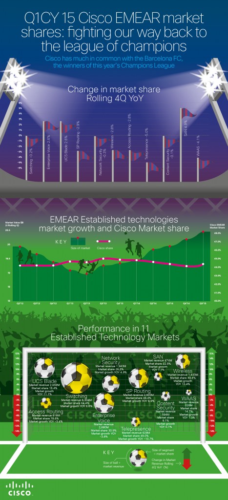
3 Story-driven infographics: Infographics combine visual elements and data storytelling to convey information succinctly and attractively. Story-driven infographics follow a narrative structure, guiding the audience through a sequence of data points to build a cohesive story. These infographics often incorporate visual cues, illustrations, and icons to enhance storytelling and make complex information more digestible.
4 User-generated data visualizations: With the rise of social media and user-generated content, organizations can leverage user-generated data visualizations to amplify their storytelling efforts. Encouraging users to create their own visualizations based on provided datasets or templates fosters engagement, collaboration, and a sense of ownership among the audience.
5 Interactive data journalism: Data journalism combines investigative reporting with data analysis and visualization to tell compelling stories. Interactive data journalism takes it further by allowing readers to interact with the data, explore different angles, and draw conclusions. These interactive experiences promote engagement and empower readers to participate actively in storytelling.
Data storytelling through visualizations is a powerful tool that allows organizations to communicate complex information effectively. Storytellers can captivate audiences and drive meaningful engagement by incorporating the art and science of storytelling, leveraging interactive data visualization tools and platforms, and following effective techniques. The power of data visualization lies in its ability to transform raw data into compelling narratives that resonate with audiences on an emotional and intellectual level. By staying abreast of emerging trends and utilizing advanced tools, organizations can harness the true potential of data storytelling, making a lasting impact and unlocking the insights hidden within their data.
Effective data storytelling becomes even more critical as data grows in volume and complexity. Through captivating visual narratives, organizations can present data-driven insights that drive decision-making, spark innovation, and inspire action. By combining the art of storytelling with the science of data visualization, organizations can bridge the gap between data and understanding, transforming numbers and statistics into stories that engage, educate, and empower.
Data storytelling is an essential skill in today’s data-driven world. By mastering the art and science of storytelling through data visualizations, organizations can unleash the power of their data, captivate audiences with meaningful narratives, and significantly impact their industries. Storytellers can create data-driven stories that leave a lasting impression and drive actionable insights by carefully selecting tools, techniques, and platforms, combined with a deep understanding of their audience. Embrace the art of data storytelling, and unlock the potential within your data to drive meaningful change.
Related Stories
Try this sniff test to see if your business stands out
Business intelligence tools give your business a competitive advantage
6 undeniable reasons why Power BI is a good skill to have for any marketer
Everything you need to know about advertising on one annotated slide
About the author

My name is Andy Pemberton. I am an expert in data visualization. I guide global clients such as Lombard Odier, the European Commission and Cisco on the best way to use data visualization and then produce it for them: reports, infographics and motion graphics. If you need your data visualized contact me at andy@furthr.co.uk or call 07963 020 103
Posted in: Infographic by Furthr | Leave a Comment


