The best infographic ever
Our friends at Business insider have uncovered the best infographic ever.
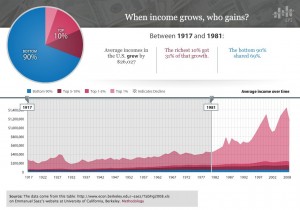
The Economic Policy Institute has put together a dynamic infographic that shows the growh of US incomes over the past 90 years.
By adjusting the sliders on the chart it reveals that starting in the early 1980s, a 60-year trend changed, and most of the country’s wealth gains started going to the top 10% of the population. In other words, the charts show how 90% of the country has gotten shafted over the past 30 years, and especially over the past 10.
From 1917-1981, average incomes rose by $26,000. The richest 10% captured 31% of that growth, and the other 90% captured 59%.
Over the past three decades, the picture changes–radically. From 1981-2008, average incomes grew by a healthy $12,000. But a shocking 96% of that growth went to the richest 10% of the country. Only 4% of it went to the other 90%.
From 1997-2008, average incomes grew by $2,700. All of these gains went to the richest 10%. The incomes of the other 90% declined.
The next question, of course, is what has caused the shift of the past 30 years, as well as what can be done to reverse it. The cause is likely a number of factors, from globalization (the entry of three billion low-cost laborers into the workforce) to tax policy to technology. And there’s no easy and quick solution…
As Business Insider writes:
Posted in: Infographic of the day | Leave a CommentYou’d certainly have to be a member of the top 10% to think that the trend over the past 30 years is okay. You’d also have to be pretty short-sighted. Because if that trend continues, and if you’re in the top 10% because you own or work for a company that serves the other 90%, demand for your products will soon be going down.
