Three charts explain all you need to know about the UK government’s plans to tackle COVID-19
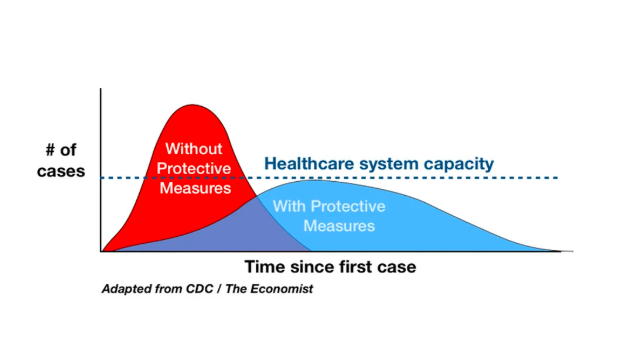
This chart (above) from the the US Centre for Disease Control explains what is meant by that oft repeated phrase “flattening the curve.”
Mitigation efforts like social distancing help reduce the disease caseload on any given date, and can keep the healthcare system from becoming overwhelmed.
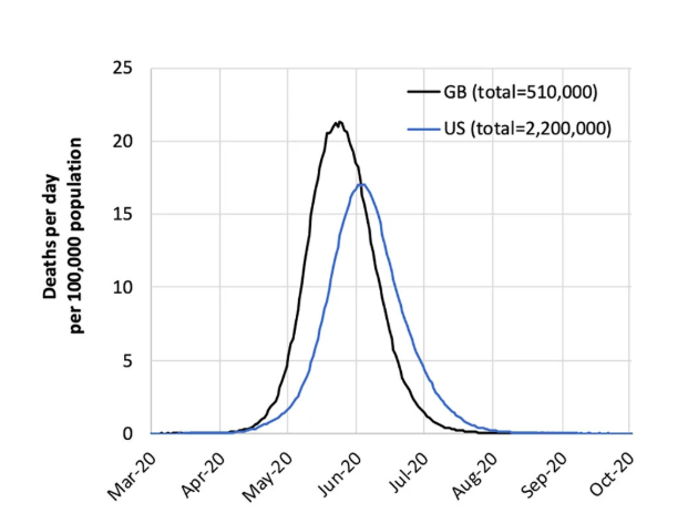
This chart (above) from Imperial College COVID-19 Response Team shows the number of deaths that could occur in the U.S. and Britain in the absence of actions to control the epidemic.
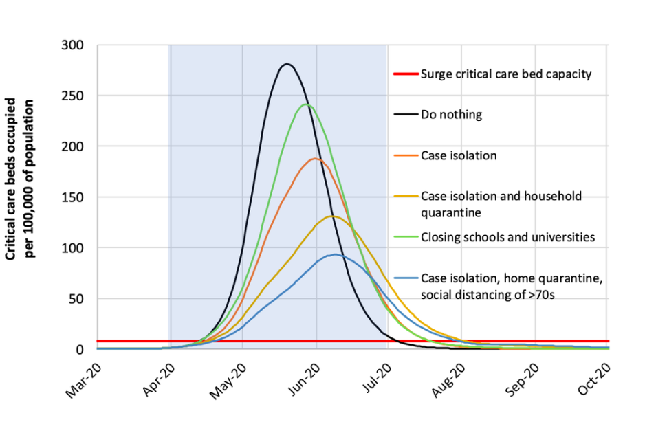
This final chart (above) explains the predicted impact countermeasures could have on the death toll in Britain.
The flat red line running along the bottom of the chart is the hopelessly overwhelmed critical care bed capacity available in the UK. According to Imperial College, the most extreme measures would cut deaths by half, down to 250,000 in the UK.
Posted in: Big Picture story, Infographic of the day | Leave a Comment