Harnessing AI for powerful data visualizations: a step-by-step guide
In today’s data-driven world, making compelling data visualizations is essential for businesses and individuals. With the advent of artificial intelligence (AI), creating compelling data visualizations has been revolutionized. This article will explore how AI can be leveraged to produce impactful data visualizations and delve into various tools, software, and techniques that can assist in this process. Furthermore, we will touch upon the concept of visual storytelling, which combines data visualization with narrative techniques to convey insights and engage audiences.
I. Understanding AI-powered data visualization
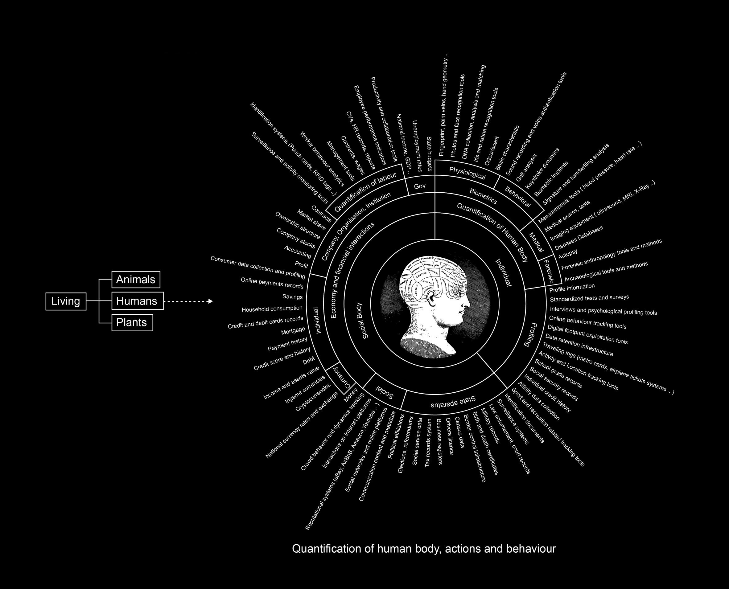
Data visualization is the graphical representation of data to uncover patterns, relationships, and insights that may otherwise remain hidden in raw data. AI has transformed the data visualization landscape by automating and enhancing several aspects of the process. With AI-powered data visualization, complex datasets can be analyzed, interpreted, and presented in a visually appealing and understandable manner.
AI techniques, such as machine learning algorithms and natural language processing (NLP), play a significant role in data visualization. Machine learning algorithms can automatically analyze large datasets, identify patterns, and make predictions. NLP enables AI systems to extract insights from textual data, facilitating sentiment analysis, topic modelling, and text summarization.
II. Tools and software for AI-driven data visualizations
Tableau: Tableau is a popular data visualization tool that utilizes AI capabilities to assist users in creating interactive visualizations. It offers features like drag-and-drop functionality, predictive analytics, and natural language processing to simplify the visualization process. Tableau’s AI-powered features enable users to explore data, gain insights, and create compelling visual representations.
Power BI: Microsoft’s Power BI is another powerful tool that combines AI with data visualization. It provides advanced analytics, machine learning algorithms, and interactive dashboards, enabling users to create compelling visual representations of their data. Power BI’s AI features enable users to analyze data, detect trends, and generate automated insights.
Google Data Studio: Google Data Studio is a free tool that integrates AI and data visualization. It allows users to connect various data sources, create customized reports, and apply machine learning algorithms for deeper insights. With Google Data Studio, users can create visually appealing and interactive dashboards that convey data insights.
Plotly: Plotly is an open-source library that offers AI-powered data visualization capabilities. It supports multiple programming languages, allowing users to create interactive and customizable charts, graphs, and dashboards. Plotly’s AI features enable users to create dynamic and visually stunning visualizations with ease.
III. Leveraging AI for enhanced data insights
Automated data analysis: AI algorithms can analyze large datasets quickly and identify meaningful patterns, correlations, and anomalies. This analysis assists in selecting the most relevant data points for visualization, leading to more accurate and impactful visual representations. By automating the analysis process, AI reduces the time and effort required to gain insights from data.
Predictive Analytics: AI-powered predictive models can forecast future trends and outcomes based on historical data. Incorporating these predictions into data visualizations provides a forward-looking perspective and helps in decision-making processes. Predictive analytics empowers organizations to anticipate future scenarios and make data-driven decisions proactively.
Natural Language Processing (NLP): NLP enables AI systems to analyze textual data and extract relevant information. By incorporating NLP algorithms, data visualizations can include sentiment analysis, topic modelling, and text summarization, adding valuable context to the visual representation. NLP-powered data visualizations provide a deeper understanding of textual data, making it easier to communicate insights.
IV. The power of visual storytelling in data visualization
Visual storytelling combines the art of storytelling with data visualization, aiming to communicate insights and engage audiences. It involves structuring data visualizations in a narrative format that guides viewers through a compelling story. By incorporating AI-driven data analysis and visualization techniques, visual storytelling can provide a more immersive and impactful experience.
Visual storytelling goes beyond presenting data points; it involves crafting a cohesive narrative that connects different data elements and presents them in a logical and meaningful sequence. AI can assist in this process by identifying patterns, correlations, and outliers within the data, which can then be incorporated into the storytelling framework.
When employing visual storytelling, it is essential to consider the target audience and their level of familiarity with the subject matter. The narrative should be tailored to their knowledge and interests, using appropriate visual elements and storytelling techniques to engage and educate them.
Additionally, AI-powered tools and software can enhance visual storytelling by automating certain aspects of the process. For example, AI algorithms can automatically select the most relevant data points, suggest appropriate visual representations, and even generate textual annotations or captions for the visuals.
To create impactful visual stories, consider the following tips:
Define the story: Define the objective and message of your visual story. Identify the key insights or findings that you want to communicate.
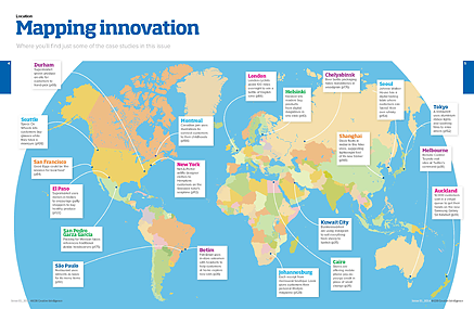
Choose the right visuals: Use elements that support and enhance the narrative. This can include charts, graphs, infographics, maps, or interactive visualizations. AI-powered tools can help you create visually appealing and informative visuals.
Structure the narrative: Create a logical flow for your visual story. Start with an introduction, present the main points, and conclude with a summary or call to action. Use transitions and annotations to guide the audience through the story.
Engage the audience: Use interactive features, such as drill-down capabilities or animations, to encourage audience interaction and exploration of the data. AI-powered tools provide features that facilitate user engagement.
Keep it concise and clear: Avoid overwhelming the audience with excessive data or complex visuals. Simplify the information to its essence, focusing on the most relevant insights that support your narrative.
AI has revolutionized the field of data visualization, enabling users to create effective and engaging visual representations of complex data. Users can automate data analysis, gain predictive insights, and produce interactive visualizations by leveraging AI-powered tools and software. Additionally, incorporating visual storytelling techniques adds depth and context to data visualizations, enhancing audience understanding and engagement. As AI continues to advance, the possibilities for creating impactful data visualizations are expanding, allowing businesses and individuals to extract valuable insights from their data and make informed decisions. By embracing AI-powered data visualization and visual storytelling, organizations can communicate their data-driven narratives and drive meaningful impact.
Related Stories
Try this sniff test to see if your business stands out
Business intelligence tools give your business a competitive advantage
6 undeniable reasons why Power BI is a good skill to have for any marketer
Everything you need to know about advertising on one annotated slide
About the author

My name is Andy Pemberton. I am an expert in data visualization. I guide global clients such as Lombard Odier, the European Commission and Cisco on the best way to use data visualization and then produce it for them: reports, infographics and motion graphics. If you need your data visualized contact me at andy@furthr.co.uk or call 07963 020 103
Posted in: Design and branding, Uncategorized | Leave a Comment