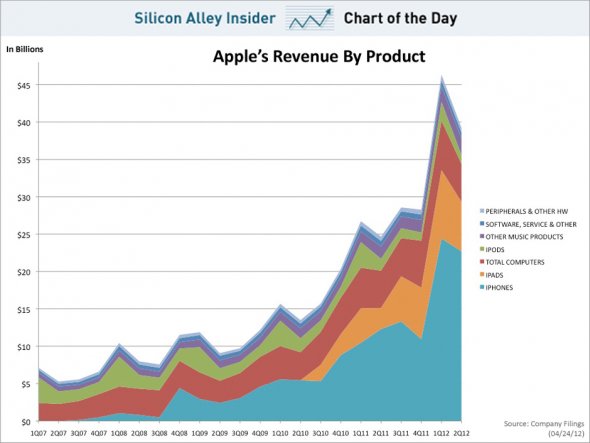
This chart proves that for Apple, it’s all about the iphone

Everyone says the money is in mobile media – and it seems they are right.

The iPhone accounted for 58% of Apple’s total revenue last quarter.

The iPhone didn’t exist five years ago.

Today, the iPhone business alone is more profitable than Exxon.

In the chart, you can see how the iPhone has gone from zero to a hundred billion annually in the span of five years.

Posted in: Infographic of the day, News | Leave a Comment
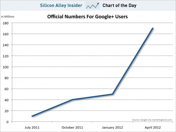
This chart showing users of Google+ could be misleading


This chart from Google+ claims the social media network has 170million registered users.

But is it the whole story?

According to Business Insider:

“Google has hundreds of millions of users and it’s stuffing Google+ down their throats. Naturally, many people are going to sign up. What we don’t know is how many people are actually using Google+.”

Why is that?  Google isn’t properly reporting their numbers. Marketing Land asks a simple question:

“Over six months into its product, and Google was still dodging a fairly simple question. How many people actually use the Google+ social network itself.”


Posted in: Infographic of the day, News | Leave a Comment