An impactful data map for Into University
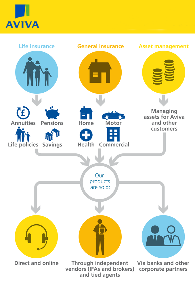
Boosting Aviva’s bottom line
“No title, no infographic” is one of the catchphrases Furthr employs when explaining how best to realise data in easy to consume, exciting visualisations. In the case of AVIVA, the title could not have been simpler. Aviva’s infographic was a summary of their progress as a business halfway through the year, and also a description of the direction the company were to take in the future. When the dynamic and static infographic was launched to coincide with their half-yearly results, the effect was electric. Thanks to the clearly-described position and “forward guidance” contained within the infographic, Aviva’s shareprice leapt 2% when the news hit the wires. Furthr’s infographic was later celebrated in a two page spread in Corporate Communications Magazine.
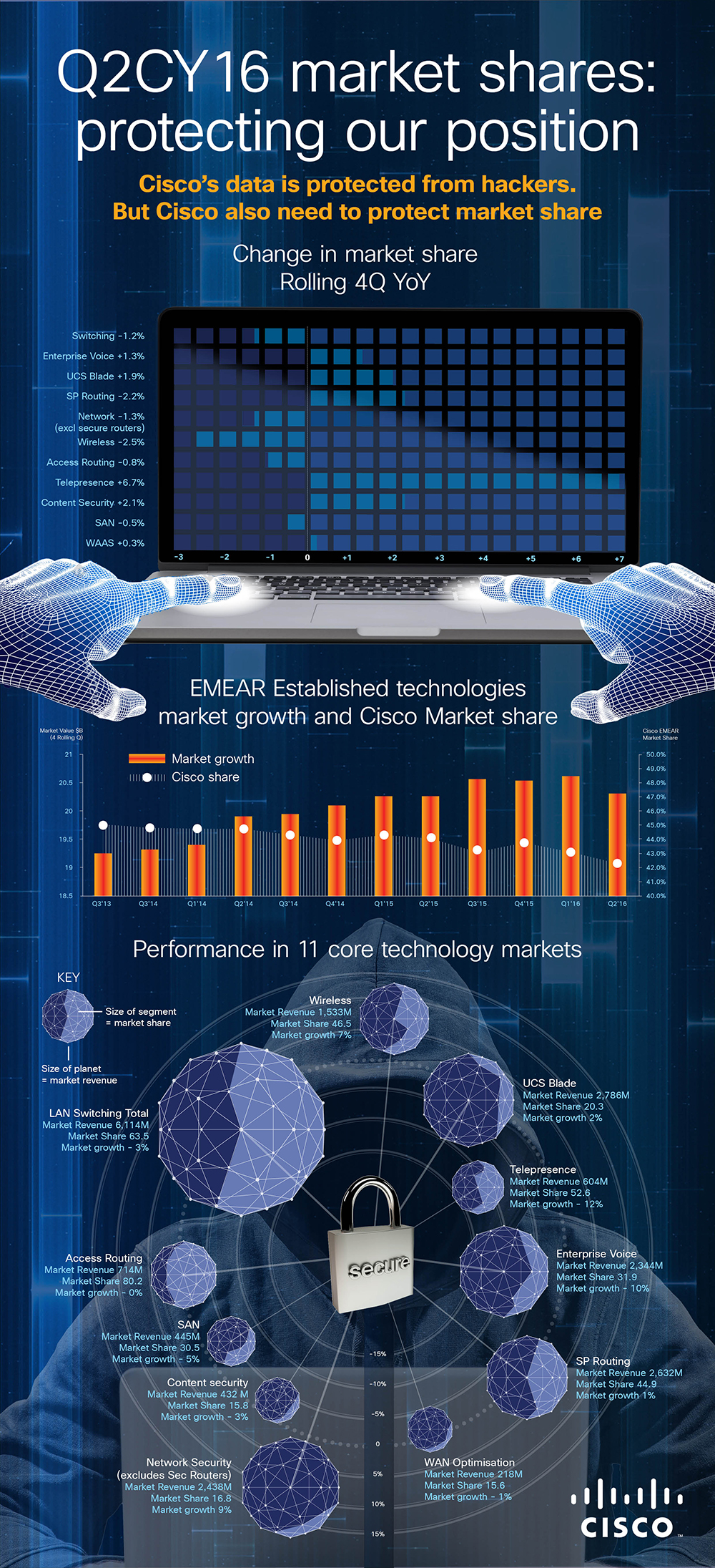
Furthr and Cisco: partners in data visualization
For the last two years, Furthr have been the visualization partner of Cisco’s data department.
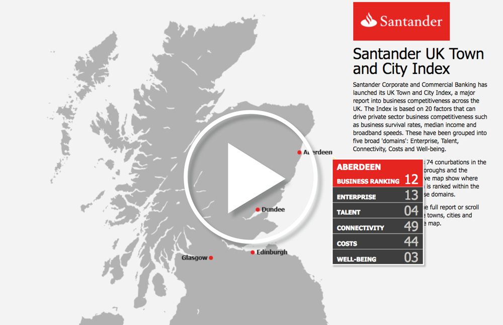
Interactive storytelling with Santander
Up to 30 percent of views of a video can be from robots. That’s why, increasingly, content makers judge the success of their content on the length of time users spend with content. (Robots don’t hang around, you see.) The best way to get users to engage with content for more than three seconds is to make content interactive. Europe’s largest bank Santander published a report explain which towns in the UK were the most business friendly. (Cambridge won). The report was over 100 pages long. That’s why they asked Furthr for help. We turned it into this brilliant interactive map.
A thought leadership column in ad bible Campaign
Incisive, trenchant and never ever dull, Furthr director Andy Pemberton is also a columnist for Campaign, the bible of the advertising industry. You can find his energizing writings here.
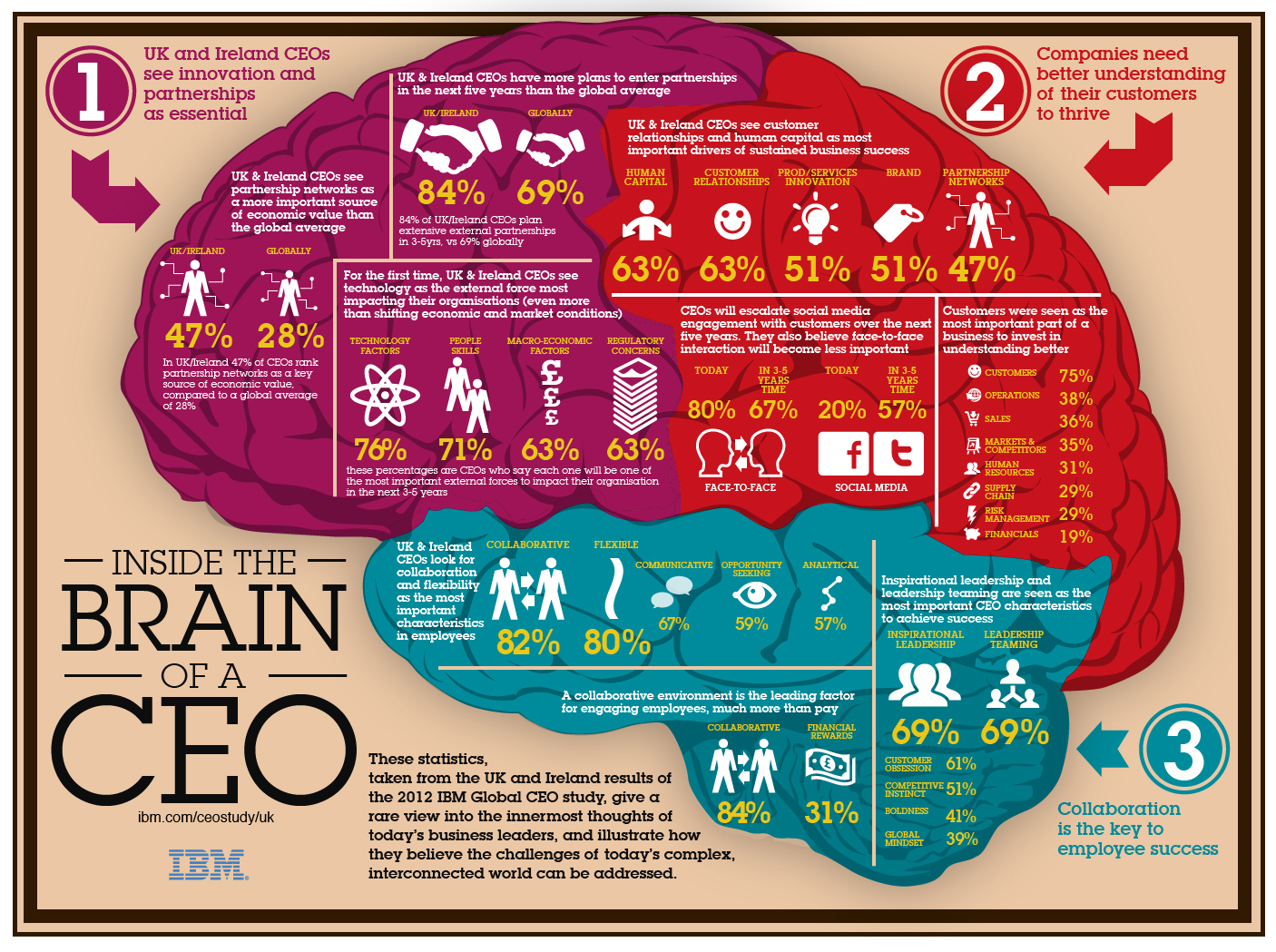
Inside the brain of IBM’s CEO
This infographic of the brain of a CEO was a roaring success for IBM, used in a global B2B campaign for more than a year.
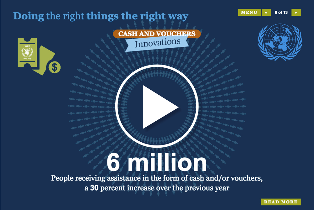
A strategic report for the United Nations
The United Nations’ World Food Programme’s annual report is a chunky read. How to get more people to read it? Furthr took the key elements and built this fun, interactive infographic.
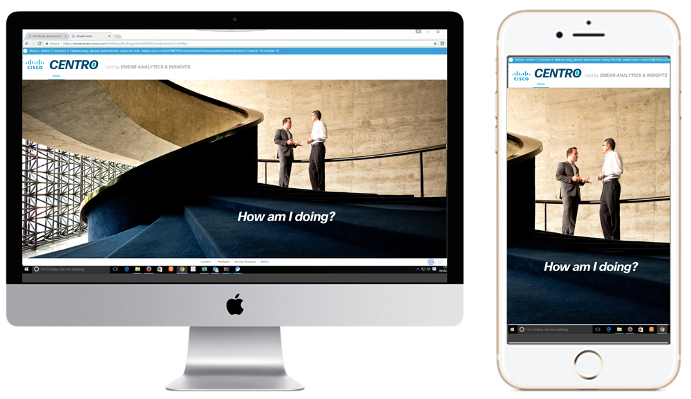
Branding for Centro, the Cisco EMEAR sales data dashboard
The development objective was to increase Cisco sales teams’ usage of Centro, a powerful, real-time data dashboard. Achieving this would improve the allocation of sales resources, align teams to the same data and speed up response times to changing market conditions. It would also reduce the sales team’s addiction to Excell spreadsheets, which are time-consuming to create and out of date just as quickly.
A brand workshop was run in London with all key stakeholders either in the room or teleconferenced from Munich and Milan. The insight from this work was to focus on individual sales’ team members sense of self-worth and accomplishment. We also wanted to suggest they should be looking at the same data sources as their boss…
The Centro logo was created using Cisco’s core content font, but with a target motif to suggest goals being well met. The staircase image invoked a sense of real-time interaction, all underpinned by the key line ‘How am I doing’. Delivery included branding for the EMEAR insights team intranet, a full set of product icons, email newsletter styling and a complete brand design guidelines.
Content strategy, brand identity and design for retail consultants GDR
What’s next for retail. This new strap-line was the key to unlocking a fully realised content solution for the London foresight agency GDR; a simple, yet powerful phrase anyone could understand. Core brand values were established and then set to work across both design and tone of all GDR’s communications. Over six months in 2013, traffic to the GDR website doubled, email newsletter open rates hit 50% and GDR signed new clients including Microsoft and Chanel.