This map shows the world is experiencing an explosion in start ups
March 31, 2014
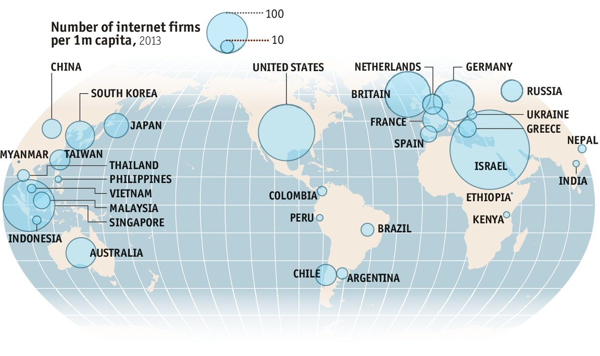
America still has more internet firms than any other country (roughly 60,000), the rest of the world combined now boasts more (about 76,000). And Israel is now the most likely place for people to start a tech firm: the country has an estimated 375 startups per million inhabitants versus nearly 190 in America. Thanks to The Economist.
Posted in: News | Leave a Comment