As scientists at Oxford’s Jenner Institute prepare for mass clinical trials, new tests show their COVID19 vaccine is effective in monkeys

Scientists at Oxford university’s Jenner Institute, have scheduled tests of their new Coronavirus vaccine involving more than 6,000 people by the end of May, hoping to show not only that it is safe, but also that it works.
And recent news suggests that it might.
Scientists at the National Institutes of Health’s Rocky Mountain Laboratory in Montana last month inoculated six rhesus macaque monkeys with single doses of the Oxford vaccine.
The animals were then exposed to heavy quantities of the virus that is causing the pandemic — exposure that had consistently sickened other monkeys in the lab.
But more than 28 days later all six were healthy.
Immunity in monkeys is no guarantee that a vaccine will provide the same degree of protection for humans. But it is encouraging.
The institute’s effort against the coronavirus uses a technology that centres on altering the genetic code of a familiar virus.
A classic vaccine uses a weakened version of a virus to trigger an immune response. But in the technology that the institute is using, a different virus is modified first to neutralize its effects and then to make it mimic the one scientists seek to stop — in this case, the virus that causes Covid-19.
Injected into the body, the harmless impostor can induce the immune system to fight and kill the targeted virus, providing protection.
Donors are currently spending tens of millions of dollars to start the manufacturing process at facilities in Britain and the Netherlands even before the vaccine is proven to work.
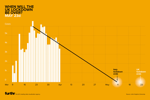
There is talk of one million doses of vaccine ready by September. Most analysts recognize, that measures to open the economy will already need to be underway by then.
As I write this AstraZeneca has just announced it will manufacture Oxford Uni’s vaccine ChAdOx1 nCoV-19.
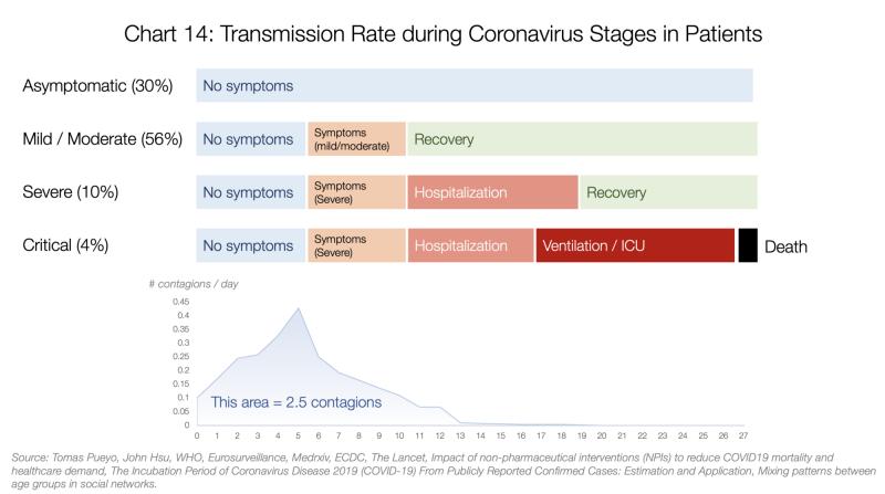
Posted in: Infographic of the day | Leave a Comment