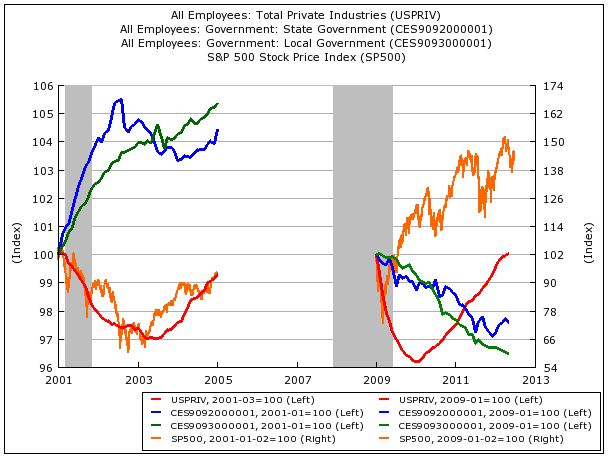
Bush vs Obama: which President did better?


The blue and green lines on this chart from Business Insider show US state and local government employment under Bush and Obama.

As you can see, government employment fell much harder under Obama than it did under Bush.

The red line is private sector employment. Despite the big government socialist stereotype, the private sector is doing better under Obama too.

Finally, the chat shows the performance of the S&P 500 (in orange) during each period.


Posted in: Infographic of the day, News | Leave a Comment
Could app popularity pose a threat to Google?


It’s been a good day for Google.  The company’s shares hit a record high of $749 last night, the end of a powerful rally that has added 30% to the value of Google’s shares since July.

But should investors be less bullish? This chart from Niselsen smartphone Analytics clearly shows that in the exploding market of mobile intrernet, users prefer apps to surfing the web (and using Google to do it.)


Posted in: Infographic of the day, News | Leave a Comment

See QE3 “turning point” for the global economy – on a chart!

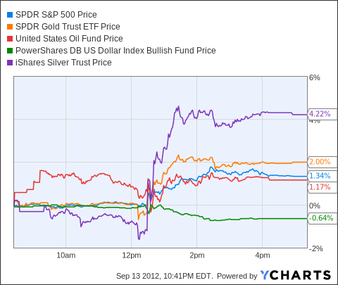
Following the Federal Reserve’s announcement of QE3 on Thursday, as shown on this chart from Seeking Alpha, stocks and commodities surged.

It’s an historic moment, says The Economist:

“Between the ECB’s action last week and the Fed’s today, the world’s two most important central banks are bringing unprecedented resolve to bear on economic growth. The world may one day look back and conclude the first half of September was either a turning point for the global economy, or the final nail in the coffin of the doctrine of central bank omnipotence.”


Posted in: Infographic of the day, News | Leave a Comment