Get 10% off data visualization for data scientists one day course
Take your career up a notch with our new data visualization course.
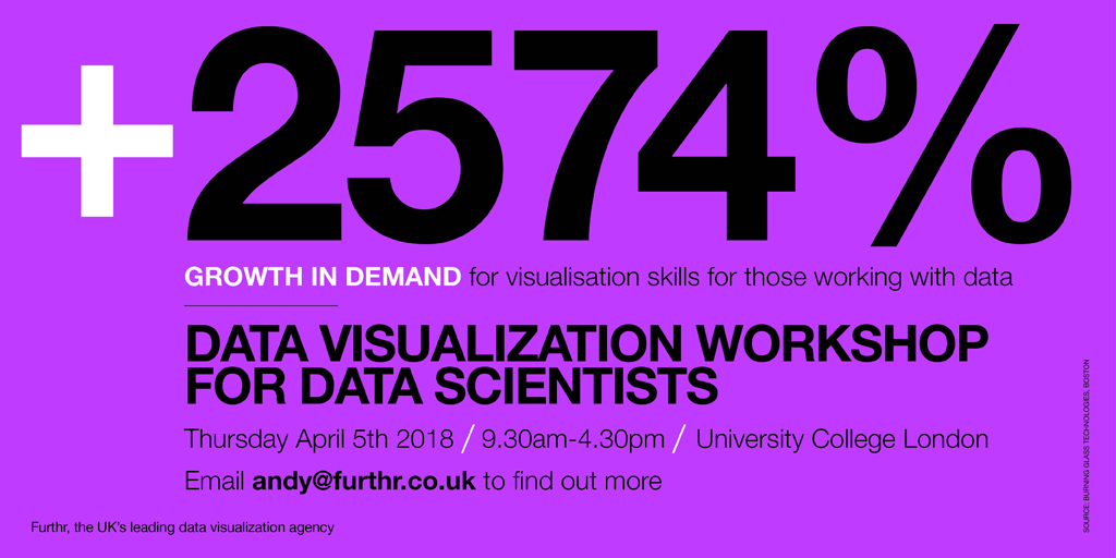
For those working with data, the demand for visualisation skills in the last five years has grown by a startling 2574%, according to Burning Glass Technologies, a Boston-based startup.
Our trainer, Andy Pemberton, trains everyone from the United Nations to the European Central Bank to the European Commission on how to show their data off in the best possible way.
Through a series of discussions and interactive exercises, he’ll help you develop new capabilities and a better approach to data visualisation.
He will show you how to turn raw data into visualisations that are impactful, simple and persuasive. He will also provide you with a set of tools to help you understand your audience, your message and your data, as well as demonstrating which charts work best, how to prep data for visualisation and what data visualisation success looks like.
Join Andy for one intense day that will elevate your reports and decks from good to the best your board have seen.
We’ll meet on April 5 2008 at one of the world’s finest universities, University College London, for an action packed day of principles and practical workshops. We’ve even got a healthy lunch covered – all you have to do is bring yourself, your laptop, and your drive.
Full details are here.
What others have said:
“Thanks for the very informative course yesterday. The phrase ‘no title, no infographic’ is now printed and blue tacked to the cupboard behind my desk.” Nic Benton, ICMM
“A big big thank you for the workshop yesterday –I’m so thrilled I went along, and I’ve already started thinking about how to do what I do better.” Leonie Le Borgne, Action Against Hunger
‘Thanks for the great training. It was really good. I am sure I will now be able to present my plans.’” Christine Bryan, European Central Bank
More comments here.
Posted in: Infographic of the day | Leave a Comment