How to write a rock solid content strategy for any business in three easy steps

How to write a content strategy

It is easy to write a content strategy for any brand, political party or organisation. 

And I mean, embarrassingly easy. It will take you 20 minutes,

All you need are three key pieces of information.  And they are:

  1. Who is the single most important customer?
  2. Who is the single biggest competitor?
  3. What does your brand actually do?

The single most important customer

I have written at length about the critical importance of getting your audience down to one person. But how do you figure out who they are?

This is a tricky question and takes some skill to figure out.  But not much skill. Perhaps you could start by asking yourself, who actually pays the bills? Who is the customer, without whom this entire business or political party will crumble into dust?

Sometimes this is not as obvious as it seems. I work with many B2B  businesses who get confused. They think the person physically paying the bills is the customer. But this may not be the case. Just because a CEO pays your fees does not mean they are the customer for your corporate social responsibility programme. Despite the flashy title, that CEO is often a middle man. The customer is the employee on the receiving end. on one occasion, this person was  described to me by one high up as “Doris on the till.” If Doris does not get it, he implied, you will be out on your ear. Doris is the customer.

A politician’s customer is not her political boss, or the press or civil servants. Voters are her boss. (The question for her is, which voters matter most?)

As you can see, once you know who your single most important customer is, you are up and running, Now you can deep dive into their brain and see how they feel about your product, service, organisation or party. You can ask them directly. I regularly interview client’s customers on their behalf. It is always illuminating.

With a clear view on the customer, content becomes easy. Do the things she likes. Avoid the things she doesn’t like.

Who is your single biggest competitor?

Research firm Gartner have made millions explaining the competitive landscape to brands. Of course, rather than explaining it, they make it seem fiendishly complicated. If it’s complicated, you need Gartner.

It is true that the competitive landscape can be complex. It can be hard to wrap your mind around it.

It’s far easier to think about your single biggest competitor. Who is the brand or rival who keeps you up at night? You should not have to think about this too hard. Their name should trip off your tongue as they are the ones making your professional life a misery.

Once you have your fiercest rival in view you are ready for point three.

What does your brand actually do?

This is a deceptively complex question, but whatever the reality, you need a simple answer.

The answer must be simple because you need your single most valuable customer to easily understand it.

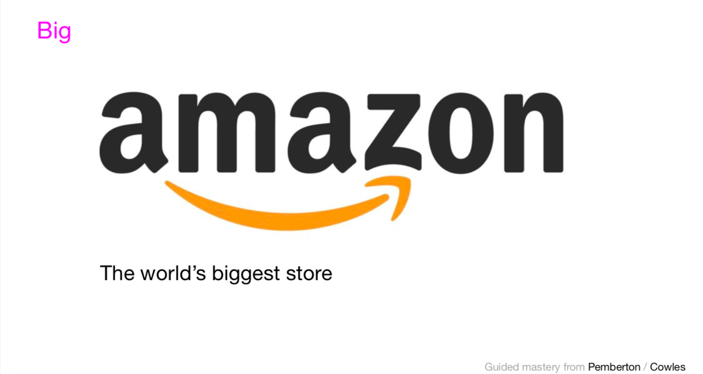
Amazon is the world’s biggest store. The RNLI saves lives at sea. Google organises the world’s information.

If you do not know what your firm does, type their name into Google. When their name comes up on the search engine results page, the line under the company name should explain what your firm does.

If that line sounds a lot like your fiercest rival, you have a problem. Your customer will not be able to tell the difference. You will have to change that line.

Otherwize you are in good shape. Now you should have a clear view on your single most important customer (name her!).  You should know your biggest rival. (Make sure you are distinct from them). And finally a simple and clear explanation of what it is your company does.

Headlines, headlines, headlines

Now start making content. How often should you make content? What kind of content should you make? How long or short should it be?  Should I make video? Infographics? What about White Papers? Should I be on Tik Tok?

The answer  to all these questions and more is always the same: ask your single most significant customer. If they like it, do it. If they don’t, don’t.  Twelve year olds aren’t on LinkedIn. CEO’s don’t go on Tik Tok.  You get the idea.

So that was the easy bit. Now comes the hard part. The place where your strategy comes alive, where it gets real, is the headlines to your stories.

Anyone who is ever going to engage with anything you do ever, will read the headline first. Whatever picture you use, what video you make, where that content lives is all led by the headline. So, when you come to make content there are three things to focus on: Headlines, headlines and headlines.

So here is my advice: put all your efforts into crafting headlines that engage your core customer. If you can do that, the content world is yours.

Thanks to Andy Cowles for brilliant design work here.

Related stories

Effective content is easy if you use this one secret technique favoured by experts

The simple secret of redesigning websites? Headlines are EVERYTHING

Everything you need to know about advertising on one slide ANNOTATED

About the author

My name is Andy Pemberton. I am an expert in data visualization. I guide global clients such as Lombard Odier, the European Commission and Cisco on the best way to use data visualization and then produce it for them: reports, infographics and motion graphics. If you need your data visualized contact me at andy@furthr.co.uk or call 07963 020 103

Posted in: Infographic of the day | Leave a Comment

Effective content is easy if you use this one secret technique favoured by experts

Making effective content is easy.

Devising a workable content strategy is simple.

Creating impactful comms is a cakewalk.

All you have to do is use one simple strategy used by experts.

It’s this: get your audience down to one person. Once you have done that you are all set.

Get your audience down to one person

It feels counter intuitive. That is until you actually stop and think hard about it. And then you realize doing anything else is impossible.

We know that emotions drive behaviour. This is not an opinion. It is a recorded scientific fact. Therefore if we want to engage anyone and get them to take any kind of action, we must appeal to their emotions before we do anything else.

But what if we want ten million people to vote for us? What can we say or write that will win over the hearts of ten million people?

Sit at your computer and try to imagine ten million people. You can’t, can you? What about one million? Forty thousand? Do you even know what 300 people look like?

Crafting messages to trigger the emotions of lots of people isn’t just hard, it is impossible. How can we make it more manageable?

Marketers will try to create “personas” of six potential customers to simplify their messaging strategy. What is so special about six? Nothing. There is no logic to this at all. Why not 66? It makes no earthly sense.

So what do you do? You get your entire audience down to one person. Let’s try it.

Workington Man

You are Boris Johnson. It is the 2019 UK general election. A large part of the electorate has already decided they will vote Labour. Another segment will vote conservative. There is absolutely no point creating a comms strategy aimed at either group. They have already decided who they will vote for.

Better to target the undecided. The floating voters. It makes sense to aim all your emotive messages at them. If they vote for you, after all, you will be prime minister.

In the 2019 election, these floaters were ex Labour voters who backed Brexit. Research suggested they’d be willing to vote for the Conservatives under Brexit-winning Johnson. But as a group they still seem is a bit too abstract. If we want to  start crafting emotionally resonant messages for this group we need to make them feel real.

Conservative strategists settled on one person: Workington Man. He was male, 57, loved rugby league, drank beer and wanted to “Get Brexit Done.”  If Boris Johnson’s messages did not resonate with this one man, then he would not win the election. But if Workington Man liked what he heard, Johnson was going to win.

The reason this strategy works is complex. Successful messaging must be strong and clear. If it is targeted at the most valuable member of your audience or customer base only, it will be clear. And they will love it.

Then, something strange happens. Others around this group start to like what they hear too. We do not need them to love it, just to like it.  They vote too.

It sounds counter-intuitive, but the way to win over a crowd is to appeal to the most valuable member first. Your messaging will be tight, focussed and effective, and those around that individual will be drawn in.

It’s a strategy that works. Just ask soccer moms, Mondeo Man, Harlow Man, the list goes on.

Effective comms

Now think  about the reverse case. If you write for thousands, you will freeze at the keyboard. Who can possibly guess what motivates such a large crowd?  Your messaging will be bland, distant and dull. You will lose.

This is the way content works. Next time you have to write an article, think about who it is for. Get that down to one person. Now write as if you are writing to them.

The effectiveness of your comms will go through the roof, I guarantee it. But you do not need my guarantee. If you think about it hard enough, you will see there is simply no other way to do it.

Now you hold the secret of content in your hands. Use it wisely.

Related stories

Try this sniff test to see if your business stands out

Business intelligence tools give your business a competitive advantage

6 undeniable reasons why Power BI is a good skill to have for any marketer

Everything you need to know about advertising on one annotated slide

About the author

My name is Andy Pemberton. I am an expert in data visualization. I guide global clients such as Lombard Odier, the European Commission and Cisco on the best way to use data visualization and then produce it for them: reports, infographics and motion graphics. If you need your data visualized contact me at andy@furthr.co.uk or call 07963 020 103

Posted in: Infographic of the day | Leave a Comment

Uses of motion graphics: 5 ways to make your online presence memorable


Motion graphics are a great way to make your online presence memorable. Whether you’re hiring new employees or selling products, they make a big impact.

People are hard-wired to pay attention to things that move. So if your message is dynamic, engagement will go up. This is not an opinion. Studies have shown this to be true time and again. And we have found it to be true at Furthr too. 

What’s more, video continues to dominate the internet. The numbers can be staggering.

500 million people watch Facebook videos every single day. Youtube users upload 300 hours of video  to the platform every single minute. An incredible 93% of businesses get new customers as a result of video content.

People spend an average of 6 hours and 48 minutes  watching online videos every week. No wonder advertisers use motion graphics for campaigns. Designers use motion graphics to make content. for the same reason. It was what people love to watch.

What are the benefits of using motion graphics?

Motion graphics are great for highlighting key messages and breaking down complex arguments.

Visual cues and colours engage the viewer to take in what they’re hearing. When used right, motion graphics bring out the key points of an article or sales pitch in a memorable way .

By creating many videos, you can also enhance your brand and create a unified look. This is useful if you have many people pitching ideas on different projects. Having one unified look makes them more cohesive as well as engaging.

What are different types of motion graphics?

Draw on a whiteboard  with the traditional whiteboard marker pens. Now imagine if your drawing started moving around of its own accord. That is whiteboard animation.

The idea is to help your audience understand what your company does.

Creating an engaging, light-hearted story makes your business stand out. It also makes it easy to understand.

Whiteboard animation is simple, clear and concise. It lends itself to social media advertising campaigns. Whiteboard animation is easy to share.

There is a downside. It can be time-consuming as there are no templates available. Each video must be hand-tooled for your business and its customers.

 CBS Evening News used whiteboard animation. The news network were trying to explain how  super-delegates operated when they attended the Republican Party  conventions. It was a rather “dry” subject. It could easily lose their audience. CBS believed  whiteboard animation could make the issue seem more interesting It could make it more digestible too.

By making the super-delegates resemble wizards, CBS News hoped their audience would grasp their role. Some viewers found the animations embarrassingly child-like.  They thought CBS were “dumbing it down.” But other viewers found it a useful way to  understand the issue.

2D animation is what you would see in what you’d call traditional animation. There’s rich vibrant colours and the characters are what many people consider to be ‘cartoon like’.

2d animation gives what you’re trying to show your audience  more depth, colour and movement. It is a richer experience.

Examples of this include graphics parallax scrolling backgrounds. They add extra interest to what your business does.

This type of motion graphic is good for adding interest when you are explaining what you do.

Furthr made this 2D motion graphic animation for Brouns &Co

If you just talk through what you are doing, interest can wane. This is sometimes called chalk and talk.” Motion graphics is make the story more exciting. They are a great way to create impact in advertising. It can look stunning. Awesome Inc are a great agency with a long suit in 2d animation.

3D animation is what people think of when they hear the words ‘computer generated’.

This type of motion graphic is what you would use to create a Hollywood movie or other high budget film.

After Effects is the software package you can use to make 3D motion graphics. They do a great job of helping make what you do look realistic on screen.

Capacity Studios love using 3D modelling when they make animations for computer games.. That is what they have deployed in this 3D video for Lamborghini. The  fast cuts between a multitude of camera angles makes your heart  race with excitement.

Video production is live-action video. It features people instead of drawings or animated characters. There’s nothing drawn or animated in the background.

Video production can be  inexpensive compared with Motion Graphics. It doesn’t need highly paid animators or clever 3D artists. You can shoot everything live. It doesn’t need as much post-production editing either. This can bring down the cost.

In this skateboarding video, director David Holm uses his skills as an animator. But instead of using cartoons, he films live action sequences. Each sequence has many different angles, fast cuts and shows the eye of a graphic artist. It could be motion graphics. But it isn’t.

What are the elements of good motion graphic design?

The number one ingredient for good motion graphic design is feeling.

The best motion graphics convey human emotion. It could be surprise, love, hate, anger or anything else. Without emotion there is no communication.

The vehicle for conveying emotion is stories. Storytelling can be a confusing term but actually it means something very simple. Storytelling follows a structure hard-wired into the human brain. That structure is The Hero’s Journey.

The topic of the Hero’s Journey is a post in itself. You can look it up online. All the stories that mean something to humans follow this rigid structure. The best motion graphics – those that engage our emotions – follow this structure too.

 5 ways you can use motion graphic videos to engage an online audience.

1.  Social media videos

These can be a great way to drive viewers to engage with your company on social media. People love receiving rewards for engaging with companies. Why not create a quick video in response to their post/question/comment?

2. Product explainers and tutorials

People like learning new things. Tutorials are an ideal way to get people interested in your product or service. You can then use that interest to lead into sales or other uses for the product.

3. Customer testimonials

To build trust in your brand you need to put your customers front-and-centre. Spice up video testimonials by highlighting the key words and messages used.

4. Event and webinar invitations

Draw attention to important events by creating motion graphics to advertise them.

5.  Logo animation

Bored of using the same email signature? Make yours stand out by creating an exciting logo animation with motion graphics.

These are 5 different uses of motion graphics to make your business stand out online

You can use motion graphics for marketing to product explainers and tutorials. Using them will engage your audience and establish a cohesive brand. That will make it easy for viewers to remember you in future.

Related stories

Try this sniff test to see if your business stands out

Business intelligence tools give your business a competitive advantage

6 undeniable reasons why Power BI is a good skill to have for any marketer

Everything you need to know about advertising on one annotated slide

About the author

My name is Andy Pemberton. I am an expert in data visualization. I guide global clients such as Lombard Odier, the European Commission and Cisco on the best way to use data visualization and then produce it for them: reports, infographics and motion graphics. If you need your data visualized contact me at andy@furthr.co.uk or call 07963 020 103

Posted in: Infographic of the day | Leave a Comment

Business intelligence tools give your business a competitive advantage

The ability to use data and information to make good decisions is invaluable. That’s why it’s so important for businesses to choose the right tools. That is the only way to get the insight they need.

This blog post will explore the main benefits of business intelligence tools. It will show you how they will help your business grow in 2022.

But business intelligence is not just about using tools to collect data about your business. It is also about using that data as the basis for decisions. If we ground our decisions in good data we will make good decisions. And the secret to running a successful business is to make more good decisions than bad decisions.

What is business intelligence?

Business intelligence describes strategies and technologies used by firms to analyze business data. BI technologies provide a view of the past, the present and even the future. It can sometimes predict business operations

What is an example of a business intelligence tool?

The market for data visualization software and Business Intelligence tools is busy. No players are popping up everywhere. Microsoft Power BI and Tableau are the biggest players.

Power BI is one of the most powerful tools that you can have in your marketing toolkit.

Power BI is Microsoft’s data visualization tool. It creates interactive visualizations and business intelligence. Its’ interface is simple enough for end users to create their own reports and dashboards. It is part of the Microsoft Power Platform

Power BI includes data preparation and visual-based data discovery. It features interactive dashboards and augmented analytics. It is software that runs on Azure. If you prefer you can run it  as an on-premises option in Power BI Report Server.

Power Bi is big. Very big. 1.2 billion people worldwide use Microsoft Office product or service. There are 60 million monthly active Office 365 commercial customers. 50,000 small business customers get Office 365 each month. Power BI is included in Office 365 E5. This means that Power BI sells itself.  Millions of other users of other Microsoft office products receive prompts from Power BI. They are nudged to “visualize in Power BI.” That means that everyone who uses Microsoft Office can see Power BI. And that is a lot of people. Microsoft Power BI is not going away anytime soon.

Tableau is Power BI’s main competitor. It is easier to use than PowerBI. And it offers marketers a more powerful insight into customer behaviour than they might have ever seen before..

It means business users can access, prepare, analyze and present their data. Tableau uses visualization to show your data to the world. It gives your data meaning. It also makes it impactful and persuasive. That is why marketeers love Tableau so much.

Tableau is very popular with its users. Customers show a fanlike attitude toward Tableau. An incredible 20,000 users attended its 2019 annual user conference. These users are strong champions for Tableau.

The are more business intelligence tools beyond Tableau and Microsoft’s Power BI. They include XL charts, Datapine, yellowfin BI. The list goes on and on.

Why do you need a business intelligence tool?

Data discovery was once the province of advanced analytics specialists. But now is something almost anyone can do using tools like those listed above.

These tools will give anyone insights you need to achieve business growth. It will collect all your data in one place. It will help you identify and resolve urgent issues. You will be able to forecast future outcomes and track past mistakes. It will identify trends that you would otherwize have no idea about.

How exactly does business intelligence improve efficiency?

Business intelligence improves decision making. It makes it faster and easier. That means you can deploy your workforce or resources without hesitation. You will be able to analyze your business processes and boost efficiency.

The main advantages of using a business intelligence tool in your company:

Accurate data analysis

A business intelligence tool means your employees can up to date use data. With accurate data you make better decisions using the results of analysis. And that does not mean only analyzing past data. Predictive analytics means you can predict future events based on detailed research.

 New insights for better business growth

Business Intelligence means you can discover your company’s hidden treasure. You will locate areas with potential for growth. PowerBI will help you anticipated market changes. That means you will come up with effective strategies before it’s too late.

Alerts for real-time data means faster decision making

One of the advantages of an enterprise business intelligence tool is alerts. They let you receive alerts every time your data changes fast. This allows you to make better business. You can react fast or and find out what led to those changes – immediately after they happened.

Improve customer satisfaction

An advantage of an enterprise business intelligence tool is tracking customers. You will be able to see how they are reacting to certain services or products. You will see what customers think about their experiences. That will help you make better decisions . Especially when it comes to designing new product packages or running events.

By watching customer data, you can make sure your product aligns with their needs and wants.

Engage employees by removing data entry

Employees that use spreadsheets waste a lot of time inputting data. A lot of advantages come with enterprise business intelligence tools. They mean employees access information fast. So they can improve their productivity by having more time for other important tasks.

Help cut costs

Good business intelligence software helps you keep an eye on cash flow. That helps you reduce costs. Insight into how your company is performing will help you see where you can make cuts. You will be able to keep a close eye on the money earmarked for future growth.

Consider the advantages a business intelligence tool could bring to your business. If you think it can help – and it can – then get to it.

But remember, collecting data is only half the story. It is also necessary to use it. You need to make data and Business Intelligence a focal point of your team’s strategic thinking. You must ensure that you use it to craft smart business policies.

The advantage of enterprise business intelligence is clear. It helps you make more good decisions. And less bad ones,.

Over the long haul, that will safeguard your company from unnecessary failure.

More than that, you will be able to get an edge on business rivals.

Related stories

Try this sniff test to see if your business stands out

Business intelligence tools give your business a competitive advantage

6 undeniable reasons why Power BI is a good skill to have for any marketer

Everything you need to know about advertising on one annotated slide

About the author

My name is Andy Pemberton. I am an expert in data visualization. I guide global clients such as Lombard Odier, the European Commission and Cisco on the best way to use data visualization and then produce it for them: reports, infographics and motion graphics. If you need your data visualized contact me at andy@furthr.co.uk or call 07963 020 103

Posted in: Infographic of the day | Leave a Comment

The simple secret of redesigning websites? Headlines are EVERYTHING

I have worked in content for my entire adult life. And I have found one thing to be true.

Headlines are everything. Everything.

Let me give you an example. Right now, I am working on the redesign of a financial website. The client would like the website to appeal to a younger demographic

There are many ways to effect this change. First you identify which sector of the audience you cannot live without. In this case, it is graduates who have a background in tech.

Safe, Exciting or Superior

Next, you could figure out how they want to feel when they visit the site. That sounds like a broad question. But in reality there are only three fundamental options. They can feel safe, excited or superior. We could call these the Volvo, BMW or Mercedes Benz options.

It does not take a genius to see that graduates would rather drive an exciting BMW than a safe Volvo.

(Fun game: which of these three values does the brand you work for represent?)

So we start to turn the fonts, colours, photos and sitemap to appeal to these tech graduates. (Of course we also do not want to lose the existing audience.)

(The font that represents “Excitement” is sans serif? “Superior” is serif. And “Safe” – think NHS – is slab, a mixture of the two).

We can add the right colour, the right images all to boost excitement on the site.

But whatever we do, it has to work on mobile. That means this design work must fit into an oblong about three inches by six.

As I am sure you are aware, over time, websites have begun to conform to a series of best practice frameworks. The logo goes top left, the line under the logo goes beneath it. There is a nav bar.

Once you have obeyed the rules of best practice there is really no other design work to do that is going to make a difference on mobile. It’s just headline image text from here on in. Your hands are tied.

There is only one dynamic element that will truly make a difference.

The way you write the headlines.

Everyone reads the headline

Everyone reads the headlines.

Almost everything else on your average website is static. The about page rarely changes. The homepage is always the same. The only bit that moves is the content. Humans are hard-wired to look at the bit that moves.

Eye-tracking surveys reveal that we all look at the headline first. And here is the important bit: it does not matter what we are reading

When you read this article, you read the headline first. When you look at data visualizations you read the headline first. Then you scan the visualization to see if it supports whatever you read in the headline.

Most recruitment consultants will tell you to write a headline on your CV. (Mine says “Creating content that attracts new customers”). The rest of the CV is evidence that supports the headline.

Next time you give a PowerPoint presentation take a look around the room. You will notice that everyone is paying attention at the start of your talk. How long before they start to switch off? A generous assessment might say ten minutes. Two minutes is likely closer to the truth. That’s two slides. That’s why we put the best thing we have got on the opening slide. AKA the headline.

In the days of print, the headline came first and the image a close second. The picture reflected the headline. if a man catches a fish,  man and said fish go in the photo.

But digital has cut off the relationship between headline and image. Sometimes headlines will be all you see of a story before you click on it. That’s why headlines rule the digital world.

The body of the article merely stands up the headline. And reading rates drop off fast. Sixty percent get a third of the way down. Ten per cent read to the end.

Everything else is supporting cast

Do you remember anything about the Tory party conference?  The one held in Manchester before the 2019 election? Nothing? How about the headline “Get Brexit Done”?

Content is the headline and headlines are the content. Everything else is supporting cast.

So how does this look in the real world? Take a look at these two headlines, both taken from the same website.

  • As a 22 year-old at JPMorgan I earned $155k & life was not bad
  • The art of leaving an investment bank in Hong Kong

Both these headlines come from the same site. One of these is the most popular headline on the site. The other is not. One is emotional, vivid and aimed at younger people. The other is not.

Emotional and vivid

Now imagine taking the tone of one of these headlines and driving it through every story on the website.  The rest of the site could be completely unchanged – same fonts, colours and sitemap. But by tweaking the headlines,  you will have altered the character and appeal of that website forever.

No other piece of content has the power to change our perceptions . No other single piece of content can set the agenda. No other piece of content can change the level and nature of our engagement.

And to be frank, we can’t remember any other piece of content anyway.

Whether the medium is video, live events, website or data visualization. No other single force has the power to change the game. Instantly.

Headlines are everything.

It’s that simple. That is the game.


Related stories

Effective content is easy if you use this one secret technique favoured by experts

The simple secret of redesigning websites? Headlines are EVERYTHING

Everything you need to know about advertising on one slide ANNOTATED

About the author

My name is Andy Pemberton. I am an expert in data visualization. I guide global clients such as Lombard Odier, the European Commission and Cisco on the best way to use data visualization and then produce it for them: reports, infographics and motion graphics. If you need your data visualized contact me at andy@furthr.co.uk or call 07963 020 103

Posted in: Uncategorized | Leave a Comment

7 simple data visualization techniques to win more business today

7 data visualization techniques to win new customers

When you’re selling your product, each touch-point with your prospect must be engaging.

The last thing you want is for your prospects to not understand what they’re buying and choose a competitor.

Data visualization can help clarify things. It can make your sales materials stand out from the crowd.

Data visualization makes it easier for people to understand the differences between products. It can explain how each option will work for them.

In this blog post, we’ll share 7 simple data visualization techniques. They will transform your sales materials. They will make it easy for your prospects to choose your company.

Why is data visualization important for presentations?

Let’s start with the basics. Data visualization is important because data is important. And data is everywhere.

There is no sector in which data is  unimportant.

If data isn’t present in sales materials, you’re missing out on an opportunity. Data helps your prospects make their decision.

Above all data visualization is a reassurance tool. It is best used towards the end of the sales funnel, before conversion. Data visualization provides proof the customer’s decision to buy  is the right one.

Customers will take a look at the data just before they decide to buy. If the data is right, they will go ahead with the sale. That is why data visualization is so important in sales.

Data visualization  closes the sale.

What data should you visualize?

If data isn’t represented in a way that makes sense, customers won’t care about it. You don’t want your data visualization to be boring or hard to understand.

Data can be used in sales. It can be used in other places.

Data from data visualization can be a starting point for future product iterations. It can keep track of performance over time.  Data can predict trends and is useful for internal use to understand what is important to the market.

What data should I visualize in my sales materials?

You should visualize data about your product in your sales materials. You can include data about your company.  You can also feature data highlighting trends in your industry. You can include any data that your prospect will care about.

But the most effective data visualizations show the benefit of the product or service.

There are a million ways to visualize data and every situation is different, but here is an example.

Imagine you were considering sending your child to a school. You’d start looking at local schools in your area. You would tour them. The school may allow you to chat to a pupil that takes you and your partner around. You can speak to the head teacher.

Towards the end of this process you will study the schools’ results in detail. What A’ level results did pupils who attend the school get? What about GCSE’s?

This data is shown in graphs.  Want to know how how the school has performed over a period of years?  A line graph could be helpful.. If you want to know the percentage of students who got top grades at GCSE the school may use a pie chart. If the data is strong, and all other factors are equal, you will choose the school.

That is one way you can use data visualization to reassure customers – or in this case parents . With data visualziation, they are sure they are making the right choice.

Here are 7 data visualization techniques. You can use to upgrade your sales materials today

1) Bar charts

Bar charts are a popular data visualization to use for presentations. They are simple and effective. Everyone understands them. It is wise to never underestimate simplicity.  You can compare data from different categories or from the same category with ease.

A bar chart is great for data comparison. Does your company makes several products? Data about each product must be part of the data visualization.

A bar chart is great for showing growth or quantity. This stacked bar chart shows almost every career in the US and how much you can earn doing it. You can understand it without thinking. The reason it is is deliberate. It shows you what inequality – the different earnings between careers – looks like.

2) Line charts

Power BI is one of the most powerful skills that you can have in your marketing toolkit.

One man made billions from monetizing line charts. He is Michael Bloomberg. He popularized the Bloomberg terminal. Stockbrokers use it. It shows the price of a stock over time, depicted as a line graph. Line charts are great for data that has a natural order.

A line chart is helpful when you want to show the data over time,.  You can use it to show how much your company is growing in comparison with its competitors.

Recently line graphs have hit the news. The have showed us the progress of Covid-19 infections in different countries.  

3) Pie charts

We all know pie charts from school. Pie charts are great for showing percentages or how a market divides.

It is always advisable to use charts that everyone understands. A Sankey diagram may look exciting. But it is possible that many of your readers will not understand how to read it.

Pie charts are a data visualization technique that everyone can understand.

4) Treemaps

Treemaps are data visualization charts that use the size of data to tell a story. They help your prospects understand data spread out over many categories fast. Treemaps break everything down into manageable, bite-sized chunks.

5) Wordcloud

Wordcloud data visualizations are great for data that’s not quantitative. The data may be qualitative. They could use text data about your prospects or their opinions on different topics.  Or, the data may be words in general, such as data about the products you offer or company data.

6) Heatmaps

heatmpas are a great data visualization technnique

Heatmaps use different colours to represent different values.  They’re helpful to visualise intensity.

Heatmaps make intuitive sense. It is no surprise data scientists use them much. Governments have used Heatmaps to tell the story of the spread of Covid 19.

7) Correlation Indices

Correlation data visualizations represent data in a coloured grid.  Data scientists split the data  into different categories. They assign a  colour to each category, such as data about your company.

They fill the grid with dots that show the correlation in the data.. The data is from different categories. Or the data is identical across all categories.

Learn these seven data visualization techniques. They will ensure you improve your sales materials . They will help your company stand out from the competition.

Related stories

Try this sniff test to see if your business stands out

Business intelligence tools give your business a competitive advantage

6 undeniable reasons why Power BI is a good skill to have for any marketer

Everything you need to know about advertising on one annotated slide

About the author

My name is Andy Pemberton. I am an expert in data visualization. I guide global clients such as Lombard Odier, the European Commission and Cisco on the best way to use data visualization and then produce it for them: reports, infographics and motion graphics. If you need your data visualized contact me at andy@furthr.co.uk or call 07963 020 103

Posted in: Infographic of the day | Leave a Comment

What is motion graphics? Exploring 4 types you should know about

What is motion graphics?Motion graphics is a visual language. It uses individual images, text, and video to create animated sequences.

It’s been around since the 1970s but has exploded in popularity in recent years. Modern technology has made it easier for people to produce. More distribution means more people can find it. The appetite for content is global. Motion graphics are easy to understand no matter what language you speak.

If you combine motion design with graphic design you get motion graphics.

What is the difference between animation and motion graphics?

Motion graphics are a type of animation. Animation is an umbrella term for the whole field of moving imagery. Motion graphics describes moving or animated graphic design. It includes everything from cartoons to claymation. In motion graphics there are few limitations. If it can be done in a computer, it can be done in motion graphics. The only real limitation is your imagination.

Why are motion graphics important? Why should marketers care?

Motion graphics have become an important aspect of a marketers armoury. If you convey information through animation it is engaging. It is easier to consume than written content. Animations can help companies explain what the company does. It can explain what makes the product or service different. It can show what data you have to back up what you do. Motion graphics are succinct and entertaining. They can be understood by everyone.

You can use motion graphics in movie clips, trailers, commercials, title sequences.

Emotive videos move the audience to feel something. The primary aim of these videos is to elicit a powerful, emotional response from the viewer. As we know, emotion drives behaviour.  If you want your adience to take an action, engaging their emotions is the best way to do it.

Explainer videos help define a concept, product or service. Promotional videos sell a product, service or event.

Relevance to your target audience is crucial.

There are 4 types of motion graphics used by businesses. All have their own pros and cons. These are: whiteboard animation, 2D animation, 3D animation and video production.

1. Whiteboard Animation

Take a classic whiteboard and draw on it with the traditional whiteboard marker pens. But this isn’t school. This is whiteboard animation. It is a thing.

The idea is to help your audience understand what your company does. Creating an engaging, light hearted story makes your business stand out. It also makes them easy to understand.

Whiteboard animation is simple, clear and concise. It lends itself to social media advertising campaigns. Whiteboard animation is easy to share.

There is a downside. It can be time-consuming as there are no templates available. Each video must be hand-tooled for your business and its customers.

Here is a great example. CBS Evening News with Katie Couric used whiteboard animation. They wanted to show how super-delegates work at a political convention. They used whiteboard animation because they were exploring a complex issue. The issue did not lend itself to more conventional story-telling techniques.

By making the super delegates seem like wizards, CBS News hoped their audience could grasp their role at a convention. Some found the animations child-like.  But others got the point.

2.  2D Animation

2D animation is what you would see in what you’d call traditional animation. There’s rich vibrant colours and the characters are what many people consider to be ‘cartoon like’.

This allows what you’re trying to show your audience to have more depth, colour, movement.

Examples of this include pop up graphics layered over what the story. Parallax scrolling backgrounds add extra interest to what your business does.

Furthr made this motion graphics video for Kinetic Thinking

This type of motion graphic is good for adding interest to explain what you do. It is more appealing than talking through what you’re doing.

This style of motion graphics is a great way to create impact in advertising. It can look stunning.

Awesome Inc are a great agency with a long suit in 2d animation. Awesome Inc say there has never been a better time to be in media.

The appetite for content is insatiable, they say. Supply has difficulty keeping up with demand.

There is a greater focus on diverse voices. Which motion graphics is great at exploring.

3. 3D Animation

3D animation is what people think of when they hear the words ‘computer generated’.

This type of motion graphic is what you would use to create a Hollywood movie or other high budget film.

You can create 3D models within software like Cinema 4d and After Effects. They make what you do look more realistic on screen.

You could use 3D models to show how your business models work. Pieces of your company would move around and come back together again. Between each action, the model would show what the that part fo the business does.

Capacity Studios use 3D modelling in this 3D video for Lamborghini. The range of camera angles and fast cuts create excitement. It is perfect for a computer game.

4. Video Production

Video production describes a live-action setting. It’s where people come into play instead of drawings or animated characters. There’s nothing drawn or animated in the background.

Video production is cheap compared with Motion Graphics. It doesn’t need animators or 3D artists. You can shoot everything live. That means it doesn’t need as much post-production editing either.

In this skateboarding video, director David Holm uses his skills as an animator. But instead of using cartoons, he films live action sequences. Each sequence has many different angles, fast cuts and shows the eye of a graphic artist. It could be motion graphics. But it isn’t.

The answer to the question What is motion graphics? is broad. But it is a question worth asking. Motion graphics is booming. For each new designer that joins the workforce, there are as many new projects. Digital media has opened more distribution options than ever before.

When live action is not an option motion graphics is seen as the answer.

But as these examples show, the best work involves taking risks.

But with motion graphics there are few limitations. And once you get outside your comfort zone, your motion graphics will have impact.

Whether it is whiteboard animation, 2D animation, 3D animation or video production, motion graphics are an engaging way to get your point across.

Related stories

Try this sniff test to see if your business stands out

Business intelligence tools give your business a competitive advantage

6 undeniable reasons why Power BI is a good skill to have for any marketer

Everything you need to know about advertising on one annotated slide

About the author

My name is Andy Pemberton. I am an expert in data visualization. I guide global clients such as Lombard Odier, the European Commission and Cisco on the best way to use data visualization and then produce it for them: reports, infographics and motion graphics. If you need your data visualized contact me at andy@furthr.co.uk or call 07963 020 103

Posted in: Uncategorized | Leave a Comment

6 undeniable reasons why Power BI is a good skill to have for any marketer

Power BI is one of the most powerful skills that you can have in your marketing toolkit.

Power BI is one of the most powerful skills that you can have in your marketing toolkit.

Power BI is Microsoft’s data visualization tool. It creates interactive visualizations and business intelligence. Its’ interface is simple enough for end users to create their own reports and dashboards. It is part of the Microsoft Power Platform

Power BI includes data preparation and visual-based data discovery. It features interactive dashboards and augmented analytics. It is software that runs on the Azure cloud or as an on-premises option in Power BI Report Server.

The market for data visualization software and Business Intelligence tools is busy. Power BI and Tableau are the biggest players.

Power Bi is big. 1.2 billion people worldwide use  Microsoft Office product or service. There are 60 million monthly active Office 365 commercial customers. 50,000 small business customers get Office 365 each month. Users get Power BI included in Office 365 E5. This means that Power BI  is “self-seeding.” Users of other Microsoft office products receive prompts to “visualize in Power BI.” This means that everyone who uses Microsoft Office can see Power BI.

Power BI has not always been so successful. From its launch in 2013, it was a follower product.

It had to be “good enough” to justify its price of $10 a month per user.

Today, that is no longer the case. The Power BI Pro cloud service overtook its competitors in 2019.  It included innovative features such as augmented analytics and machine language.  AI-powered services such as text and sentiment analysis, are available within Power BI.

Microsoft is always investing in new capabilities and integrating them with Power BI.

The vast majority of Microsoft’s customers recommend Power BI without qualification.

There is only one area where Power BI loses out to its chief opposition Tableau.

Power BI offers a wide range of data connectors. But feedback from users says it does not connect to systems like rival  Tableau. Customers choose to load data into Power BI instead.

Yet Power BI remains one of the most powerful skills that you can have in your marketing toolkit.  Here is why it is  powerful, and what value it can bring to your business.

1. It is important for marketers to be up-to-date with data and trends in their industry

As a marketer, it is important to stay up to date on the latest changes within your industry.  Power BI is one of the best ways to do this in a visual and easy way. It is simple to set up. And Power BI doesn’t need users to write SQL code.

Power BI can connect your Power BI account to all kinds of other sources.  You can connect Google Analytics, Mailchimp and Facebook Ads Manager to Power BI.

Power BI allows marketers to compare marketing metrics from different sources. That removes the possibilities of having false positives from your data.

Every week, Microsoft releases an update to its cloud service. It has added hundreds of features in 2019.  Decomposition tree visuals, LinkedIn data connectivity and geographic mapping have all been added recently. Users can expect many more additions.

Microsoft want to beat their rivals and win the battle for  data visualization. And they have the resources to succeed.

2. You can gain powerful insights into the business that will help you grow faster than before

Users can connect to many data sources. You can connect cloud services to on-site sources and Excel spreadsheets.

Power Bi produces easy-to-read reports that cut out the fluff and focus on what matters.

You can ask Power BI Desktop to explain changes in your data. You can see distribution factors in charts. And you can get fast, automated, insightful analysis about your data.

These findings will help your business to grow like never before.

3. Power BI is great for sharing information with clients and upper management

With a Power BI pro account you can share reports with external users. Data visualization is a terrific reassurance tool. It is great way to show bosses the impact of a business action in a way that can he or she can grasp in seconds.

You can share Power BI charts with clients or customers. Data visualization is used towards the end of the customer journey to close sales.

Power BI can increase your effectiveness within your company.

4. It is helpful in meetings if people are trying to explain ideas without time for explanation

People consume the basic gist of a chart in about two seconds. We call this impact. Once users have a basic understanding of the chart, then they drill down to find out more.

Without impact, charts do not get read.

Charts generated by Power BI have impact. They can reach their audience in two seconds. That is powerful, even when the underlying data may be complex. For this reason data visualization has real cut-through.

5. Customisation is easy

Sometimes you may wish to customize your charts. For instance, many folks use too much colour in charts, which confuses the user. It’s better to pick one colour and use different shades of that colour for your charts. (Google Analytics adopt this strategy. They use different shades of the colour blue.)

This is easy to do in Power BU. Here’s what you need to do to use the “Personalize” feature in Power BI Desktop.  Go to File > Options and settings > Options > Current file > Report settings. Then you can make sure you have turned Personalize visuals on.

By customizing charts you make them you own. People  trust charts that look like they come from a s ingle source.

Power BI uses AI to suggest possible charts of your data you may not have thought of.   Power BI makes wide use of AI. This is one of its features in which it beats competitor Tableau.

6. You will be more employable

One of the great things about Power BI is how it is becoming one of the go-to skills for employers. Because it is a tool that is becoming more used, the chances are that you will be able to use it in your next role.

If you are a data scientist, getting  Power BI-certified will supercharge your career. And your salary.

If you’re a marketer and Power BI isn’t on your radar, we can understand why. But Power BI is a skill you should in vest in today.

Using Power BI will improve your reports. It will make you a more influential employee. And a more effective marketer.

For these reasons, Power Bi is a skill worth learning.

Related stories

Try this sniff test to see if your business stands out

Business intelligence tools give your business a competitive advantage

6 undeniable reasons why Power BI is a good skill to have for any marketer

Everything you need to know about advertising on one annotated slide

About the author

My name is Andy Pemberton. I am an expert in data visualization. I guide global clients such as Lombard Odier, the European Commission and Cisco on the best way to use data visualization and then produce it for them: reports, infographics and motion graphics. If you need your data visualized contact me at andy@furthr.co.uk or call 07963 020 103

Posted in: Uncategorized | Leave a Comment

The trailer for Peter Jackson’s new Beatles film Get Back is a masterclass in storytelling

Peter Jackson uses storytelling like a master in the new Beatles' film Get Back

Storytelling is a buzzword in business. But what does it mean? It means the heroes’ journey. Watch this four-minute trailer for the new Beatles’ film Get Back.  Peter Jackson deploys the heroes journey masterfully on a story we thought we knew. I defy you not to be stirred.

Key quote: “The best bit of us [The Beatles], is when our backs are against the wall.”

Posted in: Uncategorized | Leave a Comment

Everything you need to know about advertising on one slide ANNOTATED

Sixty per cent of your communication should be about brand. The remaining 40% is activation. That’s the optimal strategy, tactics mix, says a study.


Readers have asked me to unpack this slide which comes from Les Binet and Peter Field form Adam and Eve DDB.

It summarizes at least ten years of research. It contains some useful nuggets that explain a hell of a lot in the media landscape.

Much of it will be familiar to anyone who has also read How Brands Grow by Byron Sharpe. That’s summarized elsewhere on this site.

So what’s the top line?

  • Whatever anyone says, advertising is not half as clever as it pretends to be.
  • If you take out many ads, you will sell more stuff.
  • Google is Classified Ads on steroids. Don’t expect too much of it.
  • Everything and nothing has changed in 40 years.

Let’s go through the slide now and unpack what it means. 


1. The engine of growth is penetration not loyalty. And reach is still the best way to increase sales.

What does this actually mean?

If you want to grow your brand you should forget about loyalty. Loyalty marketing under-performs.

Coca-cola count a loyal customer as someone who buys two cans a year. And still they struggle to identify loyal customers.

You might think that you are loyal to Apple but you are not. Not in any meaningful way that will affect sales this year.

Do not spend too much time on loyalty programmes. Your favourite customers can’t recall the name of your product. They call it a “thingumy.”

Penetration describes how much a product is being used by customers. We compare this to the total estimated market for that product or service. The result is that brand’s “reach”.

If you want to sell more stuff, you need to talk to everyone in a category. That sounds obvious. But for years, advertisers have been singing a different tune.

Instead they suggested we use clever tricks to speak to segments of people. Digital platforms such as Facebook tried to convince brands they could target customers. The problem in the first instance is that they couldn’t.

MIT professor Catherine Tucker found targeting gender was unsuccessful. Digital ads couldn’t do it more than half the time. That means they were worse than random.

A Nielsen analysis found only 25% of its ads were reaching the right households. Location-targeted ads wasted as much as 65% of ad spend.

Facebook’s targeting algorithm’s “accuracy” was between 9% and 41% a lawsuit has alleged. It has quoted internal Facebook emails describing the company’s targeting as “abysmal.” But apart from the fact that digital platforms are no good it, to target too-specific consumer groups is a bad idea anyway.

In fact, advertising is something of a blunt tool. It is important to talk to buyers in a category more than your competitors do.

2. Share of voice is still important for growth. ESOV is the key metric for budget-setting.

As I said, advertising is all is about talking to everyone in the category. So it is important that you talk to them more than your competitors do.

And the way to do that is with lots of money. If you want reach in your market you have to pay for it. And if you are under-investing, you can expect your market share to decline.

The relationship between how much you talk to users and how much of the market you own has remained the same. For more than 40 years!

What everyone wants is an excess share of voice (ESOV). That’s share of voice (SOV) minus share of the market (SOM). If you’ve got it, good for you. If you haven’t, you could get into trouble.

3. The best brand allocation is 60:40

Where you put all that money matters too, says the research.

You should put 60% on brand ads and 40% on “activation.” That usually means digital ads you might find on Facebook, Google or Twitter.

Let’s take a look at a terrific case study I often enjoy wheeling out.

A few years ago Adidas announced they would no longer be running TV ads. Instead, they would pour all their cash into activation – ie digital advertising.

But when Google ads went down in South America, Adidas noticed that it did not affect their sales. Oops!

“We had an understanding it was digital advertising driving e-commerce sales. We were over-investing,” said Simon Peel, from Adidas

That’s the nice way to put it. Let’s look at the numbers.

Adidas put 23% of their ad spend into the brand. They put 77% into performance – otherwise known as digital ads.

Before long they discovered brand ads were driving 65% of sales. Adidas screwed the pooch.

Nike poured millions into their ads too. They booked a big TV campaign that backed controversial NFL player Colin Kaepernick. It was all about the brand. Their ad won an Emmy.

The Nike campaign was a huge success. Nike stock rose 5% as a result.

While reading this, take a look in your cupboard. Which trainers do you wear? Nike or Adidas? You can compare the search terms on Google Trends too. Nike slays Adidas.

Nike out performs Adidas on Google Trends

Most neuroscientists accept the idea that decision-making is emotional in nature. Nike bet the farm on that idea and won.

So what? Well, many of us may be toiling in the digital salt mines creating content like this post. Sometimes we may wonder at the efficacy of this content. Will it drive sales? And the answer, according to the research is yes, 40% of the time.

Successful brands spend 60% of their budget putting feelings into their customers’ heads. Then they spend the rest of it reminding them of it. This is “activation.”

4. Brand activity uses emotional messages. These drive long terms sales, market share and profit. They also reduce price sensitivity.

Translation: goose the brand and you can charge more. And people will remember you longer.

5. Activation with more rational messages increases short-term sales efficiency.

Spend 40% of your budget reminding people you exist online. It will help you drive sales this week.

Here endeth the lesson.

Related stories

Try this sniff test to see if your business stands out

Business intelligence tools give your business a competitive advantage

6 undeniable reasons why Power BI is a good skill to have for any marketer

Everything you need to know about advertising on one annotated slide

About the author

My name is Andy Pemberton. I am an expert in data visualization. I guide global clients such as Lombard Odier, the European Commission and Cisco on the best way to use data visualization and then produce it for them: reports, infographics and motion graphics. If you need your data visualized contact me at andy@furthr.co.uk or call 07963 020 103

Posted in: Uncategorized | Leave a Comment