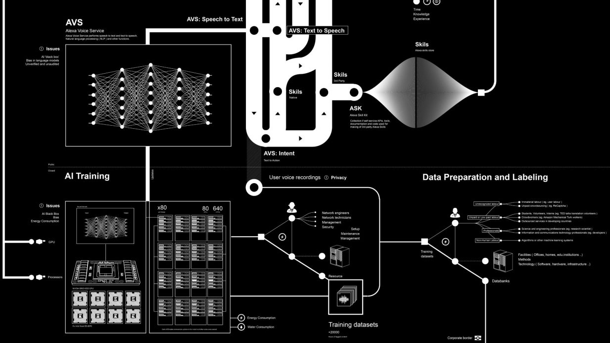
Unlocking hidden insights: using advanced data visualization techniques to discover new perspectives

Unlocking hidden insights with data visualization The ability to extract actionable insights from complex datasets is paramount. Advanced data visualization techniques empower organizations to unlock hidden patterns, correlations, and trends that can provide new perspectives and drive informed decision-making. This article delves into the world of advanced data visualization, exploring powerful tools, techniques, and trends that enable the discovery of hidden insights within data. From interactive data visualization tools to cutting-edge software solutions, we’ll uncover the secrets of leveraging advanced techniques to extract meaningful and actionable intelligence from your data.

I The power of advanced data visualization

Advanced data visualization goes beyond traditional charts and graphs, enabling organizations to explore data in dynamic and interactive ways. By employing sophisticated techniques, advanced data visualization allows users to uncover hidden insights and patterns that may not be apparent in raw data alone. These visualizations provide a holistic view of complex datasets, helping organizations gain a deeper understanding of their data and confidently make data-driven decisions.

II Exploring advanced data visualization techniques

Dimensionality reduction: Techniques such as principal component analysis (PCA) and t-distributed stochastic neighbor embedding (t-SNE) reduce the dimensions of high-dimensional data, enabling visualization in lower-dimensional spaces. This technique helps uncover patterns and relationships that might not be discernible in the original data.

Network analysis: Network visualization techniques represent relationships between entities, revealing connections and dependencies within complex networks. These visualizations help identify central nodes, clusters, and influential relationships, providing valuable insights into network structures and dynamics.

Geospatial visualization: Geospatial data visualization leverages maps and spatial relationships to uncover geographical patterns, distribution, and spatial dependencies. By overlaying data onto maps, organizations can gain insights into regional trends, demographics, and spatial correlations.

Interactive Dashboards: Interactive data dashboards offer a comprehensive view of multiple datasets, allowing users to explore and interact with the data in real-time. These dashboards provide dynamic visualizations, drill-down capabilities, and interactive filters, empowering users to discover hidden insights and trends.

III. Advanced data visualization tools and software

Tableau: Tableau provides a robust platform for advanced data visualization, offering features such as drag-and-drop functionality, scripting capabilities, and interactive dashboards. Its wide range of visualization options enables users to create powerful representations of complex datasets.

D3.js: D3.js is a JavaScript library that provides extensive capabilities for creating customized and interactive visualizations. It offers a low-level approach, allowing developers to have fine-grained control over every aspect of the visualization design.

Power BI: Microsoft’s Power BI offers a comprehensive suite of tools for advanced data visualization. It combines interactive visuals, powerful analytics, and seamless integration with other Microsoft products, providing a user-friendly experience for creating insightful visualizations.

Qlik Sense: Qlik Sense is a data visualization and analytics platform that offers advanced capabilities for exploring data and uncovering hidden insights. Its associative model allows users to make dynamic connections between data elements, facilitating data exploration and discovery.

IV Examples and trends in advanced data visualization

Visualizing time-series data: Advanced techniques, such as heat maps, sparklines, and small multiples, enable the visualization of time-series data in a compact and informative manner. These visualizations help uncover dynamic datasets’ temporal patterns, seasonality, and trends.

Augmented reality (AR) visualization: Emerging trends in advanced data visualization include the use of augmented reality to enhance data exploration. AR overlays data onto the physical environment, providing immersive experiences and new perspectives for data analysis.

Interactive storytelling: Advanced data visualization techniques are being combined with interactive storytelling to create engaging and impactful narratives. By combining advanced visualizations with a narrative structure, organizations can guide users through a compelling data-driven story, enabling them to uncover hidden insights and make informed decisions.

Machine learning-driven visualizations: Incorporating machine learning algorithms can enhance Advanced data visualisation techniques. Machine learning can assist in pattern recognition, anomaly detection, and predictive modelling, enabling organizations to uncover valuable insights from complex datasets and generate visualizations that showcase the findings.

Virtual reality (VR) data visualization: VR technology is emerging as a trend in advanced data visualization, allowing users to immerse themselves in data environments and explore multidimensional datasets in a more intuitive and immersive way. VR visualizations offer a unique perspective, enabling users to manipulate and interact with data in a three-dimensional space.

V Case studies and real-world examples

To illustrate the power of advanced data visualization techniques, let’s explore some real-world examples:

Financial data analysis: advanced visualization techniques can be applied to financial data to identify market trends, detect anomalies, and make informed investment decisions. Financial analysts can uncover hidden insights and patterns that drive their investment strategies by visualizing stock market data using techniques like candlestick charts, heat maps, and network visualizations.

Healthcare analytics: advanced data visualization techniques can assist in analyzing complex healthcare data, such as patient records, medical imaging, and clinical trial results. Visualizing healthcare data using interactive dashboards, 3D visualizations, and network analysis can help healthcare professionals identify trends, optimize treatment plans, and improve patient outcomes.

Social media analytics: advanced data visualization techniques enable organizations to analyze social media data, understand consumer behavior, and make data-driven marketing decisions. Visualizing social media data using techniques like sentiment analysis, social network analysis, and geospatial visualizations can reveal insights about customer preferences, brand sentiment, and market trends.

VI The future of advanced data visualization

As technology continues to evolve, the future of advanced data visualization holds exciting possibilities. Emerging trends such as augmented reality, machine learning integration, and virtual reality will further enhance data visualisation capabilities, enabling organizations to unlock even more profound insights from their data. Converging advanced data visualization techniques with artificial intelligence will allow automated insights and real-time data exploration.

Additionally, advancements in natural language processing and voice recognition will allow users to interact with data visualizations using natural language commands, making data exploration more intuitive and accessible.

Advanced data visualization techniques provide organizations with powerful tools to unlock hidden insights, discover new perspectives, and make informed decisions. By leveraging interactive data visualization tools, utilizing cutting-edge software, and staying abreast of the latest trends, organizations can unleash the full potential of their data. Advanced data visualization empowers users to explore complex datasets, identify patterns, and extract meaningful insights that drive innovation and business success. Embracing advanced data visualization techniques opens the door to a new world of data exploration, where hidden senses become visible and informed decision-making becomes a reality.

Related Stories 

Try this sniff test to see if your business stands out

Business intelligence tools give your business a competitive advantage

6 undeniable reasons why Power BI is a good skill to have for any marketer

Everything you need to know about advertising on one annotated slide

About the author

My name is Andy Pemberton. I am an expert in data visualization. I guide global clients such as Lombard Odier, the European Commission and Cisco on the best way to use data visualization and then produce it for them: reports, infographics and motion graphics. If you need your data visualized contact me at andy@furthr.co.uk or call 07963 020 103

Posted in: Infographic by Furthr | Leave a Comment

The art and science of storytelling through data visualizations: captivating audiences with meaningful narratives

The art and science behind engaging data visualizations

The ability to transform raw data into compelling narratives is a powerful skill. Data storytelling combines the art of storytelling with the science of data visualization to convey insights and engage audiences on a deeper level. This article explores the art and science of storytelling through data visualizations, focusing on techniques, tools, and platforms that enable organizations to captivate audiences with meaningful narratives. From interactive data visualization tools to advanced techniques and current trends, we’ll uncover the secrets of compelling data storytelling and how it unlocks the potential for impactful communication


I The power of data visualization in storytelling

Data visualization serves as the visual language that brings data-driven narratives to life. By representing data visually, we can uncover patterns, relationships, and trends that might otherwise go unnoticed. Interactive data visualization tools empower storytellers to create immersive and engaging experiences, allowing audiences to explore and interact with the data themselves. These tools enable users to uncover insights, understand complex information, and connect with the story.


II Techniques for effective data storytelling

1 Define the narrative: A compelling data story begins with a clear, focused narrative. Define the story’s purpose, identify critical insights, and structure the narrative arc to guide the audience through the data journey.

2 Choose the proper visualization techniques: Select techniques that best represent the data and support the narrative. Consider options such as charts, graphs, maps, and interactive dashboards to convey information effectively.

3 Simplify and focus: Data storytelling requires distilling complex information into digestible chunks. Simplify visuals, remove unnecessary clutter, and focus on the most relevant data points to enhance clarity and understanding.

4 Incorporate interactivity: Interactive data visualizations invite audiences to engage with the story actively. Implement tooltips, filters, and drill-down capabilities to enable users to explore the data and derive their insights.

5 Use data storytelling frameworks: frameworks such as the “Five-Act Structure” or the “Hero’s Journey” can be applied to data storytelling. These frameworks provide a narrative structure that guides the audience through the data exploration and analysis process.


III. Tools and platforms for data storytelling

1 Tableau: Tableau offers a comprehensive data visualization and storytelling tool suite. Its interactive dashboards and drag-and-drop functionality make it easy to create engaging visual narratives.

2 Power BI: Microsoft’s Power BI provides powerful data storytelling capabilities with its interactive visuals and seamless integration with other Microsoft products. It offers a user-friendly interface for creating compelling narratives.

3 Datawrapper: Datawrapper is a user-friendly online tool that allows users to create visually appealing charts and maps for data storytelling. It provides intuitive customization options and responsive designs.

4 Flourish: Flourish offers a range of templates and interactive data visualization options that facilitate data storytelling. It allows users to create animated charts, maps, and stories easily.

5 Adobe Illustrator: Adobe Illustrator provides advanced design capabilities for creating custom data visualizations and infographics. It offers a wide range of tools and features to create visually stunning and impactful visuals.


IV Emerging trends in data storytelling

Data storytelling continues to evolve, driven by emerging trends that enhance audience engagement. Some notable trends include:

1 Immersive experiences: Virtual reality (VR) and augmented reality (AR) technologies are utilized to create immersive data storytelling experiences, allowing users to enter the data narrative.

2 Real-time data visualizations: The ability to incorporate real-time data into visual narratives adds relevance and freshness, enabling audiences to stay up-to-date with the story as it unfolds. Real-time data visualizations can showcase live updates, monitor key metrics, and provide dynamic insights, fostering a sense of immediacy and engagement.

3 Story-driven infographics: Infographics combine visual elements and data storytelling to convey information succinctly and attractively. Story-driven infographics follow a narrative structure, guiding the audience through a sequence of data points to build a cohesive story. These infographics often incorporate visual cues, illustrations, and icons to enhance storytelling and make complex information more digestible.

4 User-generated data visualizations: With the rise of social media and user-generated content, organizations can leverage user-generated data visualizations to amplify their storytelling efforts. Encouraging users to create their own visualizations based on provided datasets or templates fosters engagement, collaboration, and a sense of ownership among the audience.

5 Interactive data journalism: Data journalism combines investigative reporting with data analysis and visualization to tell compelling stories. Interactive data journalism takes it further by allowing readers to interact with the data, explore different angles, and draw conclusions. These interactive experiences promote engagement and empower readers to participate actively in storytelling.

Data storytelling through visualizations is a powerful tool that allows organizations to communicate complex information effectively. Storytellers can captivate audiences and drive meaningful engagement by incorporating the art and science of storytelling, leveraging interactive data visualization tools and platforms, and following effective techniques. The power of data visualization lies in its ability to transform raw data into compelling narratives that resonate with audiences on an emotional and intellectual level. By staying abreast of emerging trends and utilizing advanced tools, organizations can harness the true potential of data storytelling, making a lasting impact and unlocking the insights hidden within their data.

Effective data storytelling becomes even more critical as data grows in volume and complexity. Through captivating visual narratives, organizations can present data-driven insights that drive decision-making, spark innovation, and inspire action. By combining the art of storytelling with the science of data visualization, organizations can bridge the gap between data and understanding, transforming numbers and statistics into stories that engage, educate, and empower.

Data storytelling is an essential skill in today’s data-driven world. By mastering the art and science of storytelling through data visualizations, organizations can unleash the power of their data, captivate audiences with meaningful narratives, and significantly impact their industries. Storytellers can create data-driven stories that leave a lasting impression and drive actionable insights by carefully selecting tools, techniques, and platforms, combined with a deep understanding of their audience. Embrace the art of data storytelling, and unlock the potential within your data to drive meaningful change.

Related Stories 

Try this sniff test to see if your business stands out

Business intelligence tools give your business a competitive advantage

6 undeniable reasons why Power BI is a good skill to have for any marketer

Everything you need to know about advertising on one annotated slide

About the author

My name is Andy Pemberton. I am an expert in data visualization. I guide global clients such as Lombard Odier, the European Commission and Cisco on the best way to use data visualization and then produce it for them: reports, infographics and motion graphics. If you need your data visualized contact me at andy@furthr.co.uk or call 07963 020 103

Posted in: Infographic by Furthr | Leave a Comment

Maximizing impact: how interactive data visualizations engage audiences and drive results

Maximising impact with data visualizations


Interactive data visualizations have emerged as powerful tools for engaging audiences and extracting meaningful insights. This article explores the impact of interactive data visualizations, highlighting their ability to captivate users for extended periods while driving tangible results. We will delve into the various aspects that make interactive data visualizations effective, including user engagement, immersive experiences, and the utilization of cutting-edge software. By understanding the power of interactivity and leveraging the right tools, organizations can unlock the full potential of their data and create visualizations that leave a lasting impression.

I. The role of interactivity in data visualizations

Interactive data visualizations empower users to actively explore and interact with the data, fostering engagement and enhancing their understanding. Unlike static visualizations, interactive ones offer users the ability to manipulate data parameters, filter information, and access deeper levels of insights. This interactivity transforms the visualization from a passive experience to an active and dynamic one, encouraging users to spend more time exploring the data and uncovering patterns and trends.

II. Engaging users for extended periods

Interactive data visualizations have the unique advantage of keeping users engaged for extended periods. Interacting with the visualization allows users to follow their curiosity, dig deeper into specific data points, and discover new insights. By presenting complex information intuitively and interactively, these visualizations facilitate a continuous flow of exploration, capturing users’ attention and encourageing them to spend more time interacting with the data.

III. Immersive experiences with interactive data visualizations

The immersive nature of interactive data visualizations creates an engaging experience for users. Users can dynamically navigate and interact with the data through features like zooming, panning, tooltips, and animations. This interactivity enhances user comprehension, enables a deeper understanding of complex relationships within the data, and fosters a sense of connection and exploration. By immersing users in the visualization, organizations can effectively convey their data stories and leave a lasting impact.

IV. Software for creating interactive data visualizations

To create interactive data visualizations, organizations can leverage various software tools that offer rich interactive capabilities. Here are some popular options:

  • Tableau: Tableau provides a user-friendly interface and a wide range of interactive features, allowing users to create dynamic visualizations without extensive coding knowledge.
  • D3.js: D3.js is a powerful JavaScript library that enables the creation of highly customized and interactive data visualizations. It offers flexibility for developers to design unique interactive experiences.
  • Power BI: Microsoft’s Power BI provides a suite of interactive visualization tools, allowing users to create compelling dashboards and reports with intuitive interaction features.
  • Plotly: Plotly offers a comprehensive platform for creating interactive data visualizations, including charts, graphs, and maps. It supports various programming languages, making it versatile for developers.

By utilizing these software tools, organizations can unlock the potential of interactive data visualizations and create engaging and impactful experiences for their audiences.

Interactive data visualizations have become instrumental in engaging audiences and driving results. By incorporating interactivity, these visualizations captivate users for extended periods, leading to a deeper understanding of complex data sets. The immersive experiences offered by interactive visualizations foster user exploration, enabling the discovery of valuable insights. Leveraging software tools like Tableau, D3.js, Power BI, and Plotly empowers organizations to create compelling interactive data visualizations that leave a lasting impact. By embracing interactivity and utilizing cutting-edge software, organizations can maximize the impact of their data visualizations, drive meaningful engagement, and unlock the full potential of their data-driven initiatives.

Related Stories 

Try this sniff test to see if your business stands out

Business intelligence tools give your business a competitive advantage

6 undeniable reasons why Power BI is a good skill to have for any marketer

About the author

My name is Andy Pemberton. I am an expert in data visualization. I guide global clients such as Lombard Odier, the European Commission and Cisco on the best way to use data visualization and then produce it for them: reports, infographics and motion graphics. If you need your data visualized contact me at andy@furthr.co.uk or call 07963 020 103

Posted in: Infographic by Furthr | Leave a Comment
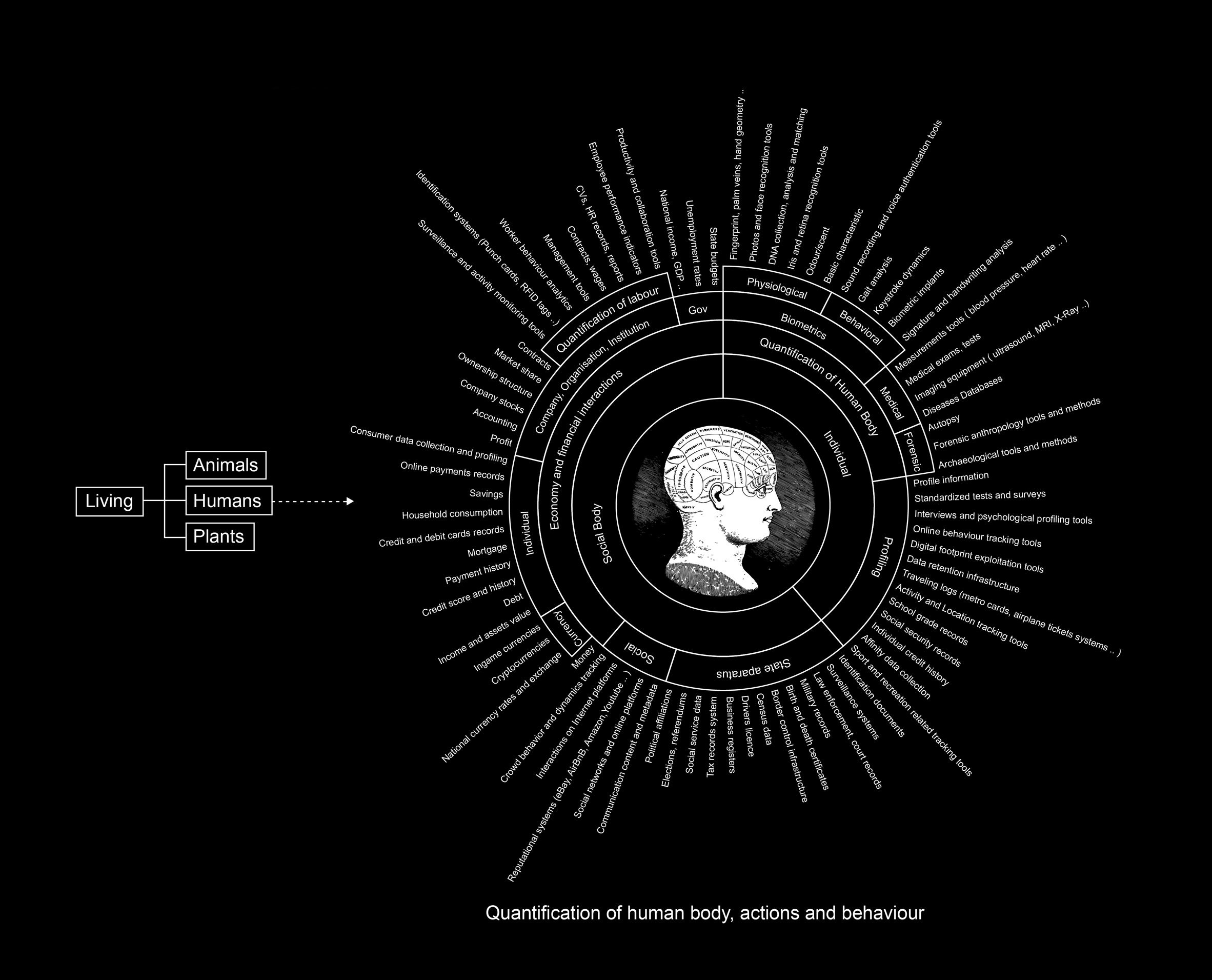
From raw data to visual masterpiece: the process of commissioning custom data visualizations


Transforming raw data into a visual masterpiece requires a well-defined process and expertise in data visualisation. Commissioning custom data visualizations allows organizations to unlock the potential of their data and communicate insights effectively. This article explores the significance of the headline in the data visualization process and delves into the step-by-step journey of commissioning custom data visualizations. From understanding project requirements to collaborating with data visualization experts, we will navigate through the crucial stages that contribute to creating impactful visual representations of complex data.


I. The Importance of the headline in data visualization

The headline plays a vital role in data visualization by capturing the essence of the visual story and setting audience expectations. It serves as a hook, enticing readers to engage with the data and explore the visual masterpiece. A well-crafted headline should be concise, informative, and attention-grabbing. It should provide a glimpse of the insights or narrative conveyed through the data visualization, compelling readers to dive deeper into the visual story.


II. Understanding project requirements

Before embarking on the journey of commissioning custom data visualizations, it is crucial to define project requirements. This involves understanding the purpose, target audience, and key messages the visualization should convey. Collaborating with stakeholders and domain experts helps gather insights into the data’s context and desired outcomes.


III. Data exploration and preparation

Once the project requirements are established, the next step is data exploration and preparation. This involves collecting, cleaning, and organizing the raw data to ensure its quality and suitability for visualization. Data preprocessing techniques, such as filtering outliers, handling missing values, and transforming data formats, may be employed to enhance data accuracy and reliability.


IV. Designing the visual story

Designing the visual story is a crucial phase where the narrative and aesthetics of the data visualization are shaped. It involves selecting appropriate visualization techniques, such as charts, graphs, or interactive dashboards, that best represent the data and align with the project objectives. Consideration should be given to colour schemes, typography, and layout to create a visually appealing and cohesive visual story.


Collaboration with data visualization experts

Collaborating with data visualization experts brings specialized skills and knowledge. These experts understand the art and science of transforming raw data into compelling visual representations. They can provide insights on selecting the proper visualization techniques, data interpretation, and storytelling approaches. By leveraging their expertise, organizations can ensure that the custom data visualization meets the highest standards of quality and effectively communicates the intended insights.


VI. Review, refinement, and iteration

The review and refinement stage is an iterative process where feedback is gathered and incorporated to improve the custom data visualization. Stakeholders’ inputs are valuable in fine-tuning the visual representation, adjusting narrative elements, or enhancing user interactivity. Continuous refinement ensures that the visual masterpiece aligns with the project objectives and meets the audience’s needs.


Commissioning custom data visualizations is a journey that involves transforming raw data into a visual masterpiece. The headline of the data visualization sets the stage for audience engagement and provides a glimpse of the insights conveyed. Organizations can ensure that their custom data visualisations are impactful, informative, and visually stunning by understanding project requirements, exploring and preparing data, designing the visual story, and collaborating with data visualization experts. With a well-defined process and expert guidance, organizations can unlock the potential of their data and create data visualizations that captivate audiences and drive meaningful insights.

Related Stories 

Effective content is easy if you use this one secret technique favoured by experts

The simple secret of redesigning websites? Headlines are EVERYTHING

Everything you need to know about advertising on one slide ANNOTATED

Business intelligence tools give your business a competitive advantage

6 undeniable reasons why Power BI is a good skill to have for any marketer

About the author

My name is Andy Pemberton. I am an expert in data visualization. I guide global clients such as Lombard Odier, the European Commission and Cisco on the best way to use data visualization and then produce it for them: reports, infographics and motion graphics. If you need your data visualized contact me at andy@furthr.co.uk or call 07963 020 103

Posted in: Strategy | Leave a Comment

Harnessing AI for powerful data visualizations: a step-by-step guide

How to use AI for Data viz


In today’s data-driven world, making compelling data visualizations is essential for businesses and individuals. With the advent of artificial intelligence (AI), creating compelling data visualizations has been revolutionized. This article will explore how AI can be leveraged to produce impactful data visualizations and delve into various tools, software, and techniques that can assist in this process. Furthermore, we will touch upon the concept of visual storytelling, which combines data visualization with narrative techniques to convey insights and engage audiences.


I. Understanding AI-powered data visualization

Data visualization is the graphical representation of data to uncover patterns, relationships, and insights that may otherwise remain hidden in raw data. AI has transformed the data visualization landscape by automating and enhancing several aspects of the process. With AI-powered data visualization, complex datasets can be analyzed, interpreted, and presented in a visually appealing and understandable manner.

AI techniques, such as machine learning algorithms and natural language processing (NLP), play a significant role in data visualization. Machine learning algorithms can automatically analyze large datasets, identify patterns, and make predictions. NLP enables AI systems to extract insights from textual data, facilitating sentiment analysis, topic modelling, and text summarization.


II. Tools and software for AI-driven data visualizations

Tableau: Tableau is a popular data visualization tool that utilizes AI capabilities to assist users in creating interactive visualizations. It offers features like drag-and-drop functionality, predictive analytics, and natural language processing to simplify the visualization process. Tableau’s AI-powered features enable users to explore data, gain insights, and create compelling visual representations.

Power BI: Microsoft’s Power BI is another powerful tool that combines AI with data visualization. It provides advanced analytics, machine learning algorithms, and interactive dashboards, enabling users to create compelling visual representations of their data. Power BI’s AI features enable users to analyze data, detect trends, and generate automated insights.

Google Data Studio: Google Data Studio is a free tool that integrates AI and data visualization. It allows users to connect various data sources, create customized reports, and apply machine learning algorithms for deeper insights. With Google Data Studio, users can create visually appealing and interactive dashboards that convey data insights.

Plotly: Plotly is an open-source library that offers AI-powered data visualization capabilities. It supports multiple programming languages, allowing users to create interactive and customizable charts, graphs, and dashboards. Plotly’s AI features enable users to create dynamic and visually stunning visualizations with ease.


III. Leveraging AI for enhanced data insights

Automated data analysis: AI algorithms can analyze large datasets quickly and identify meaningful patterns, correlations, and anomalies. This analysis assists in selecting the most relevant data points for visualization, leading to more accurate and impactful visual representations. By automating the analysis process, AI reduces the time and effort required to gain insights from data.

Predictive Analytics: AI-powered predictive models can forecast future trends and outcomes based on historical data. Incorporating these predictions into data visualizations provides a forward-looking perspective and helps in decision-making processes. Predictive analytics empowers organizations to anticipate future scenarios and make data-driven decisions proactively.

Natural Language Processing (NLP): NLP enables AI systems to analyze textual data and extract relevant information. By incorporating NLP algorithms, data visualizations can include sentiment analysis, topic modelling, and text summarization, adding valuable context to the visual representation. NLP-powered data visualizations provide a deeper understanding of textual data, making it easier to communicate insights.


IV. The power of visual storytelling in data visualization

Visual storytelling combines the art of storytelling with data visualization, aiming to communicate insights and engage audiences. It involves structuring data visualizations in a narrative format that guides viewers through a compelling story. By incorporating AI-driven data analysis and visualization techniques, visual storytelling can provide a more immersive and impactful experience.

Visual storytelling goes beyond presenting data points; it involves crafting a cohesive narrative that connects different data elements and presents them in a logical and meaningful sequence. AI can assist in this process by identifying patterns, correlations, and outliers within the data, which can then be incorporated into the storytelling framework.

When employing visual storytelling, it is essential to consider the target audience and their level of familiarity with the subject matter. The narrative should be tailored to their knowledge and interests, using appropriate visual elements and storytelling techniques to engage and educate them.

Additionally, AI-powered tools and software can enhance visual storytelling by automating certain aspects of the process. For example, AI algorithms can automatically select the most relevant data points, suggest appropriate visual representations, and even generate textual annotations or captions for the visuals.

To create impactful visual stories, consider the following tips:

Define the story: Define the objective and message of your visual story. Identify the key insights or findings that you want to communicate.

Choose the right visuals: Use elements that support and enhance the narrative. This can include charts, graphs, infographics, maps, or interactive visualizations. AI-powered tools can help you create visually appealing and informative visuals.

Structure the narrative: Create a logical flow for your visual story. Start with an introduction, present the main points, and conclude with a summary or call to action. Use transitions and annotations to guide the audience through the story.

Engage the audience: Use interactive features, such as drill-down capabilities or animations, to encourage audience interaction and exploration of the data. AI-powered tools provide features that facilitate user engagement.

Keep it concise and clear: Avoid overwhelming the audience with excessive data or complex visuals. Simplify the information to its essence, focusing on the most relevant insights that support your narrative.

AI has revolutionized the field of data visualization, enabling users to create effective and engaging visual representations of complex data. Users can automate data analysis, gain predictive insights, and produce interactive visualizations by leveraging AI-powered tools and software. Additionally, incorporating visual storytelling techniques adds depth and context to data visualizations, enhancing audience understanding and engagement. As AI continues to advance, the possibilities for creating impactful data visualizations are expanding, allowing businesses and individuals to extract valuable insights from their data and make informed decisions. By embracing AI-powered data visualization and visual storytelling, organizations can communicate their data-driven narratives and drive meaningful impact.

Related Stories 

Try this sniff test to see if your business stands out

Business intelligence tools give your business a competitive advantage

6 undeniable reasons why Power BI is a good skill to have for any marketer

Everything you need to know about advertising on one annotated slide

About the author

My name is Andy Pemberton. I am an expert in data visualization. I guide global clients such as Lombard Odier, the European Commission and Cisco on the best way to use data visualization and then produce it for them: reports, infographics and motion graphics. If you need your data visualized contact me at andy@furthr.co.uk or call 07963 020 103

Posted in: Design and branding, Uncategorized | Leave a Comment

Exercise 5: identify the intro

BBC News has been told a menu of options has been worked up in Whitehall to help struggling households.

Energy industry sources are optimistic the government will back a plan to freeze the energy cap.

Either Rishi Sunak or Liz Truss will be announced as the new PM later today.

A freeze on energy bills is one of a number of options for tackling the soaring cost of gas and electricity due to be presented to the new prime minister this week.

Ms Truss’s team is understood to have been working on a support package for energy bills “for weeks” and an announcement on what they will do is pencilled in for this Thursday.

**

Charlotte, from west London, who did not want her full name published, told the BBC how she felt blamed by her bank and made to feel like a “criminal”.

She believes thieves accessed her card PIN via the phone app, but Santander said she must have disclosed it.

The bank has apologised to her and refunded her money.

Charlotte went to exercise at a Virgin Active gym in Chiswick after work on 24 August when all of her belongings, including her bank cards and phone were stolen.

A woman has described how criminals raided her gym locker, stole her wallet and went on an £8,000 shopping spree while she was exercising.

**

The Dutch month ahead wholesale gas price, a benchmark for Europe, was up as much as 30% in early trading on Monday.

The Nord Stream 1 pipeline had been due to reopen on Saturday after being shut for three days.

But Russia’s state-owned energy firm Gazprom said it had found a leak.

Gas prices have soared on concerns over energy supplies after Russia announced it would not reopen its main gas pipeline to Europe.

Europe has accused Russia of using gas supplies to blackmail European countries because of the Ukraine conflict, which Moscow denies.

**

Nandi Bushell, from Ipswich, joined the band onstage and took Hawkins’ place on the drum stool for Learn To Fly.

Hawkins died earlier this year while the band were in South America.

Nandi said: “It was amazing to play Wembley, but at the same time it was really sad.”

A 12-year-old drummer said she had mixed emotions performing at Wembley Stadium as part of a memorial concert for Foo Fighters drummer Taylor Hawkins.

She was one of many musicians to fill Hawkins’ seat on Saturday in London, including Blink-182’s Travis Barker, Roger Taylor’s son Rufus and Hawkins’ 16-year-old son, Shane.

**

Ministers and officials are now getting to the same conclusion.

How could you do it? There are a couple of ways.

Scottish Power suggested freezing all bills at current level of £1,971 for two years at a cost of nearly £100bn. That was dismissed by the current chancellor (until tomorrow) as it was not targeted enough at poorer households.

Ovo suggested that richer households would start to pay more on top of the frozen rate as they either earned and used more energy. This would be cheaper but would still run to many tens of billions of pounds according to Ovo’s chief executive Stephen Fitzpatrick.

Energy bosses have insisted for some time that a government-backed “superfund” from which they could borrow to lower or freeze bills “is the only game in town” – as one told me last week.

Ends

Posted in: Digital Training | Leave a Comment

Exercise 5: edit this copy and supply a headline  

  • Break up the paragraphs
  • Active, not passive: “Jane hands the baby to Dad”
  • One idea per sentence
  • No adverbs, basically.
  • Remove waffle
  • Give it a headline (not a heading!)

A local magnet fisherman has unearthed a strange object in the Kennet and Avon Canal at Bathampton. Magnet fishers search outdoor waters for ferromagnetic objects, using a strong neodymium magnet, a hobby which has gained popularity in recent years as enthusiasts unearth grenades, bombs, safes, bicycles and old coins, bric a brac, scrapmetal, and so on. Ben Smith, who hails from Frome, in the South West district of the UK, first decided that he would get into this very unusual pastime three months ago after engaging with some magnet fishing content on YouTube. On Saturday (August 27) he travelled to the canal in Bath with his friends. The 39-year-old said: “We were near the toll bridge and I was pulling things out left, right and centre. The magnet I have is so powerful it has the facility to lift just about anything off the canal- or riverbed. I pulled out this very strange, triangular object and decided to take it home with me because I didn’t know what it was. So, I sent a few pictures of it to some people and a couple of them said it could be a bomb from the Second World War and that I should absolutely phone it in.”

The next day, the object was taken down to Ben’s usual fishing spot at Oldford in Frome. The police were called. When an officer arrived, it was explained where Ben had located the “device” and they contacted the bomb squad. Avon and Somerset Police have since confirmed that the object was not a bomb, but actually a piece of scrap metal. However, Ben believes he may have some more very specific information. The dad-of-two said: “One of my friends who lives very nearby, not far from here in fact, said she heard an explosion soon after they took it away so presumably that was them making it safe. Then I spoke to another very good friend who is ex-Navy, from the Portsmouth area, and he spoke to a guy, who is not local to the South West area, who is a bomb expert, and he said it looked like a projectile fuse from the top of a shell.”

Unfortunately, the police took the object quickly away so it was not possible to study this find any further. However, he has made several other discoveries while engaged in magnet fishing that he has been allowed to keep. The first was a Smith and Wesson .38/44 revolver that he pulled out of the river at Woolverton. “It was in such an altogether bad state that they said I could keep it,” Ben said. He has also found a very very small pistol at Oldford, which he believes would have been utilized by a lady in the late 1800s or early 1900s. “It was a pin fire pistol, so it would have been utilized by a woman as a sort of defensive weapon. “I had someone from the states look at it and they told me what it was. They were made by Webley in Birmingham from the late 19th century to early 20th century. “I’ve also found a lot of horseshoes and a safe, at Woolverton, that had some costume jewellery in it. We think it must have been stolen in a burglary or something and dumped in the river afterwards,” Ben said.

The Frome man has really caught the bug for magnet fishing since he engaged with it for the first time around three months ago. He eventually said: “I go out maybe two or three times a week. I’m just really interested in stuff and I bought magnets for my son, Liam, who’s 10 and my daughter Lily, who’s seven, so we can all go together.  However, my wife wants me to put a stop to it after this near-miss with the ‘bomb’. She was rather unhappy to hear I’d been driving around all over the place with it in the boot of my car.” With regards to the strange object Ben found in the canal, an Avon and Somerset Police spokesman said: “We were called to the river by Staplemead Creamery, in Oldford near Frome, on Sunday 28 August following reports of a suspected bomb being pulled from the river.

Source:

https://www.somersetlive.co.uk/news/local-news/man-finds-ww2-bomb-magnet-7525784


ends


Posted in: Digital Training | Leave a Comment

There is no such thing as B2B marketing. Everything is B2C

There is no such thing as B2B (business to business). Everything is B2C (Business to consumer).

It is obvious if you stop to think about it. And I believe in doing what’s obvious.

Imagine you run Business A. You supply widgets to Business B, who in turn supplies them to its customers, DIY enthusiasts.

How can you convince Business B to buy more of your widgets? You could say they are cheaper than your competitors or you can deliver them faster. That would work until your competitor caught up with you.

A better option would be to convince Business B that its customers prefer your widgets.

In all your communication, you can go beyond Business B and reach out to its customers. You can talk to them in a way that is emotive, empathetic, exciting etc. If you limit yourself to just talking to Business B you will be forced to be rational. And as we have seen elsewhere, emotions drive behaviour.

A good analogy is politics. If you are a pressure group that wants politicians to make a change, your best option is to garner support among voters, who are politicians’ real customers. They are the folks that politicians listen to.

While B2B marketing seems the obvious thing to do, in fact, it makes it very hard for you to stand out. By communicating “through” the middleman to their customers, you can move the dial.

In the world of marketing, B2B does not exist. Everything begins and ends with the customer.

Related Stories 

Effective content is easy if you use this one secret technique favoured by experts

The simple secret of redesigning websites? Headlines are EVERYTHING

Everything you need to know about advertising on one slide ANNOTATED

Try this sniff test to see if your business stands out

Business intelligence tools give your business a competitive advantage

6 undeniable reasons why Power BI is a good skill to have for any marketer

About the author

My name is Andy Pemberton. I am an expert in data visualization. I guide global clients such as Lombard Odier, the European Commission and Cisco on the best way to use data visualization and then produce it for them: reports, infographics and motion graphics. If you need your data visualized contact me at andy@furthr.co.uk or call 07963 020 103

Posted in: Infographic of the day | Leave a Comment

The Metaverse will be ruled by Apple’s Tim Cook, not Meta’s Mark Zuckerberg

This week Apple hit a $3trn dollar market capitalization.

That means that Apple is now worth more than Walmart, Disney, Netflix, Nike, Exxonmobil, Coca-cola, McDonald’s, AT&T, Goldman Sachs, Boeing, IBM, and Ford put together.

It’s a monster. And at the heart of its success lies the true metaverse. We could call it the Appleverse.

A metaverse, you will recall, is a series of Internet services connected by one operating system that does not recognize geographic boundaries.

Every metaverse needs a way in, a portal. For Apple, it is the App Store, which has been described as one of the most accretive business models in history. Another portal into the Appleverse is AirPods. Apple’s AirPods business alone generates around $12billion a year. That is more than Shopify, Snap, and Twitter combined.

Apple’s rival in the Metaverse is Facebook. Sorry, Meta. One reason Facebook has made a play for the Metaverse is that, unlike Apple, Meta has no hardware they control. They rely on other firms – including Apple – to carry their social media sites Facebook, Instagram and WhatsApp. This puts them in a weaker position.

Zuckerberg hopes that his Occulus headset can be the portal into the one true Metaverse, his metaverse. Setting aside the deeply troubling notion of spending time in any environment controlled by Zuckerberg, there are other reasons to be doubtful Zuck’s Metaverse will be a success.

His Oculus headset is selling somewhere between three and 5 million units. As one pundit has pointed out, that sounds like a lot until you realize crocs – a rubber slipper with holes in – shifts 60 million units a year. Last year, there were 130 million air pods sold. I am not sure AirPods look cool, but they look a lot better than wearing anyone wearing the Occulus headset.

Related Stories 

Effective content is easy if you use this one secret technique favoured by experts

The simple secret of redesigning websites? Headlines are EVERYTHING

Everything you need to know about advertising on one slide ANNOTATED

Try this sniff test to see if your business stands out

Business intelligence tools give your business a competitive advantage

6 undeniable reasons why Power BI is a good skill to have for any marketer

About the author

My name is Andy Pemberton. I am an expert in data visualization. I guide global clients such as Lombard Odier, the European Commission and Cisco on the best way to use data visualization and then produce it for them: reports, infographics and motion graphics. If you need your data visualized contact me at andy@furthr.co.uk or call 07963 020 103

Posted in: Infographic of the day | Leave a Comment

5 tips on how to make a Tableau dashboard look good


A Tableau dashboard is a powerful marketing and sales tool. It can help you to visualize data in an interesting and engaging way.

Despite this, there are many pitfalls that marketers fall into when building dashboards.

In this post, I will share five tips on how to make your Tableau dashboard look good.

What is a Tableau dashboard?

A dashboard is a combination of several views of data. You can arrange them for a presentation or to keep an eye on data as it changes.

A Tableau Story is different. It is a sequence of views or dashboards that work together to convey information.

Building dashboards with Tableau allows beginners to create engaging, interactive visualizations in minutes.

In a few clicks, you can combine data sources and dd filters. You can drill down into specific information.

Tips for Tableau beginners

If you are new to Tableau consider these tips:

You do not need to wait for your source data to be perfect. Tableau can help you identify so-called “dirty data. “

When connecting to data, there is a method that allows you to use a connection from another workbook. On the Connect panel, choose the “other files” option. Then select the workbook with the data source you’d like to use in the new workbook.

You can copy whole dashboards between workbooks too. Right-click on the tab of the worksheet and /or dashboard you want to copy. Next, select “copy sheet” from the menu. Then right-click over the tab area of your destination workbook. Then you can select “paste sheet.”

Remember, data visualizations are generally produced for others to read. So it is a good idea to ask yourself, “Would this view make sense to anyone else?”

That’s where visual best practices come in. It can help you make dashboards that actually make sense to other people.

Don’t forget to test for performance!

What is Tableau dashboard size best practices?

The golden rule is to author at your final display size.

Tableau dashboards are set to use a fixed size. If you keep this setting, be sure to build your visualization at the size your audience will view it at.

You can set Size to Automatic. This makes Tableau adapt the dimensions of a visualization based on screen size.

If you design a dashboard at 1300 x 700 pixels, Tableau will resize it for smaller displays. Sometimes this results in scrunched views or scrollbars. The Range sizing feature is helpful for avoiding this.

When it comes to Tableau dashboards, there are many things that you can do to make them look good.

In this post, I will share 5 more tips on how to make your Tableau dashboard look great.

1. Organize your data

One of the best ways to make your Tableau dashboard look good is to organize your data.

You have spent time and effort collecting, organizing, and cleaning your data,. Now it makes sense to spend more time making sure you display this information how you want it to be.

Using the Tableau easy filter option is a great way of making your data look good. It will keep things organized at the same time.

2. Use dashboard actions for quick insights

The best way to make your Tableau dashboard look great is by adding interactive elements. One example is dashboard actions.

Dashboard actions mean users can get instant insights into their data. All they have to do is click on the visualizations.

Imagine you have a visualization of how sales vary by region and how sales relate to the size of the company. Adding a dashboard action that shows how many clients there are per region would add context. It would allow your users to see how this data impacts your business.

3. Take advantage of filters

Another way to make your Tableau dashboard look great is by taking full advantage of filters.

Filters help achieve valuable insights. They show how different parts of your data vary from each other. You can use colour coding conditional formatting with thresholds. These .make sure users see patterns in your data.

But remember: too much colour can be a bad thing. This is because colour is powerful. Each different colour has an emotional meaning. Red can raise the alarm, blue is calm. Drenching your charts in colour is a typical beginner’s mistake.

For a premium touch, instead, use different shades of the same colour. Google uses this method for its data analytics. By using different shades of blue, their charts cool calm, and in control.

4. Make sense from all angles

Sometimes it’s tempting to cram as much information as possible into your dashboard. But it is important to make sure that all the data is easy to understand from all angles.

Once again, try not to use too many fonts and colours and make sure that you align everything.

A sans font such as Ariel is easier to read small.

5. Use storytelling to engage users

The best way how to make your Tableau dashboard look great is by using storytelling.

Storytelling helps you to communicate complex information in a clear and concise way. It helps keep users engaged with your data.

To tell a story with your data, pay special attention to the title of your chart. The title should be the conclusion of the data beneath it.

Eye-tracking surveys reveal readers look at the headline first. Then they look at the chart to see if the visualization supports the conclusion in the headline.

If you put the conclusion of the data in the chart headline you will be able to develop a story over a series of charts. And your readers will be able to follow it.

If you do not put the conclusion in the headline, your readers will not be able to follow and they will get lost.

It is shocking how fast readers abandon charts they do not understand.

Use these techniques. You will make your Tableau dashboards more engaging and visual.

The golden rule is that it is important that your data is correct. But it is also important that your data visualizations are interesting. Make sure you do not overwhelm your charts with colour. Ensure that you have a story to tell. Tell that story by putting the conclusion of the data in the headline. Then make sure the chart supports that headline. If you do these things, your Tableau dashboards will look good.

Related Stories 

Try this sniff test to see if your business stands out

Business intelligence tools give your business a competitive advantage

6 undeniable reasons why Power BI is a good skill to have for any marketer

Everything you need to know about advertising on one annotated slide

About the author

My name is Andy Pemberton. I am an expert in data visualization. I guide global clients such as Lombard Odier, the European Commission and Cisco on the best way to use data visualization and then produce it for them: reports, infographics and motion graphics. If you need your data visualized contact me at andy@furthr.co.uk or call 07963 020 103

Posted in: Infographic of the day | Leave a Comment