7 simple data visualization techniques to win more business today

When you’re selling your product, each touch-point with your prospect must be engaging.
The last thing you want is for your prospects to not understand what they’re buying and choose a competitor.
Data visualization can help clarify things. It can make your sales materials stand out from the crowd.
Data visualization makes it easier for people to understand the differences between products. It can explain how each option will work for them.
In this blog post, we’ll share 7 simple data visualization techniques. They will transform your sales materials. They will make it easy for your prospects to choose your company.
Why is data visualization important for presentations?
Let’s start with the basics. Data visualization is important because data is important. And data is everywhere.
There is no sector in which data is unimportant.
If data isn’t present in sales materials, you’re missing out on an opportunity. Data helps your prospects make their decision.
Above all data visualization is a reassurance tool. It is best used towards the end of the sales funnel, before conversion. Data visualization provides proof the customer’s decision to buy is the right one.
Customers will take a look at the data just before they decide to buy. If the data is right, they will go ahead with the sale. That is why data visualization is so important in sales.
Data visualization closes the sale.
What data should you visualize?
If data isn’t represented in a way that makes sense, customers won’t care about it. You don’t want your data visualization to be boring or hard to understand.
Data can be used in sales. It can be used in other places.
Data from data visualization can be a starting point for future product iterations. It can keep track of performance over time. Data can predict trends and is useful for internal use to understand what is important to the market.
What data should I visualize in my sales materials?
You should visualize data about your product in your sales materials. You can include data about your company. You can also feature data highlighting trends in your industry. You can include any data that your prospect will care about.
But the most effective data visualizations show the benefit of the product or service.
There are a million ways to visualize data and every situation is different, but here is an example.
Imagine you were considering sending your child to a school. You’d start looking at local schools in your area. You would tour them. The school may allow you to chat to a pupil that takes you and your partner around. You can speak to the head teacher.
Towards the end of this process you will study the schools’ results in detail. What A’ level results did pupils who attend the school get? What about GCSE’s?
This data is shown in graphs. Want to know how how the school has performed over a period of years? A line graph could be helpful.. If you want to know the percentage of students who got top grades at GCSE the school may use a pie chart. If the data is strong, and all other factors are equal, you will choose the school.
That is one way you can use data visualization to reassure customers – or in this case parents . With data visualziation, they are sure they are making the right choice.
Here are 7 data visualization techniques. You can use to upgrade your sales materials today
1) Bar charts
Bar charts are a popular data visualization to use for presentations. They are simple and effective. Everyone understands them. It is wise to never underestimate simplicity. You can compare data from different categories or from the same category with ease.
A bar chart is great for data comparison. Does your company makes several products? Data about each product must be part of the data visualization.
A bar chart is great for showing growth or quantity. This stacked bar chart shows almost every career in the US and how much you can earn doing it. You can understand it without thinking. The reason it is is deliberate. It shows you what inequality – the different earnings between careers – looks like.
2) Line charts
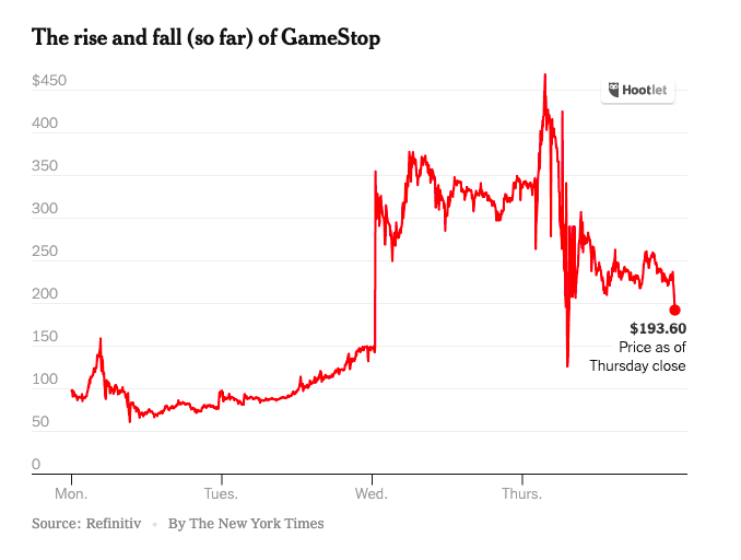
One man made billions from monetizing line charts. He is Michael Bloomberg. He popularized the Bloomberg terminal. Stockbrokers use it. It shows the price of a stock over time, depicted as a line graph. Line charts are great for data that has a natural order.
A line chart is helpful when you want to show the data over time,. You can use it to show how much your company is growing in comparison with its competitors.
Recently line graphs have hit the news. The have showed us the progress of Covid-19 infections in different countries.
3) Pie charts
We all know pie charts from school. Pie charts are great for showing percentages or how a market divides.
It is always advisable to use charts that everyone understands. A Sankey diagram may look exciting. But it is possible that many of your readers will not understand how to read it.
Pie charts are a data visualization technique that everyone can understand.
4) Treemaps
Treemaps are data visualization charts that use the size of data to tell a story. They help your prospects understand data spread out over many categories fast. Treemaps break everything down into manageable, bite-sized chunks.
5) Wordcloud
Wordcloud data visualizations are great for data that’s not quantitative. The data may be qualitative. They could use text data about your prospects or their opinions on different topics. Or, the data may be words in general, such as data about the products you offer or company data.
6) Heatmaps
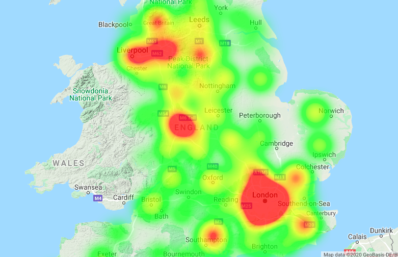
Heatmaps use different colours to represent different values. They’re helpful to visualise intensity.
Heatmaps make intuitive sense. It is no surprise data scientists use them much. Governments have used Heatmaps to tell the story of the spread of Covid 19.
7) Correlation Indices
Correlation data visualizations represent data in a coloured grid. Data scientists split the data into different categories. They assign a colour to each category, such as data about your company.
They fill the grid with dots that show the correlation in the data.. The data is from different categories. Or the data is identical across all categories.
Learn these seven data visualization techniques. They will ensure you improve your sales materials . They will help your company stand out from the competition.
Related stories
Try this sniff test to see if your business stands out
Business intelligence tools give your business a competitive advantage
6 undeniable reasons why Power BI is a good skill to have for any marketer
Everything you need to know about advertising on one annotated slide
About the author

My name is Andy Pemberton. I am an expert in data visualization. I guide global clients such as Lombard Odier, the European Commission and Cisco on the best way to use data visualization and then produce it for them: reports, infographics and motion graphics. If you need your data visualized contact me at andy@furthr.co.uk or call 07963 020 103
Posted in: Infographic of the day