This London Underground Map describes the look of each station
December 22, 2015
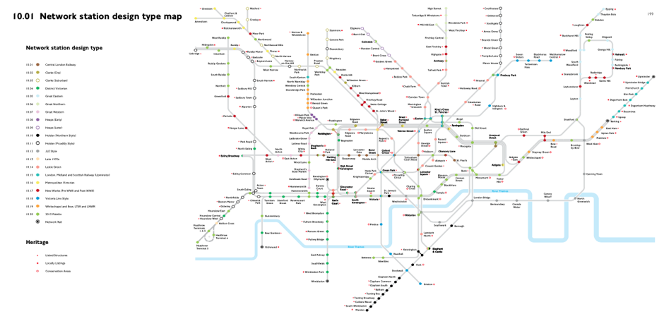 In the recently published, 225-page London Underground Station Design Idiom is a new twist on the famous Underground map: every line is gray while each station has a color dot that identifies which of the system’s 20 design periods it belongs to. (See above).
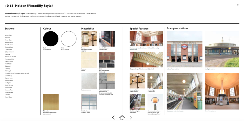
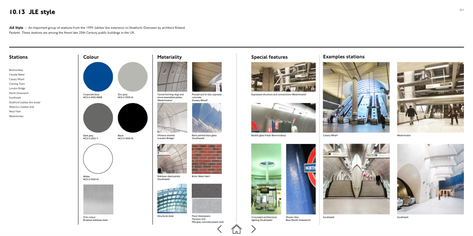
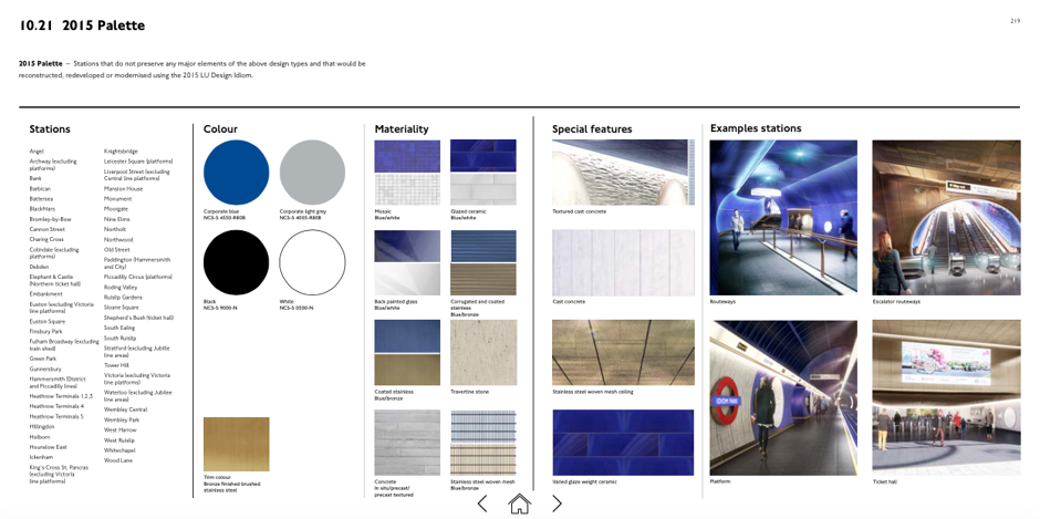
There follows Flashcards which describe each idiom:
The Idiom is on exhibit at Platform, an art space behind Southwark Underground station. It’s just one element of TfL’s “Transported by Design” programming that runs until 2017.
Posted in: Infographic of the day