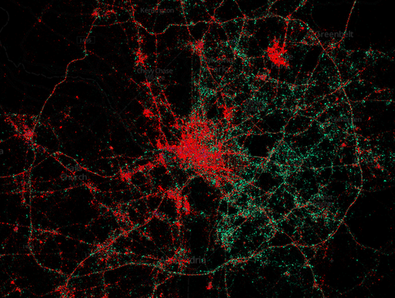
These maps prove rich people prefer iPhones
June 21, 2013
This map of Washington, D.C., which uses geolocated tweets, and the cell phone metadata attached to them, illustrates who in town is using iPhones (red dots) and who’s using Androids (green dots). iPhones are often more prominent in upper-income parts of cities (and central business districts), while Androids appear to be the dominant device in lower-income areas.
Here is New York City, which has a smattering of Blackberries in Manhattan (yes, it’s possible to tweet from a Blackberry). That green patch to the left is Newark
Here’s Chicago.
Houston.
Los Angeles
Atlanta
Jakarta, on the other hand, has a lot of Blackberries.
Posted in: Uncategorized


