How to make a HIGHLY PERSUASIVE data visualization: a three minute guide

Visual perception research has established the fact that visual information is powerfully and inescapably persuasive in a way that text and speech aren’t.
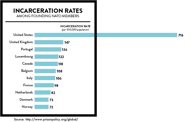
For instance, I could tell you the United States imprisons five times as many people as most nations despite having similar crime rates. I can cite sources and link to essays and research.
Zzzzzz.
Or, I could show you this:
New research is adding texture and nuance to this understanding of how data visualization persuades.
Research from Ansul Pandey at New York University indicates the persuasive power of dataviz may not be universal. It has found the success of a visualization seems to be dependent on the person assessing it.
When participants in their study didn’t have strong opinions about the message being conveyed, visuals persuaded effectively.
But they were much less effective when participants held strong opinions in opposition to the message being conveyed.
Obviously, it takes more to convince someone who doesn’t believe you than someone who simply doesn’t know or doesn’t care.
But wait. There’s more.
Those with stronger opposing views were more likely to be swayed when a disagreeable message was presented in the form of a table, rather than a chart.
Weird, right?
An unrelated study discovered people who were most likely to hold misperceptions tended to reject ALL factual corrections no matter what.
Chart, table, they did not care.
Anyone who has who has argued fruitlessly with a conspiracy theorist knows that facts presented to zealots are often rejected not because they are wrong but because they felt threatening to the subject’s world-view and their identity.
In other words, a chart may cause someone with a polar opposite view to dig in their heels because it’s too psychologically painful to confront compelling evidence that conflicts with their beliefs.
But researchers found another way to win over these groups that had nothing to do with charts: affirmation.
Asking them to recall a time when they felt good about themselves made them more willing to acknowledge uncomfortable facts.
Tuft University’s The Visual Analytics Lab have also discovered the effectiveness of visualization changes with mood, gender, and personality type.
What’s more, priming a subject can affect how they perform when reading a graphic and what they take away from it.
For instance, a bored, agitated, tired, audience won’t make sense of your charts and the message you want to convey as well as one that’s engaged, happy, well-fed, and generally positively primed.
And the ability for people to get information from a chart affects their judgment of the data itself. The most anti-persuasive thing you can do is to make a bad chart that frustrates people.
Number one on the list is data viz turn offs? Complexity.
If there’s too much information and no clear, salient point that we can intuit, we tend to shut down, unless we have the time, space, and inclination to work hard at finding the narrative in the visual.
Certainly in a presentation setting, that’s unlikely.
Number two on the list of turn offs is too many salient points fighting for attention. I always keep in mind the design aphorism, “if everything is bold, nothing is.”
Number three: charts that flout convention. If you depict time going right-to-left, say, or put scale categories out of order, you risk messing with your reader’s expectations, and the likelihood is they will give up.
So how do you get it right?
Here’s a deceptively simple, golden rule for visualizations I always use: “no title, no infographic.”
That’s just another way of saying, “Know what you want to say and use the data visualization to say it.”
So imagine the pay off, the conclusion, the final slide in your presentation – and put that first.
And make it specific.
So don’t call it “The Future of Retail.” Instead, do call it “The Future Of Retail is Online Commerce.”
Good luck.
Posted in: Infographic of the day