Giving an audience what they really want
June 5, 2015
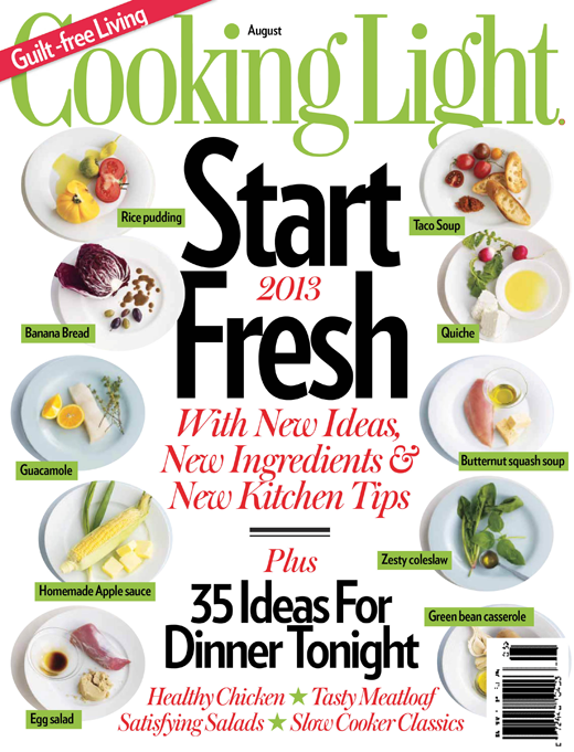
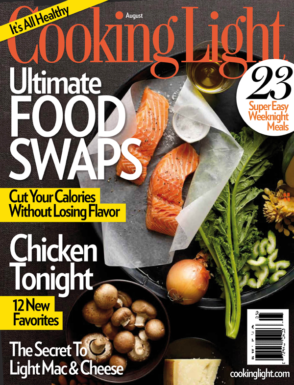
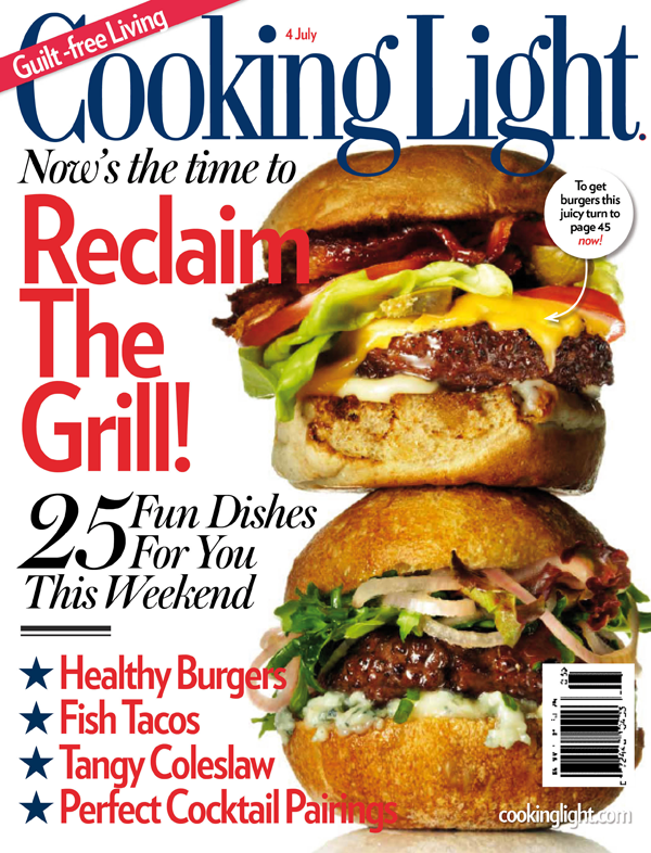
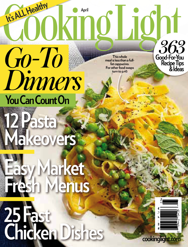
Online it’s called a ‘glanceable user interface’, offline, it’s a magazine front cover – but both have about three seconds to tell their story. Time Inc’s brief was to take their market-leading food title, and develop ways to increase both the potency of its branding and newsstand cut-through. Critically, new straplines were tested, along with compelling coverline promises, images, and dramatic, easy-to-see design decisions. Covers shown with permission.
Posted in: Our work