Chart of the week: the intensity of a stock market “bull run”
March 14, 2019
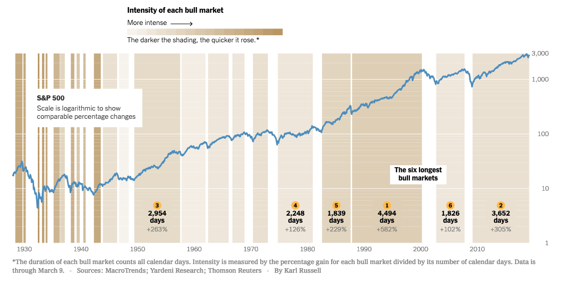
When you make data viz as I do, in the first instance you are trying to show one thing – and the reader must “feel it” rather than think it.
This week, the New York Times tried to sow the concept of “intensity” of recent bull runs. The darker the shading the quicker it rose.
Posted in: Infographic of the day