A Brooklyn ice cream brand increased sales by 50% after it redesigned its packaging to look good on Instagram
March 31, 2017
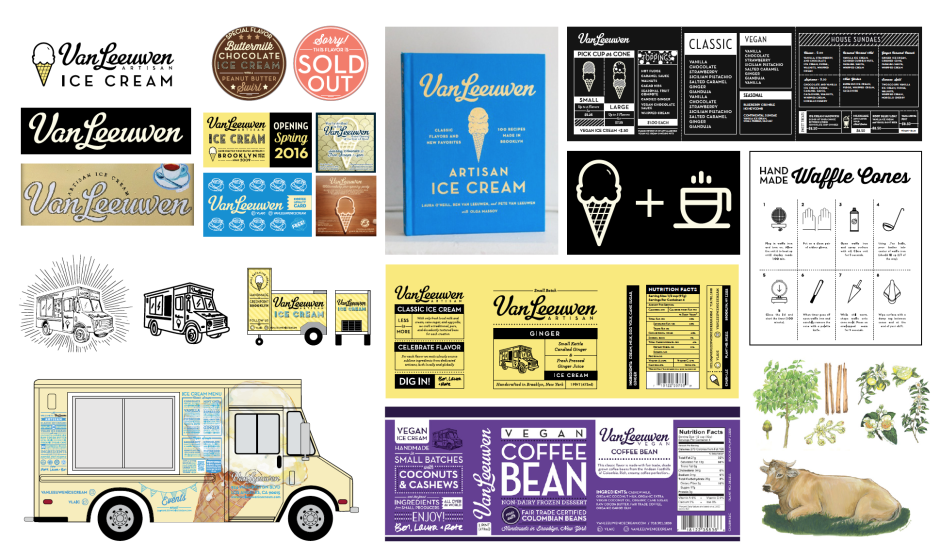
A curious thing happened when high-end ice cream brand Van Leeuwen redesigned their packaging: People began snapping pictures of supermarket freezers.
Redesigning packaging so it “looks good on social media,” is a deliberate strategy. Van Leeuwen co-founder Laura O’Neill and partners Pete and Ben Van Leeuwen worked closely with storied design firm Pentagram to make their pints and trucks “very Instagrammable,” says O’Neill.
After stripping away all visual elements, Van Leeuwen kept one line on the face of their ice pints as a nod to their heritage as a pioneer of the mythologized New York hipster food movement. In small sans serif type, it reads, “Handcrafted in Brooklyn.”
Sales rose 50%.
Posted in: Infographic of the day