5 ways data visualization is transforming business decision-making
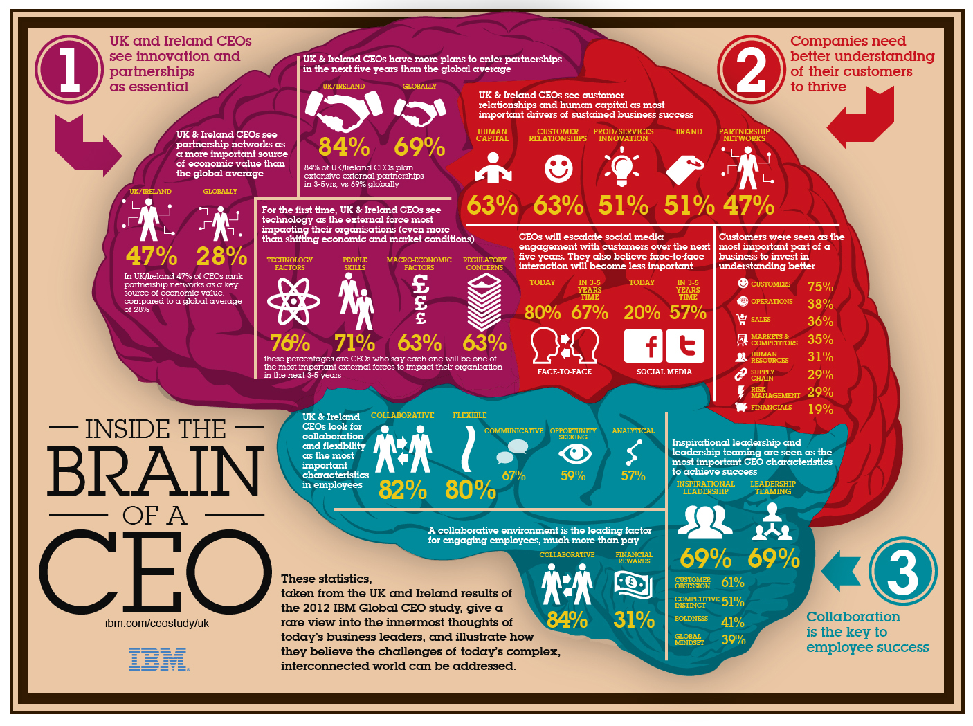
Data visualization has become indispensable for analyzing data and gaining actionable insights to inform business decisions. As data grows increasingly complex, data visualization provides a more intuitive way to explore trends, spot patterns, and communicate findings. Let’s examine five key ways interactive dataviz is revolutionizing business decision-making.
1. Identifying insights from complex datasets
The volume of data businesses collect is exploding. This “big data” can offer tremendous analytical value but make it challenging to pinpoint meaningful insights. Data visualization software like Tableau allows employees to import, combine, and visualize complex datasets using interactive charts, graphs and dashboards. By visualizing correlations, outliers, and trends in a format more accessible for the human brain to digest, key insights emerge more quickly. Dashboards make it simple for managers to toggle between data models, views, and variables to support decision-making.
2. Demystifying data science and AI
Data science and AI have become essential business capabilities. However, many managers without technical backgrounds find their processes opaque. Data visualization is a powerful tool for demystifying advanced analytics. Platforms like MATLAB enable data scientists to create visual models of machine learning algorithms, conveying how they work intuitively. Managers can also use tools like DataRobot to interactively evaluate AI predictions and recommendations for business datasets via dataviz dashboards. This builds trust and adoption of data science.
3. Real-time monitoring and forecasting
Real-time data visualization enables up-to-the-minute monitoring of business operations and external market forces relevant to an organization. Platforms like Databricks accept streaming, real-time data inputs and rapidly generate visual metrics and KPIs to enable faster responses. Real-time dashboards that alert managers the moment an anomaly occurs facilitate rapid intervention. Real-time data also allows advanced predictive data analytics using machine learning algorithms to forecast trends – which managers can assess via dataviz interfaces.
4. Data-driven storytelling and reporting
Data storytelling enhances the impact of data analysis by crafting compelling narratives tailored to engage different audiences. Managers can use data visualization tools like D3.js to build interactive infographics that bring datasets to life in memorable ways. Embedding visual data explanations directly into reports, presentations, and emails boosts engagement and retention of insights. Data-driven storytelling makes data analysis resonate across the organization to drive change.
5. Decentralizing data exploration
Traditionally, business intelligence and data analytics have been centralized functions. But modern self-service analytics platforms like Power BI, Looker and Sisense enable more employees to visualize and independently explore data relevant to their roles using interactive dashboards. This drives more comprehensive data literacy across teams to empower localized decision-making. Democratization and decentralization of dataviz unlocks an agile analytical culture.
The bottom line is that data visualization makes complex data accessible and actionable. These examples illustrate that integrating interactive dataviz throughout workflows and operations unlocks more profound data-driven decision-making. Any business can capitalize on data with the right visualisation strategies to outperform competitors.
Related Stories
Effective content is easy if you use this one secret technique favoured by experts
The simple secret of redesigning websites? Headlines are EVERYTHING
Everything you need to know about advertising on one slide ANNOTATED
Try this sniff test to see if your business stands out
Business intelligence tools give your business a competitive advantage
6 undeniable reasons why Power BI is a good skill to have for any marketer
About the author

My name is Andy Pemberton. I am an expert in data visualization. I guide global clients such as Lombard Odier, the European Commission and Cisco on the best way to use data visualization and then produce it for them: reports, infographics and motion graphics. If you need your data visualized contact me at andy@furthr.co.uk or call 07963 020 103
Posted in: Infographic by Furthr
