This exquisite infographic tracks two decades of global migration
April 7, 2014
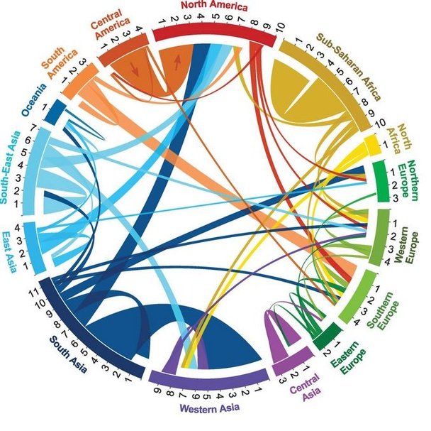
Austrian researchers Guy Abel and Nikola Sander have extrapolated United Nations data and discovered that the percentage of the world’s population that’s moved hasn’t changed much since 1995. They also found there are hot spots where massive migrations are taking place, chiefly from Latin to North America, between South and West Asia, and all around inside Africa.Here’s the large, potent flow of migrants to North America: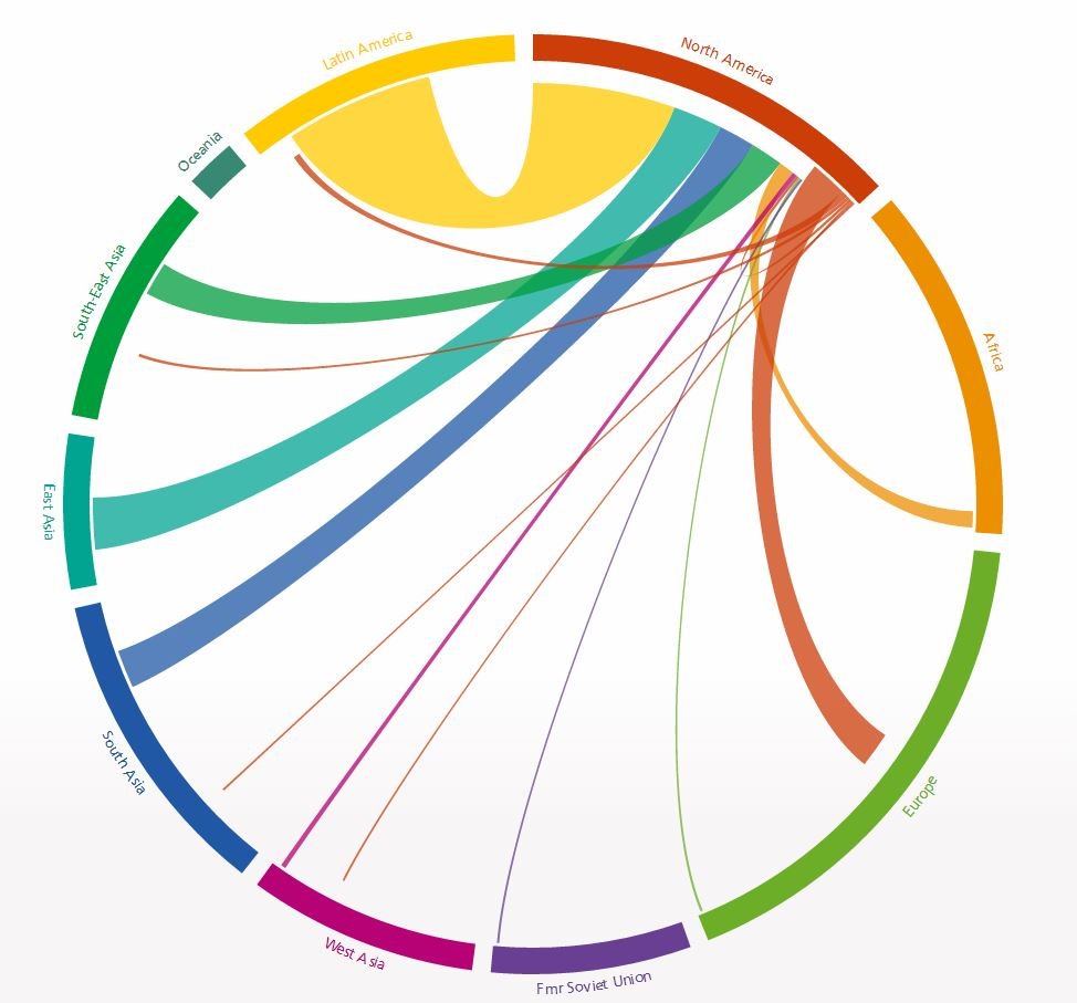
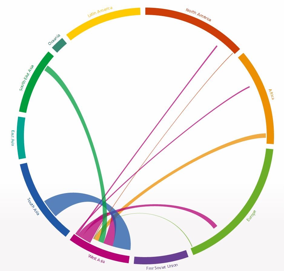
The Middle East also proves a powerful draw for many developing countries:
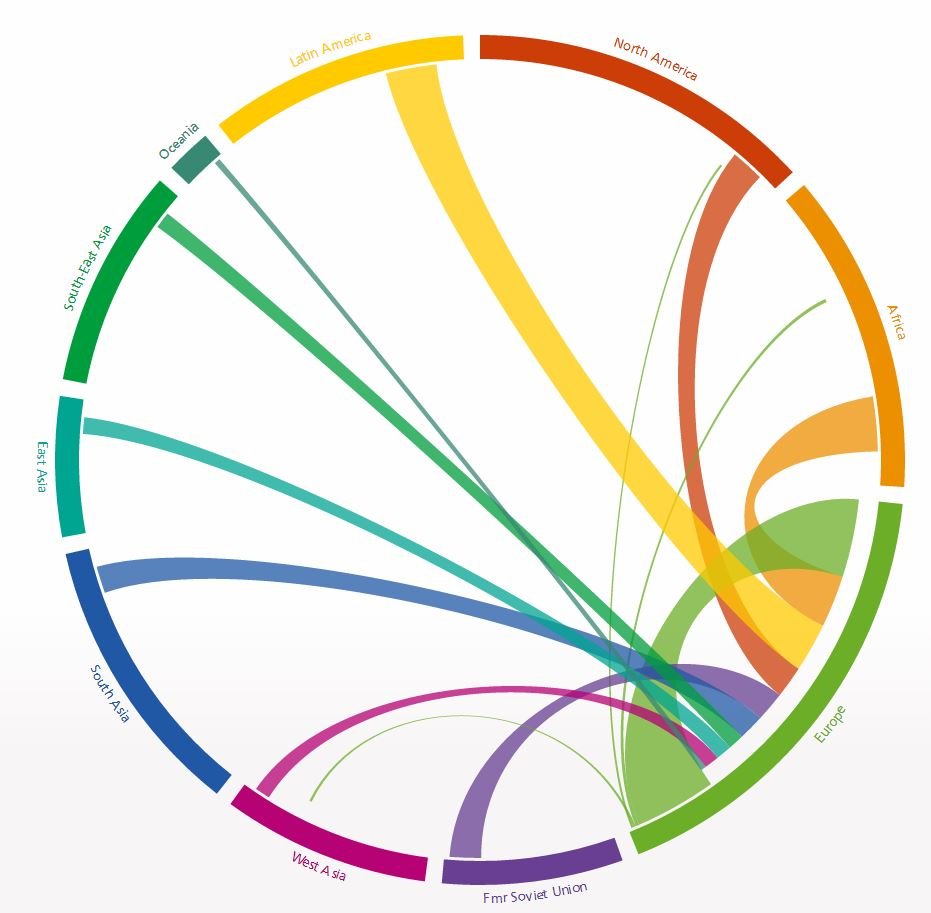
And here’s Europe, which attracts migrants from a diverse set of places but sends them mainly to other parts of the continent:
Click on each country’s name in this brilliant dynamic infographic to get a full breakdown of people in and people out.
Posted in: Big Picture story