15 companies changed their logos this year. Here are the winners and losers
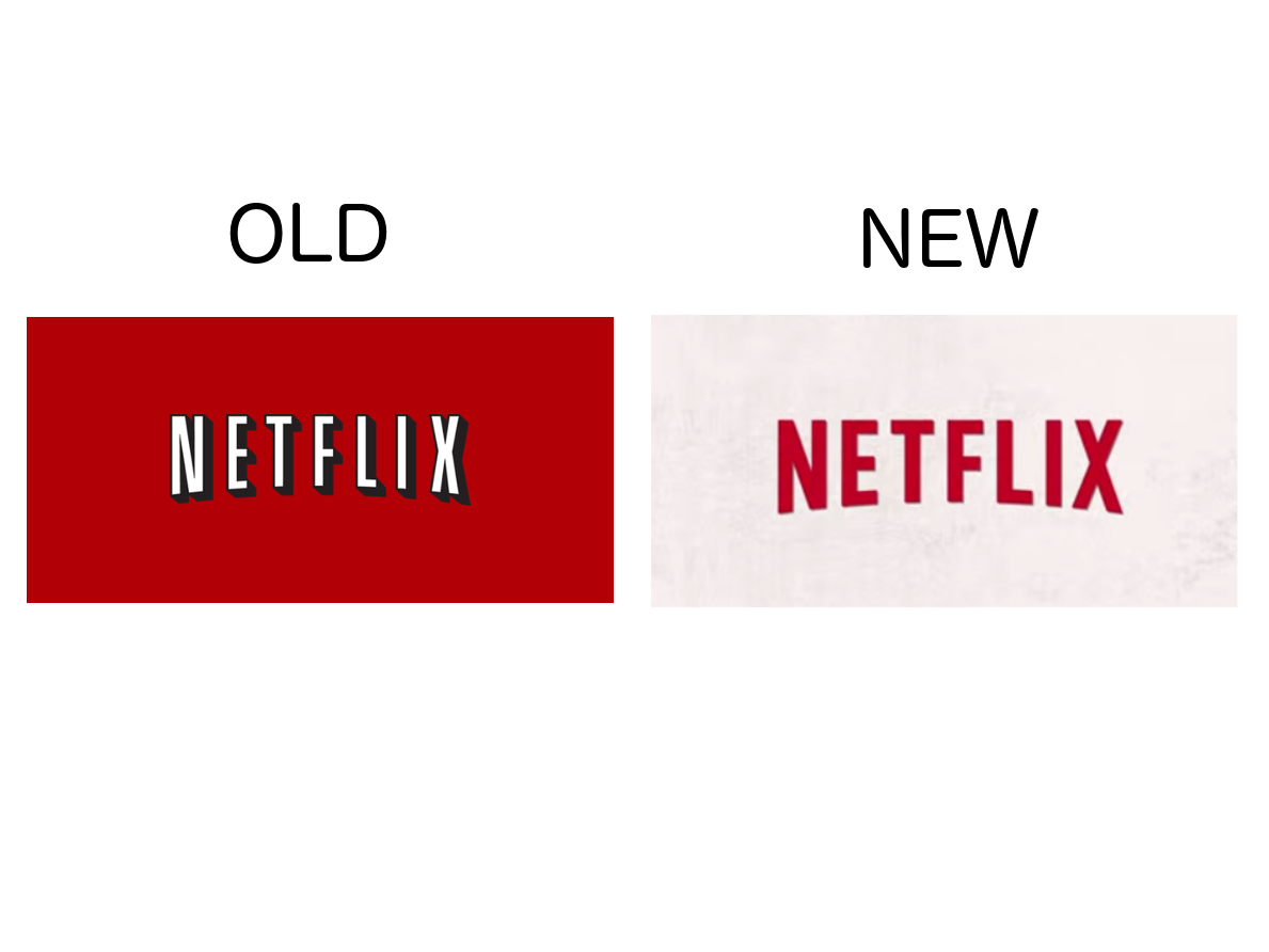
Last week, Netflix quietly tested a new logo on its YouTube page. But Netflix isn’t the only company to tweak its corporate image this year.
2014 has seen changes to a number of iconic logos, including Cadillac, Olive Garden, and Reebok.
Some of these brands, have made a couple of minor changes to their logos. Others, like Reebok, chose to completely re-imagine their brand identities. Here’s a selection.
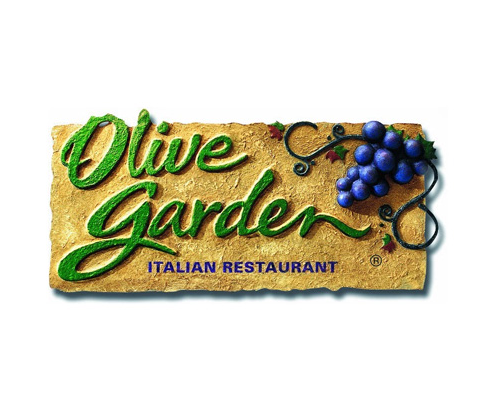
In March this year Olive Garden switched their logo from this…
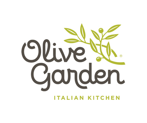
To this generic effort.
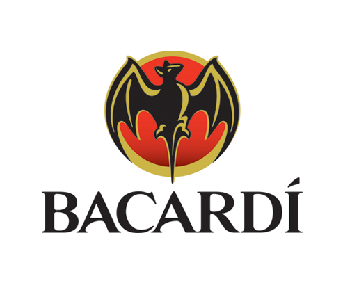
Bacardi switched from this dated logo…
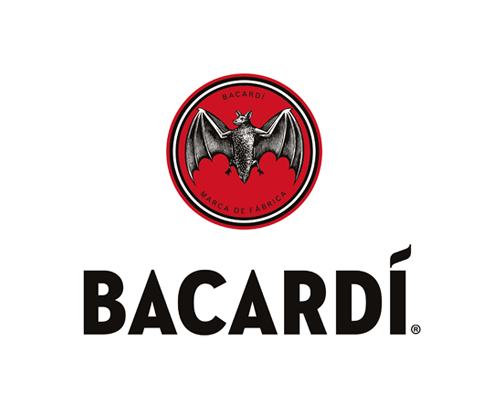
To this much cleaner version. A vast improvement.
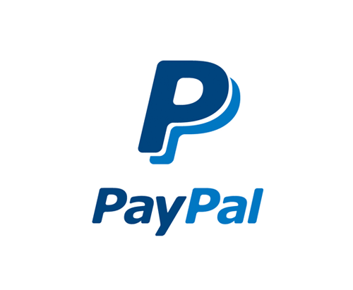
PayPal changed this…
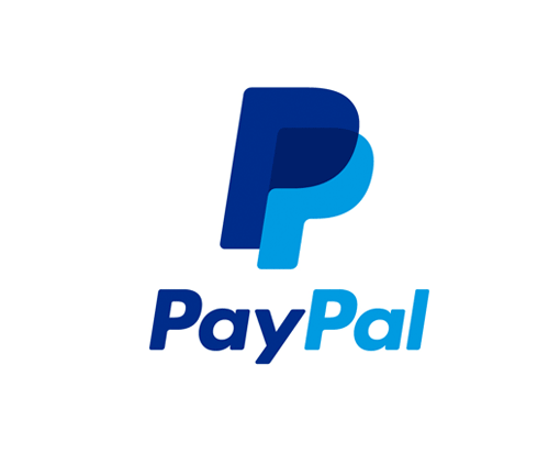
To this. The interlocking P’s are supposed to represent more human interaction.
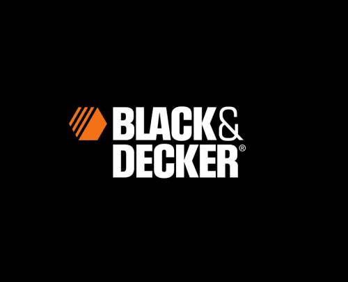
Black & Decker bid adieu to the ampersand…
And replaced it with a trendier + sign.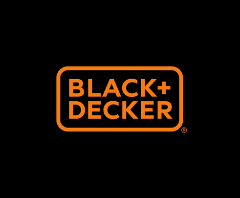
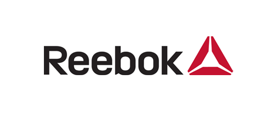
Reebok’s old logo did not match up to Nike’s swoosh or Addidas’ three stripes.
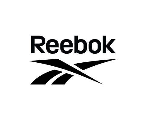
But they have not fixed it with this baffling pyramid.
This is a bit plain.

But this looks like the Beats by Dre logo (on the right)
 .
.
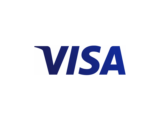
The V in Visa used to have a flourish of yellow.
Now it’s an altogether moodier darker hue.