Globalisation fans! China’s economy is definitely slowing down
September 23, 2014
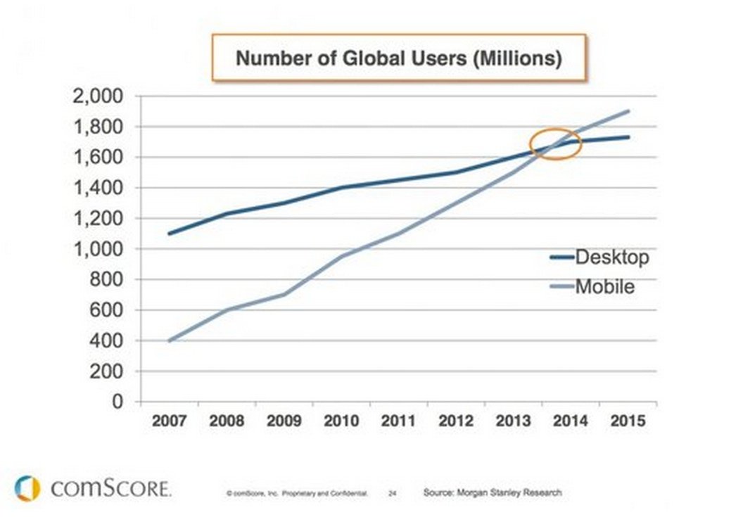
Google stock is up 139% over the past five years and 6% this year. That’s because the company basically has a monopoly on the internet’s best business: search advertising.
But nothing last forever. As the chart above shows, this year the amount of people accessing the web via mobile (iPads, smartphones) outstripped those accessing via desktop.
And most mobile users prefer to access the web via apps (see below chart).

Perhaps Google are wishing they had not given Android away for free now.
Posted in: Infographic of the day | Leave a Comment

Despite turmoil in the Ukraine, north Africa and the Middle East, the VIX index, which measures the implied volatility of America’s stockmarket, and is also known as the “fear gauge”, is near a 20-year low. The reason is that places suffering conflict are politically important but economically small. The Middle East, north Africa, Russia and Ukraine together produce just 7% of world economic output. They are mere “flesh wounds”. Only 2% of the stock of foreign investment by American, Japanese and British firms is in these places. At the same time, the world’s energy mix has shifted away from oil since the upheavals in the Middle East in the ’70s, and America has lots of shale gas.
Posted in: Infographic of the day | Leave a Comment
 This chart shows that people use Twitter to follow while they use Facebook to share.

China now emits more greenhouse gases than the United States and Europe combined.
Posted in: Infographic of the day | Leave a Comment

These are the entertainment brands homogenising global culture at a multiplex near you soon.
Posted in: Infographic of the day | Leave a Comment
That swollen angry red blob hovering menacingly over Europe? That’s the UK. We sure love the internet.
Posted in: Infographic of the day | Leave a Comment
An astonishing 73% of over 65s voted against secession yesterday.
Pro-union politicians’ warnings that pensions might be at risk in an independent Scotland undoubtedly played a part in steering the older vote.
In Scotland, those 55 and over represent 36% of Scotland’s voting-age population. And the population is getting older.
They might not like Devo Max either.
Devo Max, at root, means that most cross-subsidy between nations is cut. Scotland would largely rely on its own taxes, so Scots would bear more pain from the decline in North Sea revenue and the country’s ageing population.
And that’s why Scots politicians might choose to stick with something more modest than sweeping powers in any Devo Max settlement.
Posted in: Infographic of the day | Leave a Comment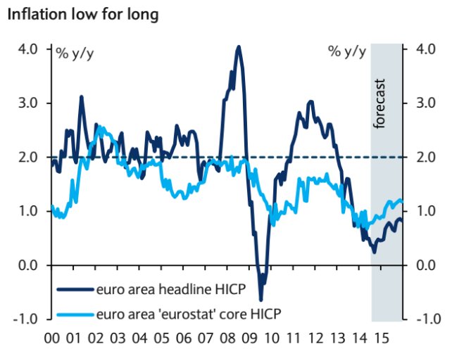
Inflation is low (see chart) so Barclays believe the European Central Bank will try “printing money” to stimulate the economy.
But analyst Michael Pearce said that “the scale of monetary easing is set to be much more timid” than the Bank of Japan’s effort. “Co-ordinating policy between the 18 separate governments and central banks of the euro-zone will be a Sisyphean challenge, even for Super Mario.”
Thanks a lot, experts!
Posted in: Infographic of the week | Leave a Comment

