This graphic shows the world spends most of its time online on social media
June 17, 2014

It’s the received wisdom in the world of media vendors, agencies and brand-side marketers that Facebook and Google’s platforms are just not suited to brand advertising, says Andy Pemberton, co-founder and director, further.
Read the rest of my post here, at Marketing magazine. This article also appears in Campaign.
Posted in: Infographic of the day, Uncategorized | Leave a Comment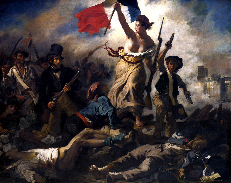
The way you say things really matters; the right tone of voice is what makes users return to your site.
But nothing makes the content makers heart sink deeper than being told a branding agency has come up with 16 adjectives that “sum up the brand” – and hey, could you use them across all comms please? If your writers can’t remember these words off by heart, they are useless.
It takes just three words to triangulate the tone of voice for the largest organisation. For the Holy Roman Empire it was “Veni, Vidi, Vici” – I came, I saw, I conquered was a cry that inspired an Empire. For revolutionary France it was “Liberté, Egalité, Fraternité.”
There is not a brand that needs more.
Posted in: Infographic of the day | Leave a Comment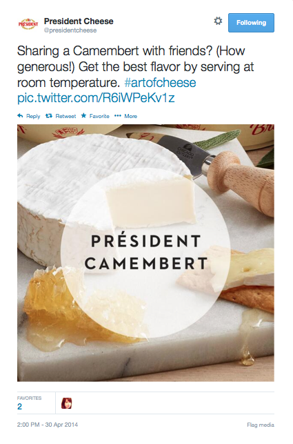
The above Tweet, by US agency Huge, took two months to come up with.
Some corporations are getting rolled on their social media campaigns. No wonder the Ad Contrarian says online advertising is a disaster. For instance:
Corporations! Beware social media agencies with complicated plans.
Posted in: Infographic of the day | Leave a Comment
![]()
Buzzfeed is now considered one of the world’s most innovative news organisations. It’s value is currently over $1bn, getting close to The New York Times ($1.28b), and dwarfing other digital news sites. Over the last year, the site has attempted a new editorial strategy, one designed at pumping up the perceived value of its reporting, nicknamed business in front, party in the back, (a phrase once used to describe the mullet hairdo, fyi).
Buzzfeed has built both traffic and reputation on spectacular viral techniques, listicles, cat videos, engaging headlines and their killer franchise, the online quiz, proving that content most people are interested in are stories about themselves. But now they now want to do serious journalism too. Reuters reports that they have boots on the ground in Ukraine, are publishing in-depth articles on Chinese dissenters and have had some big, breakout stories.
Unfortunately, nobody told the design department: no one will trust you as a serious news source if you use too much yellow.
The use of yellow has vexed media designers ever since CMYK was invented. It’s the brightest colour, but has the lowest tonal value, which means it has the highest level of visual cut-through.

Nowhere is this more apparent than on a magazine newsstand, where yellow is the number one technique for getting a headline to stand out. For some brands, relying on yellow can cause real problems. People, is the world’s biggest and most profitable magazine brand. It costs a dollar more than most rivals, but because the whole category relies on yellow headlines, People still looks cheap.
In the world at large, yellow is also often used to deliver marketing messages and price tags, which has taught us that when we see yellow, we’re being sold to.

Like a celebrity news magazine, Buzzfeed, use bright yellow to draw our attention to comments, or small pieces of content that we may otherwise overlook. It’s effective, but combined with a red logo, lemon tint panels and bright blue headlines, these colours creates a tabloid environment more akin to a Screwfix catalogue, than a premium destination for serious journalism. Buzzfeed’s font, meanwhile, is a functional sans, with an almost child-like feel created by the big lowercase ‘ee’. Headlines and text are in the highly legible and good-looking Proxima Nova. But with bits of Helvetica and other random fonts creeping in, there is a slight low-fi feeling and a lack of brand consistency.

Even on mobile (above), everything’s turned up to eleven, all of it looks fun, but there’s not a serious item in sight. And in the American style, deploy the hyped up tone of capping up every word in a headline: ‘A Naked Woman Has Made The Alphabet Out Of Human Hair’

Compare Buzzfeed to American news site Vox (above), launched just three months after founder Ezra Klein left the Washington Post. He claims that Vox is a heavyweight political commentator that will ‘Explain the world’ but the site is already creating a stir, evidenced by last weeks rant from a senior Facebook executive complaining that “Someone should fix this shit.” He was referring to Vox’s story about how you should ‘Wash your jeans instead of freezing them.” The Facebook exec was complaining that Vox was not delivering on its avowed mission statement: ‘A new home for serious journalism in a format that feels Internet-native’.
At least Vox’s designers got the memo. The serif ‘V’ of the Vox logo on their twitter icon is huge, and when spelt out has a sophisticated flourish. It feels high end, a bit like The Atlantic, redesigned by Pentagram not so long ago.

Like Buzzfeed, Vox use yellow, but in a completely different way. By making yellow the only colour, they’ve managed to retain it’s effectiveness, but without tarnishing it’s delivery. This is exactly what Grazia did in the magazine market. By using no colour other than yellow, the palette looked like a fashion statement, and made the rest of the weekly market’s use of red obsolete overnight.

Vox go further by teaming yellow with grey, delivering a sense of sober authority. And instead of black headlines, Vox use a very serious, dark grey. When I first saw this in the ‘V’ of their twitter icon, I thought it was an error, but this approach is consistently deployed all through the site, particularly on mobile. The content can look pale and washed out, but it does prevent the words looking like sales messages.

Links are understated too, with a cool grey-blue, as opposed to Buzzfeed’s more eye-popping style. Typographically, Vox has a cultured approach to their content. As any fule kno, there are only two fonts in the world, plain and fancy. Vox use both, with italic serif call-outs, traditional gothic headlines and modern sans text fonts. The feeling is sophisticated, although the small sizes create a pale reading experience.
Like Buzzfeed, Vox’s appeal is driven by the virality of the headlines. (This super-snarky story from Forbes, attempts to dismantle the thinking behind headlines such as ‘The Simpsons predicted the Ukraine crisis back in 1998’).
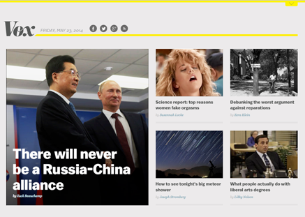
But Vox are also using content curation as a way of building a content mix, as this homepage (above) shows. Here, they pair a super-dull Russia and China story (good for credibility) alongside an orgasm story (good for clicks). Overall, I sense the desire to have a slice of Vice’s now very substantial content marketing pie.
Vox use a more measured upper and lower-case European approach on their headlines: ‘How conspiracy theories explain political parties’. This typographic technique has less urgency, but a lot more conversational intimacy.

Like Buzzfeed, Vox’s business model is based on ‘native advertising’ or any other term used to describe ads that look like a bit like editorial. However, unlike Buzzfeed, it’s really hard to see which posts are ‘sponsored’, and which are not (see above).
Political authority and influence may be the motivation behind the site, but aside from the click-bait headlines it’s hard to detect any real sense of tone in the content.
Unlike established news sites, I don’t yet know what Vox believe in, other than an enthusiasm for Obamacare. We may be conditioned to it, but when it comes to politics, readers need to know what the brand believes in order to work out the true colour behind the journalism.
Overall, the Vox design direction is modern, but dull, with yellow keeping the site just inside the pop culture canon. From a business point of view, they have set out to claim the journalistic high ground, and go viral from there. Buzzfeed are attempting world domination the other way round, by taking the lowland masses first, and then attempting to scale the higher peaks.
What Buzzfeed may discover is that any title can slide downmarket. Making the journey in the other direction is altogether trickier.
Posted in: Uncategorized | Leave a Comment
