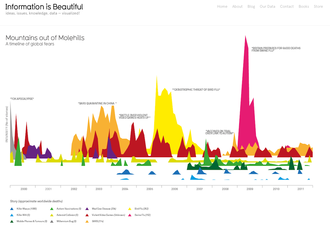
This chart shows the media’s history of hyping up crises and predicting we’re all going to die
March 2, 2013
Here is a breathtaking chart by David McCandless showing how badly the media tends to overhype “crises” that end up going nowhere.
It plots number of stories (left axis) against actual resulting deaths (horizontal axis) over time.
While it’s a pretty harsh indictment of press hysteria, it’s also rather reassuring that the various diseases we were told would imminently wipe us all out proved relatively harmless:
Posted in: Infographic of the day, News