March 31, 2014
The UK newspaper People closed their website a little while ago, writes Furthr’s Andy Cowles.
Launched with the idea that it would be ‘Buzzfeed for grown ups’, pretty much everything went wrong, according to this excellent reporting from of all places, Buzzfeed.Patrick Smith reports that there was a lack of identity, a lack of focus, and a complete failure to grasp how the native advertising business model works.
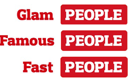
This lack of brand benefit is perfectly expressed in the website logo. The way it worked (or rather, didn’t), was that the People logo was preceeded by a rotating series of words; ‘Sporty’, ‘Famous’, ‘Glam’, ‘Funny’ and so on. The story underneath didn’t change, but the context did.
What this did was remove any trace of brand from the content beneath. The stories became entirely generic, no tone, no point of view, no recall.
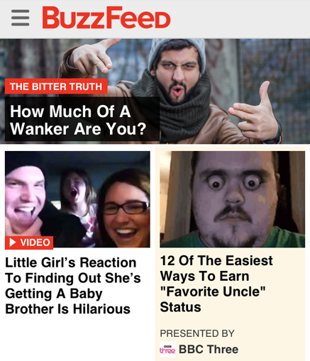
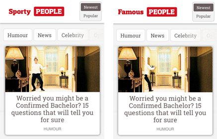
By way of contrast, this is Buzzfeed’s home screen from the very same day. Which, when you compare the lead stories of ‘Bachelor’ and ‘Wanker’, pretty well sums up why Buzzfeed’s tone is so sharp.
Posted in: News | Leave a Comment