Why no-code and AI are a match made in heaven


AI and no code will turbo-charge inclusion.

“It is fab to see AI introduced to this no-code CRM system. I gave it a test run yesterday. I created a new table. From one sentence, I could connect my new table to an existing one in the correct way. It made great suggestions in fields.”

Sofia Alvadia is principal transport operations officer at a local authority. She said she enjoys how AI boosts the leading no-code CRM system her organisation uses.

When confronted with a blank screen, Sofia used to feel unable to build her ideas. But by joining AI with a no-code CRM system, she can get started straight away.

“It is easy to use,” she said. “I can give the CRM systems prompts in plain English. The AI translates those requests.”

Sofia builds structured database schemas. She can create interfaces and application components. She can handle SQL queries and API integrations – all with natural language prompts. Harnessing AI via a no code platform expands the realm of problems that Sofia, 40, can now solve. All without code.


New collar workers

Right now, as little as one-quarter of one per cent of the world knows how to code.

“No code means more knowledge workers can turn their ideas into software,” says Nick Merry, product and partnerships director at Bristol-based DATA³. “They do not have to be tech graduates.”

An executive at IGM recently coined a new term for these workers. They are “new collar workers.” This new breed of employee can fill jobs that need advanced skills but not advanced degrees. It’s a potent way to fill a shortage in the workforce – especially in new and emerging high-tech fields. Think artificial intelligence, cybersecurity, electric vehicles and robotics.

Alongside no code, AI is exploding in popularity. The Tony Blair Institute recently described AI as a new industrial revolution. But entry-level data scientist salaries start near the six-figure mark. That means AI is out of reach for many SMEs. Unless you combine it with no code platforms.


Kacper Ciechorski, Develocraft: “AI is the game changer.”

No-code + AI is the most affordable way to put in place AI in your business. Together, it has the power to optimize any organizational KPI. If you want to boost sales, convert more leads, reduce churn, or optimize any other KPI, no code and AI is the answer.

“AI and No-code is like a marriage that brings solutions immediately. It is the future. It is the game-changer,” said Kacper Ciechorski, international partnership manager at Gdansk-based, software development agency Develocraft.

According to Gartner, 65% of applications developed this year will be using low or no code. It says the market is set to reach $65 billion market cap by 2026.

So how do AI and No code combine?

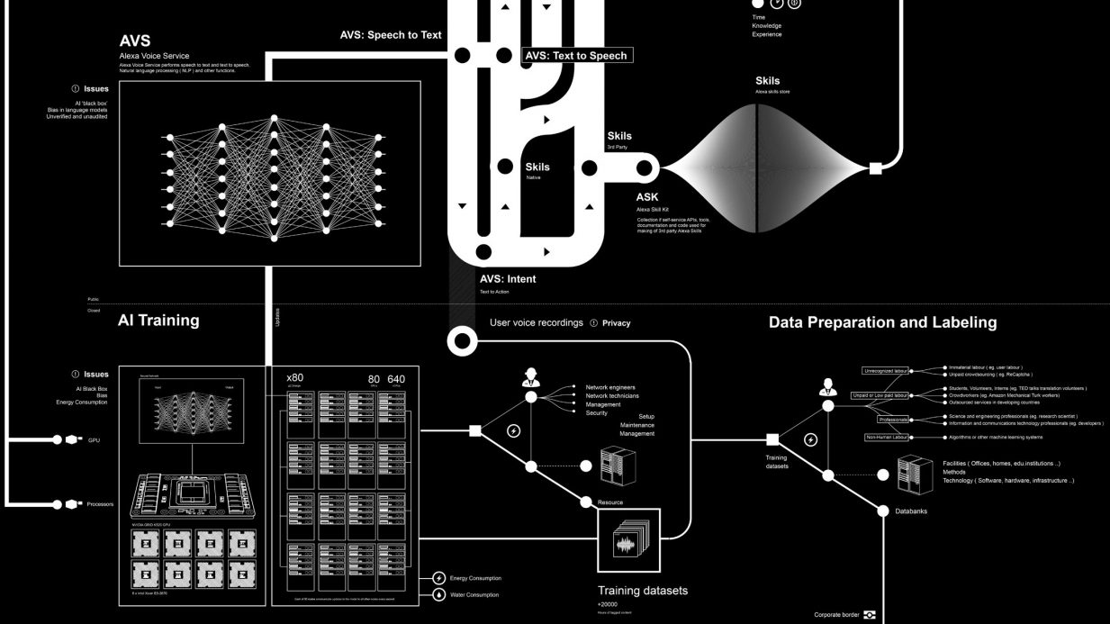
“Anywhere there is data, there’s an opportunity to create models. You can make predictions on that data,” said Nick Merry.

“Firms are taking OpenAI and lifting it into the eco-system of their company’s data. They use Open AI and train it on their own data set. It is not focused on the outside world. It is not accessible to anyone else beyond those four walls,” said Nick Merry.


Bake AI into applications

“You could have an inward feed from the outside world, rather than an outward feed. You can say, right, chatbot, you’ve seen how my business has performed over the last two years. Knowing what you know about the global economic situation, what do you think I’m going to do over the next two years? It looks at your internal data and then extracts external economic data. Then it profiles what it thinks will happen to you in the future.

“That is a single-use case. There are plenty of others,” said Nick Merry.

No-code is in an ideal position to bake AI into applications. AI can speed up no-code programming through AI-assisted code development (AICD). An AI-enabled function could be dragged-and-dropped to spin up a conversational chatbot, for example.

AI services like sentiment analysis, facial recognition, or voice-to-text are processed through cloud-based application programming interfaces (APIs). Integrating these libraries can be challenging, even for seasoned programmers. But no-code platforms can act as a “shim” or intermediary layer between different components. They can shield the user from the complicated details of integrating AI services.

Plenty of big no and low-code platforms are using AI. Mendix and OutSystems have integrated ChatGPT into their platforms. Microsoft has put ChatGPT into its Power Platform, which includes a family of no-code products. It can generate simple applications by describing them. Salesforce’s Mulesoft makes it easier to integrate with popular AI APIs. Salesforce has Einstein GPT, a generative AI for customer relationship management.

Juji is a tool designed to make building A.I. chatbots as easy as creating a PowerPoint presentation. It uses machine learning to handle complex conversation flows. Using Juji, staff at the University of Illinois were able to create and manage their custom A.I. chatbot. It enabled them to scale their student recruitment operations.

GitHub, a software development hosting company, has created tools like GitHub Copilot. It acts as an autocomplete function for coders, speeding up their work.

DeepMind, a subsidiary of Alphabet, Google’s parent company, has gone a step further. It boasts an A.I. tool capable of writing complete code to solve complex problems posed to it with normal speech.

Other popular no-code tools include Webflow, Bubble, and Carrd. You can use them to build websites and landing pages. Adalo works for mobile applications. Landbot, FlowXO, and Chatbot.com help build chatbots. Zapier or Integromat are for integrations. Shopify for E-Commerce. MemberStack or MemberSpace are for memberships. Mailchimp or Mailjet for newsletters. You can build CRM and ERP systems with Agilebase.


Your data matters

It seems nothing can stop AI and no code. Well, almost nothing.

The truth is, AI is only as good as the data you point it at. The state of the business world’s organisational data is proving a problem. Accenture CEO Julie Sweet said most organisations are not ready for AI. They lack the data architecture.

“Most companies do not have mature data capabilities,” she told the Financial Times at the end of last year. “If you can’t use your data, you can’t use AI. “

Up to 90% of the data held within enterprises is unstructured. That means it requires a heavy amount of tagging to become useful for AI.

Images, audio files, and text documents don’t have a predefined data model. For machine learning algorithms to extract insights, this data must be labelled, categorized and structured. But the effort needed to handle large volumes of unstructured data is high. Many companies struggle to prepare data to train AI systems. The lack of usable training data is a major barrier in integrating AI capabilities. Overcoming this requires investment.

No-code AI tools and platforms can help. No-code can automate parts of data labelling, categorization and structuring. All without needing extensive technical skills. This reduces the effort required for transforming unstructured data into usable training data. And that means a company can start to leverage the potential of AI in their business.

“In three to five years we expect AI to be a big part of our business,” said Julie Sweet.

Sofia Alvadia at WECA is already on board the no code + AI revolution.

“I love it,” she said. “I can create my own system from an Excel spreadsheet. Then I can query the data in lots of interesting ways. It has saved me weeks. It gives us so much flexibility and freedom to create what we need. It’s incredible..”

Posted in: Uncategorized | Leave a Comment

Data visualization best practices: Designing for impact and understanding

Data visualization must have impact

As with any communication, your data visualization must have impact. When we say impact, we mean what readers perceive in the first two seconds of looking at a chart or infographic. If they cannot grasp its basic meaning in two seconds, they will not engage with the data.

.The art of data visualization requires a thoughtful approach, utilizing best practices to craft visuals that catch the eye and provide clear and valuable information. This article delves into the essential data visualization best practices that will help you design for impact and understanding.

Know your audience and purpose

Understanding your audience and the purpose of your data visualization is the foundation of impactful design. Consider who will view the visualization and what insights they need to gain from it. Are you presenting to executives, analysts, or the general public? Tailoring the visualization to suit your target audience’s knowledge level and preferences ensures it resonates with them.

For instance, if you are presenting to a non-technical audience, opt for simple and intuitive visuals focusing on the main message. Limit jargon and define any technical terms clearly. On the other hand, analysts might require more detailed and interactive visualizations to explore the data thoroughly. Understanding context is key.

Choose the right visualization type

Selecting the appropriate visualization type is crucial for conveying information effectively. Different types of data lend themselves to specific visualization formats. Common visualization types include bar charts, line graphs, pie charts, scatter plots, heatmaps, and tree maps, among others.

Use bar charts for comparing discrete categories, line graphs for showing trends over time, pie charts for displaying proportions, and maps for communicating geographic data. Scatter plots and heat maps can reveal correlations and clusters in large datasets. Choosing ineffective visuals can misrepresent data or convolute insights. So be mindful of avoiding misleading or cluttered visuals that can confuse readers and distort the message.

Simplify and declutter

Simplicity is key to impactful data visualization. Declutter your visuals by removing unnecessary elements and focusing on critical information. Keep the design clean, using a limited colour palette, ample negative space, and straightforward labels.

Avoid excessive use of decorations, backgrounds, or 3D effects that can distract from the data itself. Embrace whitespace to enhance clarity and guide the readers’ focus to the essential elements of the visualization. Remove chart junk that doesn’t add informational value. Remember, restraint strengthens visual impact.

Tell a compelling data story

Data storytelling involves organizing your data visualization in a logical sequence to create a compelling narrative. Begin with a clear and informative title that sets the context and objective of the visualization. Guide the readers through the data systematically, highlighting significant trends, outliers, or patterns.

A well-crafted data story helps readers make sense of the information presented and fosters a deeper understanding of the data’s implications. Use annotations, captions, and contextual information to provide meaningful insights. Craft a storyline that connects with the audience’s interests and concerns.

Emphasize data accuracy and integrity
Data accuracy and integrity are paramount in data visualization. Ensure that the data used in your visualization is accurate, up-to-date, and from reliable sources. Misleading or inaccurate data can lead to misinterpretations and erode trust in your visualizations.

Provide transparent data sources and methodology to assure readers of the visualization’s credibility. When presenting data comparisons or percentages, verify that they are calculated correctly and represent a fair and accurate representation of the information. Data transparency builds confidence.

Optimize for mobile and responsive devices

With the increasing use of mobile devices, optimising your data visualizations for mobile viewing is essential. Ensure that your visuals are responsive and adapt seamlessly to various screen sizes and orientations.

Use responsive design techniques to resize and reorganize visual elements based on the device’s screen width. Arrange elements to accommodate vertical scrolling on narrow screens. This practice ensures that your visualizations remain accessible, legible, and impactful across various devices.

Incorporate interactivity thoughtfully

Interactive data visualizations enable readers to engage with, explore, and filter the data to draw their insights. However, interactivity should be used thoughtfully, as excessive features can overwhelm readers and distract from the main message.

Consider the audience’s technical proficiency when incorporating interactivity. For non-technical audiences, provide clear and intuitive interactions that enhance understanding without complicating the visualization. Tech-savvy users will expect more advanced filtering, drilling down, and customization capabilities.

Leverage colour and visual hierarchy

Colour is vital in guiding the readers’ attention and understanding of data visualizations. Use colour strategically to highlight essential data points, trends, or categories. Establish a visual hierarchy by assigning different colours and opacities to various data elements based on their significance.

However, exercise caution in colour selection to avoid misrepresentations or visual overload. Stick to a limited colour palette with enough contrast, and ensure that colour choices are accessible to readers with colour vision deficiencies. Use other encodings like shape and size as well.

Test and iterate

Designing impactful data visualizations is an iterative process. Test your visualizations with a sample audience to gather feedback and identify potential areas of improvement. Assess whether the intended message is conveyed clearly and whether readers can interpret the data as intended.

Be open to refining and adjusting your visualization based on feedback to enhance its effectiveness and overall impact. The visualization design lifecycle should include continuous testing, assessment, and refinement.

Encourage data literacy

Promote data literacy among your audience to maximize the impact of your data visualizations. Provide explanations and definitions of critical terms or metrics used in the visualization. Offer resources, such as guides or tutorials, to help readers interpret data visuals effectively.

Educating your audience on correctly reading and deriving insights from data visualization empowers them to unlock the potential of data-driven decision-making. Viewers who understand the basics of data analysis can gain much more value.

Foster trust with transparency

Trust is essential for data visualization acceptance. Being transparent about your data sources, collection methods, and any limitations or uncertainties builds credibility. Admit shortcomings in the data and explain any cleaning or assumptions made.

Trustworthy data visualization instils confidence in readers that the insights presented are accurate and worthy of informing their decisions and perspectives. Strive for transparency.

Master visualization design principles

Understanding key design principles and techniques is fundamental to creating high-impact data visualizations. Master concepts like visual hierarchy, typography, colour theory, chart layout, proportional comparisons, and visual encoding to make appropriate design choices.

Leverage principles like the proportion of ink, accessible colour palettes, and intuitive chart types purposefully based on your message and audience. Solid design skills elevate visualizations.

Conclusion

Designing for impact and understanding in data visualisation is crucial to communicate insights and drive informed decision-making effectively. By knowing your audience, simplifying visuals, telling compelling data stories, and emphasizing data accuracy, you can create impactful data visualizations that resonate with your viewers. Leveraging interactive features, optimizing for mobile, and thoughtfully incorporating colour and hierarchy further enhance the effectiveness of your visualizations.

With a commitment to testing, iterating, transparency, and promoting data literacy, you can create data visualizations that leave a lasting impression on your audience, facilitating understanding and driving meaningful action.

As you strive to design high-impact data visualizations, remember that the ultimate goal is to empower your audience to gain valuable insights from data, make informed decisions, and unlock the potential of data-driven decision-making. By adhering to data visualization best practices, you can elevate the effectiveness and impact of your visualizations, ensuring that they resonate with your audience and drive positive outcomes.

Related Stories 

Effective content is easy if you use this one secret technique favoured by experts

The simple secret of redesigning websites? Headlines are EVERYTHING

Everything you need to know about advertising on one slide ANNOTATED

Try this sniff test to see if your business stands out

Business intelligence tools give your business a competitive advantage

6 undeniable reasons why Power BI is a good skill to have for any marketer

About the author

My name is Andy Pemberton. I am an expert in data visualization. I guide global clients such as Lombard Odier, the European Commission and Cisco on the best way to use data visualization and then produce it for them: reports, infographics and motion graphics. If you need your data visualized contact me at andy@furthr.co.uk or call 07963 020 103

Posted in: Infographic by Furthr | Leave a Comment

Why data visualization should be a core competency for every organization


In today’s highly competitive business landscape, leveraging data analytics is essential but insufficient. To truly gain an edge, organizations must build competency in data visualization – the graphical representation of information – as a core capability woven throughout operations. There are compelling reasons why every company should prioritize developing internal data visualization expertise.


The data deluge requires visualization

The volume of business data being generated is exploding exponentially. This “big data” offers tremendous potential value but also presents analysis paralysis. Data visualization provides superior comprehension of large, complex data sets. Interactive charts, graphs and dashboards created with business intelligence (BI) tools like Tableau allow employees to identify trends, outliers and patterns that drive insights quickly. Dataviz enhances productivity over manual analysis. Additionally, visualizations improve accessibility for team members unfamiliar with querying databases directly. With proper training, even non-technical staff can leverage data visualization to unlock insights from company data.


Highlighting crucial signals in the noise

Like finding a needle in a haystack, key insights are often lost across massive datasets. Powerful data mining algorithms can help but still require human context. Proficient data visualization skills enable analysts to highlight the most meaningful signal from the noise. Interactive data dashboards also allow the cross-filtering large datasets on the fly to pinpoint correlations supporting business decisions. Advanced visual analytic techniques enable users to drill down into granular data and observe how indicators interact at a detailed level.


Democratizing data discovery across the organization

Traditionally, data analysis has been confined to specialists. But modern self-service BI tools like Power BI, Looker and Sisense enable more employees to access, visualize and independently explore data through user-friendly dashboards. This drives more comprehensive data literacy across the organization, empowering localized decision-making. Data visualization is critical for democratization. It removes barriers to exploring data for non-technical professionals. With proper access controls, dataviz can be securely distributed across business units based on needs. The future of business intelligence relies on putting insights directly into the hands of frontline decision-makers.

Two women look at their smartphone and laugh


Data storytelling for memorable and impactful analysis

Raw data alone fails to engage diverse audiences. Data visualization tools like D3.js allow analysts to craft compelling data-driven narratives using interactive infographics, dashboards and reports tailored to specific groups. Data storytelling makes data analysis resonate emotionally and drive change. Strong dataviz skills unlock this. Creative visualizations and compelling narratives enable data scientists to connect analytics to specific business goals and priorities for various stakeholders. The best analysis lacks impact without thoughtful contextualization and presentation.


Rapid response enabled by real-time data visualization

Real-time data visualization enables the instant monitoring of business operations and market dynamics via streaming dashboards. Rapid responses then become possible when emerging trends, risks or priorities are made visible as they occur. The ability to create real-time analytics dashboards separates the competition. Real-time dataviz should be integrated into business processes organization-wide, from supply chain to sales. The low latency empowers teams to take action at the pace of today’s markets.


Making complex analytics intuitive

Many managers struggle to apply advanced analytics like predictive modelling, machine learning and data science. Powerful data visualization makes these techniques more intuitive and accessible to business users without technical backgrounds. Interactive visual models build trust in data science recommendations applied to business decisions. Clean, engaging dataviz dashboards allow any employee to interact with AI predictions and prescriptions comfortably. The more human-centred data science becomes, the faster it generates returns.


Future-proofing for data visualization innovation

We’re only seeing the potential for data visualization innovation and applications. Augmented analytics, predictive analytics, location intelligence, virtual reality and more will reshape dataviz. Future-focused firms need the competency to adapt continuously. An in-house team removes reliance on external providers. Building institutional knowledge in emerging data visualization now allows your organization to ride the wave of innovation rather than being left behind. Fostering cutting-edge expertise prepares companies for the next generation of data visualization possibilities.


Building a dedicated internal capability

As data analytics matures, demand for multi-disciplinary data visualization expertise is soaring but talent remains scarce. Developing an internal capability delivers cost efficiencies while also enabling proprietary competitive advantages. Retaining institutional knowledge is critical with high demand for these skills. Organizations should invest in creating interdisciplinary data visualization teams combining data science, design and business acumen. A strong capability will pay dividends as data volumes and complexity rise.


Integrating data visualization throughout the business

To fully benefit, data visualization cannot remain a siloed function. It should be tightly integrated into all business operations using capabilities like embedded BI. Leadership must promote a data visualization culture across teams. With the right infrastructure, data can be democratized across the company safely to empower broad organic adoption. Change management helps drive processes to become more data-driven through visualization.


Making data visualization a high-level priority

Gaining buy-in across the C-suite and aligning key stakeholders is critical to building sustainable data visualization competency. A clear strategic vision and investment plan should inform the organizational rollout. Hiring specialized data visualization leadership provides expertise and focus. Above all, executive sponsorship gives dataviz initiatives credibility and resources to execute.

With responsive leadership and a focused strategy, the proteins that make data truly actionable and accessible – interactive visualizations combined with compelling storytelling – transform analytics. Companies prioritising building organizational competencies in data visualization will be poised to leverage data for decisive strategic advantages. Is dataviz at the core of your company’s strategy?

Related Stories 

Effective content is easy if you use this one secret technique favoured by experts

The simple secret of redesigning websites? Headlines are EVERYTHING

Everything you need to know about advertising on one slide ANNOTATED

Try this sniff test to see if your business stands out

Business intelligence tools give your business a competitive advantage

6 undeniable reasons why Power BI is a good skill to have for any marketer

About the author

My name is Andy Pemberton. I am an expert in data visualization. I guide global clients such as Lombard Odier, the European Commission and Cisco on the best way to use data visualization and then produce it for them: reports, infographics and motion graphics. If you need your data visualized contact me at andy@furthr.co.uk or call 07963 020 103

Posted in: Infographic by Furthr | Leave a Comment

5 ways data visualization is transforming business decision-making

How data visualization is being used in business for decision making

Data visualization has become indispensable for analyzing data and gaining actionable insights to inform business decisions. As data grows increasingly complex, data visualization provides a more intuitive way to explore trends, spot patterns, and communicate findings. Let’s examine five key ways interactive dataviz is revolutionizing business decision-making.

1. Identifying insights from complex datasets

The volume of data businesses collect is exploding. This “big data” can offer tremendous analytical value but make it challenging to pinpoint meaningful insights. Data visualization software like Tableau allows employees to import, combine, and visualize complex datasets using interactive charts, graphs and dashboards. By visualizing correlations, outliers, and trends in a format more accessible for the human brain to digest, key insights emerge more quickly. Dashboards make it simple for managers to toggle between data models, views, and variables to support decision-making.

2. Demystifying data science and AI

Data science and AI have become essential business capabilities. However, many managers without technical backgrounds find their processes opaque. Data visualization is a powerful tool for demystifying advanced analytics. Platforms like MATLAB enable data scientists to create visual models of machine learning algorithms, conveying how they work intuitively. Managers can also use tools like DataRobot to interactively evaluate AI predictions and recommendations for business datasets via dataviz dashboards. This builds trust and adoption of data science.

Data viz and decision making

3. Real-time monitoring and forecasting

Real-time data visualization enables up-to-the-minute monitoring of business operations and external market forces relevant to an organization. Platforms like Databricks accept streaming, real-time data inputs and rapidly generate visual metrics and KPIs to enable faster responses. Real-time dashboards that alert managers the moment an anomaly occurs facilitate rapid intervention. Real-time data also allows advanced predictive data analytics using machine learning algorithms to forecast trends – which managers can assess via dataviz interfaces.

4. Data-driven storytelling and reporting

Data storytelling enhances the impact of data analysis by crafting compelling narratives tailored to engage different audiences. Managers can use data visualization tools like D3.js to build interactive infographics that bring datasets to life in memorable ways. Embedding visual data explanations directly into reports, presentations, and emails boosts engagement and retention of insights. Data-driven storytelling makes data analysis resonate across the organization to drive change.

5. Decentralizing data exploration

Traditionally, business intelligence and data analytics have been centralized functions. But modern self-service analytics platforms like Power BI, Looker and Sisense enable more employees to visualize and independently explore data relevant to their roles using interactive dashboards. This drives more comprehensive data literacy across teams to empower localized decision-making. Democratization and decentralization of dataviz unlocks an agile analytical culture.

The bottom line is that data visualization makes complex data accessible and actionable. These examples illustrate that integrating interactive dataviz throughout workflows and operations unlocks more profound data-driven decision-making. Any business can capitalize on data with the right visualisation strategies to outperform competitors.

Related Stories 

Effective content is easy if you use this one secret technique favoured by experts

The simple secret of redesigning websites? Headlines are EVERYTHING

Everything you need to know about advertising on one slide ANNOTATED

Try this sniff test to see if your business stands out

Business intelligence tools give your business a competitive advantage

6 undeniable reasons why Power BI is a good skill to have for any marketer

About the author

My name is Andy Pemberton. I am an expert in data visualization. I guide global clients such as Lombard Odier, the European Commission and Cisco on the best way to use data visualization and then produce it for them: reports, infographics and motion graphics. If you need your data visualized contact me at andy@furthr.co.uk or call 07963 020 103

Posted in: Infographic by Furthr | Leave a Comment

10 data visualization trends to watch for in 2023 and beyond

New developments in data visualization

Data visualization has become indispensable for analyzing and communicating data in the modern digital era. As data volumes grow exponentially, visualization provides a more efficient way to explore, understand, and present complex datasets. Data visualizations utilize the power of human visual perception to identify patterns, relationships and insights that might otherwise remain hidden in rows of numbers and text.

Looking ahead, we can expect data visualisation to be more prominent in supporting data-driven industry decision-making. Here are key trends that will shape the world of data viz in 2023 and beyond:


1 The rise of interactive data visualizations

Static charts and graphs are no longer enough. Interactive data visualizations allow users to drill down into the data, highlight specific points, filter different variables, and customize the view for deeper exploration. Interactive capabilities turn data exploration into an engaging hands-on analytics activity. Dashboards with cross-filters give business analysts superpowers to slice data on the fly for rapid insights. These rich capabilities make interactivity a must-have for leading visualization tools.


2 Augmented and virtual reality will enhance data immersion

By overlaying data visualizations onto real-world environments, augmented reality (AR) and virtual reality (VR) will take data immersion to a new level. Imagine walking through a manufacturing plant and having real-time data on equipment performance pop up before your eyes, or viewing 3D data structures and manipulating them with your hands. Forward-looking companies like General Motors use AR to visualize assembly line data and optimize workflows. The spatial dimension of AR/VR provides a natural match for exploring complex informational spaces.


3 More focus on automated insights and intelligent analysis

Artificial intelligence will increasingly power data visualisation, assisting with automated analysis. Machine learning algorithms can now process massive datasets to highlight critical data points, detect anomalies and patterns, forecast trends, and generate insights faster than humans. AutoML tools make complex analytical workflows accessible to citizen data scientists. Expect more innovative recommendation engines to suggest optimal graph types based on the data structure. Advances in natural language generation will help turn visual data discoveries into automated narrative reports.


4 Data storytelling will become more prominent

Data storytelling, which presents critical data insights in an engaging narrative flow tailored to a specific audience, is going mainstream. Storytelling approaches make data more memorable and impactful. Leading companies are building in-house data journalism teams to unearth compelling stories from their data. Data artists are creating innovative data comics, zines and physical installations as creative storytelling formats. Data storytelling will be a crucial skill to develop to make analytics relevant across the organisation.


5 Democratization of data analysis

Self-service analytics and no-code tools are democratizing access to data exploration beyond technical specialists. More employees can now create their own interactive dashboards relevant to their workflow using drag-and-drop interfaces. Natural language interfaces allow asking questions of data conversationally in plain English to get customized visualizations. Collaborative features support data sharing and embedding for decentralized analytics. Democratization will spread data literacy and a culture of data-driven decision-making across teams.


6 Focus on streaming and real-time data

The ability to analyze real-time and streaming data unlocks immense value, from detecting cyber threats to monitoring supply chain disruptions to leveraging insights for just-in-time decisions. New techniques focus visualization on displaying what is happening across fast-changing data. Real-time dashboards will increasingly become operations centres for time-sensitive domains like network ops, transportation, e-commerce and IoT. Support for streaming data inputs will allow sharper predictive algorithms to boost forecast accuracy.


7 Data visualization applications will diversify

While business analytics has been the traditional stronghold, data visualization will continue expanding into diverse disciplines. Data journalism has brought increased transparency by visualizing patterns in public datasets. More data artists are using creative visualization for social commentary. Visualization plays a growing role in science education, healthcare communication, policy advocacy and data activism. Expect more startups to apply dataviz to help everyday users track their data from health, finance, productivity and social media.


8 Multi-modal approaches will provide unique perspectives

No single visualization can capture every data insight from every angle. Combining multiple graphs, charts, maps, animations, and illustrations provides a richer perspective. Linked multi-modal views allow toggling between different visual metaphors for the same dataset. Animated transitions animate changes between states. Hybrid visualization blends charts with graphical abstractions like node-link diagrams. The synergy of multiple visualization types will enable more holistic data exploration.


9 Ethical considerations will be front and centre

Like any technology, data visualization can be misused if poorly designed or implemented without care. Ethical considerations will receive greater attention to avoid issues like misleading designs, biased assumptions, privacy violations and improper interpretations. Responsible dataviz follows principles like showing data transparency, accounting for uncertainty, maintaining context and considering diverse perspectives. Dedicated data ethicists can help guide organizations in upholding ethics.


10 Ubiquitous deployment on more platforms and devices

Data visualizations are breaking free of desktop screens to be viewable on the platforms where users spend their time. Dashboards optimized for mobile phones and tablets support on-the-go decision-making. Data-driven apps put tiny data graphics at your fingertips. Omnichannel publishing means creating visualizations once for seamless web, mobile and print access. Connected TVs and intelligent assistants like Alexa enable ambient data displays. Embedding and sharing expand dataviz reach. The ubiquity of dataviz promotes pervasive intelligence.

In summary, data visualization is entering an era of unprecedented innovation and expanded impact across industries. To stay competitive, organizations must actively monitor developments on the data visualization front and be ready to adopt the most valuable advancements. With the right strategies, data visualization can become a true force multiplier for leveraging data as a core business asset and driving transformative outcomes.


Related Stories 

Effective content is easy if you use this one secret technique favoured by experts

The simple secret of redesigning websites? Headlines are EVERYTHING

Everything you need to know about advertising on one slide ANNOTATED

Try this sniff test to see if your business stands out

Business intelligence tools give your business a competitive advantage

6 undeniable reasons why Power BI is a good skill to have for any marketer

About the author

My name is Andy Pemberton. I am an expert in data visualization. I guide global clients such as Lombard Odier, the European Commission and Cisco on the best way to use data visualization and then produce it for them: reports, infographics and motion graphics. If you need your data visualized contact me at andy@furthr.co.uk or call 07963 020 103

Posted in: Infographic by Furthr | Leave a Comment

Mastering data visualization: Unleashing the power of visual insights

Mastering Data Visualization

The ability to transform complex data into insightful and compelling visualizations has become a crucial skill for professionals across industries. Data visualization, the art of presenting information visually, empowers individuals and organizations to gain valuable insights, make informed decisions, and effectively communicate complex ideas to a broader audience. From interactive data visualizations to captivating infographics, the world’s leading data visualization website is at the forefront of revolutionizing how we perceive and understand data.


Data visualization: An intuitive journey

At the heart of data visualization lies the quest to make data accessible and understandable. As the world generates an unfathomable amount of data daily, turning raw information into meaningful insights has never been more critical. Data visualization bridges the gap between data and understanding, empowering professionals to navigate vast datasets and unlock patterns, trends, and relationships that may otherwise remain hidden in spreadsheets.

The world’s leading data visualization website is dedicated to equipping beginners and seasoned professionals with the necessary tools and knowledge to master this art. With a wealth of resources and cutting-edge visualization tools, it enables users to unleash the power of visual insights and harness the true potential of their data.


The best data visualization tools for beginners

Selecting the right tools is essential for those embarking on their data visualization journey. The world’s leading data visualization website recognizes this and offers guidance on the best data visualization tools for beginners.

Tableau Public, a user-friendly and intuitive tool, ranks high. Its drag-and-drop interface and diverse visualization options allow beginners to create interactive visualizations effortlessly. Similarly, Microsoft Power BI is another top contender, providing seamless integration with Microsoft products and an extensive library of templates.

Chart.js is a popular choice for coding enthusiasts, offering flexibility and customization in visualizations. RawGraphs, with its emphasis on visual mapping, grants users the freedom to experiment with artistic and unconventional visualizations.


Unleashing interactivity and data storytelling

Interactive data visualizations are an essential aspect of modern data analysis. The world’s leading data visualization website recognizes the significance of interactivity and emphasizes its role in enabling users to dynamically explore and derive insights from visualizations. Interactivity allows users to manipulate data, zoom into specific data points, and gain a deeper understanding of the underlying information.

But data visualization is more than just numbers and charts; it is a powerful storytelling tool. The website delves into the art of data storytelling, highlighting how a well-crafted narrative around visualizations can captivate audiences and convey information with lasting impact. By structuring visualizations logically and providing context, data visualization transcends mere data presentation and becomes a compelling narrative that resonates with audiences.


The rise of infographics: merging data and design

Infographics have emerged as a preferred medium for data visualization in a world inundated with information. The website recognizes the rising significance of infographics as an effective means to convey complex information aesthetically pleasingly. With its user-friendly tools and customizable templates, users can effortlessly create stunning infographics that merge data and design seamlessly.


Data visualization for business: Driving informed decision-making

Businesses worldwide are leveraging data visualization to drive informed decision-making. The website emphasizes the impact of data visualization in the corporate world, from analyzing sales performance to identifying market trends and customer behaviour. By presenting data in visually appealing formats, data visualization enables executives and decision-makers to grasp critical insights and shape business strategies with precision.


From data to clarity: Mastering best practices

Mastering data visualization is not just about selecting the right tools; it is about adhering to best practices. The world’s leading data visualization website lays out essential guidelines to ensure that visualizations are accurate, precise, and effective. Simplicity, colour choice, and consistency are just some key principles that guide users in crafting impactful visualizations.

Furthermore, the website explores data cleaning and preparation, emphasizing the need to ensure data accuracy and credibility. By handling missing values and rectifying errors, users can lay a strong foundation for their visualizations and ensure that the insights drawn are reliable and meaningful.


Data visualization trends: Evolving the art

As technology evolves, so does data visualization. The website remains at the forefront of emerging trends, highlighting the latest advancements in the field. From augmented reality visualizations to interactive data storytelling, users can explore cutting-edge techniques that push the boundaries of data visualization.


Conclusion

Mastering data visualization is a transformative journey that empowers individuals and organizations to unlock the true potential of their data. The world’s leading data visualization website is a guiding light, illuminating the path to insightful visualizations and impactful storytelling. From interactive dashboards to captivating infographics, the website equips users with the tools and knowledge to present data with clarity and power.

In an era dominated by information overload, data visualization emerges as the beacon of clarity amidst the storm. By embracing this art, professionals across industries can navigate the vast seas of data and chart a course toward informed decision-making and meaningful communication.

As we step into a data-centric future, the power of data visualization grows stronger, allowing us to uncover the secrets hidden within data and rewrite the narrative of progress and innovation.

Related stories

Try this sniff test to see if your business stands out

Business intelligence tools give your business a competitive advantage

6 undeniable reasons why Power BI is a good skill to have for any marketer

Everything you need to know about advertising on one annotated slide

About the author

My name is Andy Pemberton. I am an expert in data visualization. I guide global clients such as Lombard Odier, the European Commission and Cisco on the best way to use data visualization and then produce it for them: reports, infographics and motion graphics. If you need your data visualized contact me at andy@furthr.co.uk or call 07963 020 103

Posted in: Infographic by Furthr | Leave a Comment

What are the best data visualization tools for beginners?

Data visualization is a powerful way to present complex data in a visually compelling manner, aiding understanding and decision-making. As data visualization gains traction across industries, beginners in the field seek guidance on the best tools to kick-start their journey. In this article, we will explore the top data visualization tools that cater to beginners, providing a comprehensive overview of their features and functionalities.

Data visualization: A brief overview

Before diving into the best tools for beginners, let’s briefly review the importance of data visualization. Data visualization helps transform raw data into interpretable charts, graphs, and dashboards, enabling users to spot trends, patterns, and insights with greater clarity. By presenting data visually, these tools empower individuals to make data-driven decisions.

Data visualization has become a critical skill in various industries, including marketing, finance, healthcare, and more. From representing sales data to analyzing market trends, professionals across domains rely on data visualization to easily communicate complex information.

Tableau Public

Tableau Public is one of the most popular data visualization tools for beginners and professionals. It offers an intuitive drag-and-drop interface, making it easy for beginners to create interactive visualizations without the need for coding knowledge. Tableau Public allows users to connect to various data sources, including Excel and CSV files, and create dynamic dashboards and storyboards to share insights with a broader audience.

With Tableau Public’s vibrant community, beginners can access a wealth of tutorials, resources, and user-generated content, allowing them to learn and grow their data visualization skills. Additionally, the tool offers a free version, making it accessible to users at all levels of expertise.

Microsoft Power BI

Microsoft Power BI is another beginner-friendly data visualization tool known for its seamless integration with other Microsoft products. It provides users with a range of data connectors to import data from different sources, and its user-friendly interface allows for the easy creation of interactive reports and visualizations. Power BI offers a vast library of pre-built templates and visualizations, making it ideal for those starting their data visualization journey.

Power BI’s deep integration with Microsoft Excel, a data analysis tool, sets it apart. Beginners familiar with Excel will find it effortless to transition to Power BI, making it a popular choice among professionals in finance and analytics.

Google Data Studio

Google Data Studio is a free, cloud-based data visualization tool that integrates well with Google’s suite of products. It enables users to create real-time, interactive dashboards and reports using data from various sources, such as Google Analytics, Google Sheets, and more. Google Data Studio’s drag-and-drop interface is beginner-friendly, allowing easy sharing and collaboration with team members.

One of the key advantages of Google Data Studio is its collaborative nature, allowing multiple users to work together in real time on the same visualization project. This feature is beneficial for teams working on data analysis and reporting.

Chart.js

For beginners with a programming background, Chart.js is an excellent choice. It is an open-source JavaScript library that allows developers to create responsive and customizable charts and graphs effortlessly. Chart.js supports various chart types, including line charts, bar charts, pie charts, and more, making it a versatile tool for data visualization enthusiasts who prefer coding over graphical interfaces.

With its extensive documentation and active community, beginners can find ample resources and examples to kick-start their Chart.js journey. The library’s simplicity and versatility make it an attractive option for those seeking complete control over the visual aspects of their data representations.

Infogram

Infogram is a user-friendly data visualization tool that focuses on creating stunning infographics and charts. It offers a wide range of customizable templates, making it easy for beginners to create visually appealing and informative graphics without any design skills. Infogram allows for easy data import from spreadsheets and cloud storage, making it a go-to choice for beginners looking to create impressive visualizations quickly.

With Infograme’s extensive library of icons, images, and maps, users can create visually engaging infographics to present data aesthetically pleasingly. The tool’s straightforward interface and seamless sharing options make it a favourite among marketers, educators, and content creators.

Plotly

Plotly is a powerful data visualization library that supports multiple programming languages, including Python, R, and JavaScript. It offers various charts, graphs, and 3D visualizations, making it an excellent tool for beginners with coding expertise who seek versatility and interactivity. Plotly’s community and documentation provide ample resources for beginners to get started and explore advanced visualization techniques.

The library’s interactive capabilities, including zooming, panning, and hover interactions, allow users to delve deeper into their data and gain valuable insights. Plotly’s integration with popular programming languages and data analysis tools makes it an attractive option for data scientists and researchers.

Datawrapper

Datawrapper is a straightforward tool that focuses on creating interactive charts and maps for storytelling and presentations. It allows beginners to develop engaging visualizations with minimal effort. Datawrapper’s intuitive interface and step-by-step process make it ideal for beginners who want to create visually appealing and informative visualizations quickly.

One of Datawrapper’s standout features is its responsiveness, ensuring visualizations look great across various devices and screen sizes. Beginners prioritising user-friendly tools and responsive design will find Datawrapper an excellent fit for their data visualization needs.

RawGraphs

RawGraphs is a unique data visualization tool that emphasizes the visual mapping of data. It allows beginners to create custom visualizations by importing their data and visually mapping it to various chart types. RawGraphs is helpful for users who wish to experiment with unconventional and artistic visualizations.

The tool’s open-source nature and ease of use make it a playground for creativity, allowing beginners to explore data visualization beyond standard chart types. RawGraphs provides an avenue for those who seek to tell engaging data stories through unique and visually compelling representations.

Conclusion

Data visualization is an essential skill for professionals in various fields, and choosing the right tool is crucial for beginners embarking on their data visualization journey. From the user-friendly Tableau Public and Microsoft Power BI to the coding-friendly Chart.js and Plotly, there are tools to suit every beginner’s preference and expertise.

Aspiring data visualization enthusiasts should start with a tool that aligns with their existing skills and gradually explore other options as they become more comfortable. Whether a beginner prefers drag-and-drop interfaces or enjoys coding their way to stunning visualizations, the data visualization tools listed above offer a great starting point.

Remember, learning data visualization is not about mastering tools; it’s about understanding the underlying data, storytelling, and presenting insights. With practice and dedication, beginners can unleash the power of data visualization and unlock the potential to communicate complex information with clarity and impact.

Related Stories 

Effective content is easy if you use this one secret technique favoured by experts

The simple secret of redesigning websites? Headlines are EVERYTHING

Everything you need to know about advertising on one slide ANNOTATED

Try this sniff test to see if your business stands out

Business intelligence tools give your business a competitive advantage

6 undeniable reasons why Power BI is a good skill to have for any marketer

About the author

My name is Andy Pemberton. I am an expert in data visualization. I guide global clients such as Lombard Odier, the European Commission and Cisco on the best way to use data visualization and then produce it for them: reports, infographics and motion graphics. If you need your data visualized contact me at andy@furthr.co.uk or call 07963 020 103

Posted in: Infographic by Furthr | Leave a Comment

How data visualization works: Turning complexity into clarity

A woman looks at data visualization on her phone

Data visualization is an indispensable tool for presenting complex data in a visually appealing and understandable manner. It transforms raw information into interactive and insightful visuals, enabling businesses, researchers, and decision-makers to gain valuable insights and make data-driven decisions. In this article, we’ll explore how data visualization works and its crucial role in simplifying complex data sets.

Understanding the importance of data visualization

Data is abundant in today’s digital age, but raw data, in its raw form, can be overwhelming and difficult to interpret. Data visualization addresses this challenge by converting data into graphs, charts, and other visual representations that highlight patterns, trends, and relationships. The human brain is wired to process visuals more efficiently than raw data, making data visualization a powerful communication tool.

The power of data visualization lies in its ability to distil vast datasets into concise and understandable images. Visualizations provide an immediate and intuitive understanding of complex information, whether it’s a simple bar chart comparing sales figures across different regions or a sophisticated 3D interactive globe displaying global temperature changes over the past century.

Selecting the right data visualization tools

The first step in creating compelling data visualizations is choosing the appropriate tools for the job. Various data visualization software and programming libraries are available, each with its strengths and capabilities. Popular tools include Tableau, Power BI, D3.js, and Python’s matplotlib. The choice of instrument depends on factors such as data complexity, interactivity requirements, and the target audience.

For instance, Tableau is known for its user-friendly interface, making it an excellent choice for business professionals who may not have extensive technical skills. On the other hand, D3.js, a JavaScript library, is preferred by developers for its flexibility and ability to create customized visualizations. Understanding the strengths of each tool allows data visualization experts to select the best fit for their specific projects.

Identifying the target audience and purpose

Before creating data visualizations, it’s essential to understand the target audience and the purpose of the visualizations. Different stakeholders may have varying levels of technical expertise and require specific insights. For instance, executives may need high-level summaries, while analysts may require granular data. Understanding the purpose helps in selecting the most relevant visualizations to convey the intended messages.

For instance, suppose a data visualization expert is working on a project for a healthcare organization. In that case, they might need to create visualizations that present patient data to doctors and medical staff in a way that aids in identifying trends and making informed decisions. On the other hand, if the same expert is working on a marketing campaign analysis for an e-commerce company, they would need to create visualizations that help marketers understand customer behaviour and optimize their strategies accordingly.

Data cleaning and preparation

Data visualization is as good as the data it represents. Hence, data cleaning and preparation are critical stages in the process. This involves identifying and rectifying errors, handling missing values, and transforming data into a suitable format for visualization. Cleaning the data ensures accuracy and enhances the credibility of the visualizations.

Data cleaning can be a time-consuming and meticulous process, but it is essential for the integrity of the visualizations. Missing data, outliers, and inaccuracies can skew the insights drawn from the visualizations and lead to erroneous conclusions. Data visualization experts employ various data cleaning techniques, such as imputation and outlier detection, to ensure that the data is accurate and reliable.

Choosing the right visualization type

Numerous types of data visualizations are available, each suited for specific data types and analytical goals. Common visualization types include:

a. Bar charts and column charts: These are used to compare and display discrete categories or data points.
b. Line charts: Ideal for illustrating trends and changes over time.
c. Pie charts: Effective for displaying parts of a whole.
d. Scatter plots: Helpful in revealing correlations and relationships between two variables.
e. Heatmaps: Useful for showing the distribution of data across two dimensions using colours.
f. Treemaps: Suitable for displaying hierarchical data in nested rectangles.

Selecting the right visualization type depends on the data attributes and the insights that need to be conveyed. For example, suppose a marketing analyst wants to visualize the sales performance of different products over a year. In that case, a line chart might be the best choice to showcase trends over time. On the other hand, if the analyst wants to compare the market share of different product categories, a pie chart would be more appropriate.

Designing clear and engaging visuals

The design of data visualizations plays a crucial role in their effectiveness. Cluttered and confusing visuals can hinder understanding and defeat the purpose of visualization. Key design principles to keep in mind include:

a. Simplicity: Keep the visuals simple and uncluttered to avoid overwhelming the audience.
b. Colour choice: Use colours purposefully to highlight important data points and avoid misleading interpretations.
c. Consistency: Maintain consistent elements across multiple visuals for easier comparison.
d. Interactivity: Incorporate interactive features that allow users to explore and delve deeper into the data.

In addition to the visual design, storytelling elements can enhance the impact of data visualizations. Data visualization experts craft narratives around the data to guide users through the insights and help them draw meaningful conclusions.

Implementing interactivity and user experience

Interactive data visualizations provide users with a hands-on experience, enabling them to explore the data at their own pace. This can be achieved through tooltips, zooming, filtering, and drill-downs. Interactivity enhances user engagement and allows them to gain deeper insights from the visualizations.

For example, a sales dashboard might include interactive elements that allow users to filter data based on specific regions or periods. Users can zoom in on specific data points to view more detailed information, empowering them to make data-driven decisions.

Data visualization on different platforms

Data visualizations should be optimized for various platforms, including desktops, mobile devices, and presentations. Responsive design ensures that the visualizations are accessible and user-friendly across different screen sizes and devices.

Given the diversity of devices and platforms used by audiences today, it is essential to ensure that data visualizations are scalable and responsive. Visualizations that are accessible on both desktop computers and mobile devices accommodate the preferences and habits of users and make the data readily available regardless of the device they are using.

Data visualization and storytelling

Data visualization is not merely about presenting facts; it’s about telling a story with data. By weaving a narrative around the visualizations, you can convey a compelling message that resonates with the audience. Data storytelling adds context and meaning, making the insights more memorable and actionable.

Storytelling in data visualization involves structuring the information in a way that captivates the audience and communicates the key takeaways. This can be achieved by arranging the visualizations in a logical sequence, highlighting the most critical data points, and providing context to aid interpretation.

Data visualization has proven to be a game-changer in various industries. Let’s explore some real-world applications where data visualization has made a significant impact:

Business analytics: In the corporate world, data visualization is used for business intelligence and analytics. It helps businesses identify trends, opportunities, and areas for improvement. For example, a retail company can use data visualization to analyze sales data and identify the most popular products, peak sales periods, and customer behaviour.

Healthcare and medicine: Data visualization is crucial for tracking patient data, disease outbreaks, and treatment outcomes. It aids medical professionals in making informed decisions and identifying patterns that can lead to early detection of diseases.

Finance and economics: Financial analysts use data visualization to present market trends, stock performance, and economic indicators. It enables investors and policymakers to grasp complex financial data quickly.

Environmental science: Climate scientists use data visualization to display complex climate models and simulations. This helps communicate climate change impacts to the public and policymakers.

Education: Data visualization plays a vital role in the educational field by presenting data on student performance, school rankings, and academic outcomes. Educators can use these insights to tailor teaching strategies and improve student outcomes.

Social Media Analytics: Social media platforms generate enormous data every second. Data visualization tools help marketers and social media analysts track engagement, user behaviour, and sentiment analysis to optimize marketing campaigns.

The impact of data visualization is expected to grow as technology advances and data becomes more abundant. To keep up with the evolving landscape of data visualization, professionals in this field must stay up-to-date with the latest tools, techniques, and trends.

Challenges in data visualization

Despite its effectiveness, data visualization comes with its challenges. Common obstacles faced by data visualization experts include:

Data Privacy and security: As data becomes more accessible, ensuring data privacy and security is paramount. Data visualization experts must be mindful of ethical considerations and comply with data protection regulations.

Overcoming data complexity: Handling vast and complex datasets can be challenging. Data visualization experts must find creative ways to simplify and represent intricate information.

Interpreting data correctly: Misinterpreting data can lead to incorrect conclusions and misguided decisions. Data visualization experts must have a strong understanding of the data they work with and avoid biased representations.

Storytelling: While data visualization can be visually appealing, it must tell a compelling story that resonates with the audience. Crafting narratives around the data requires skill and creativity.

Conclusion

Data visualization is an indispensable tool that empowers individuals and organizations to gain valuable insights from complex data. By transforming raw information into clear and engaging visuals, data visualization enables better understanding, decision-making, and problem-solving across various industries.

As technology advances, data visualization will become even more sophisticated and accessible, allowing users to explore data in new and exciting ways. To harness the full potential of data visualization, professionals in this field must learn and adapt to emerging tools and techniques continuously.

In conclusion, data visualization plays a pivotal role in turning complexity into clarity. From identifying trends in business analytics to tracking climate change patterns, data visualization is a powerful tool that unlocks the true potential of data, making it a key driver of progress and innovation in the modern world. Embrace the power of data visualization and leverage its capabilities to enhance decision-making and shape a better future for organizations and individuals.

Related Stories 

Effective content is easy if you use this one secret technique favoured by experts

The simple secret of redesigning websites? Headlines are EVERYTHING

Everything you need to know about advertising on one slide ANNOTATED

Business intelligence tools give your business a competitive advantage

6 undeniable reasons why Power BI is a good skill to have for any marketer

About the author

My name is Andy Pemberton. I am an expert in data visualization. I guide global clients such as Lombard Odier, the European Commission and Cisco on the best way to use data visualization and then produce it for them: reports, infographics and motion graphics. If you need your data visualized contact me at andy@furthr.co.uk or call 07963 020 103

Posted in: Infographic by Furthr | Leave a Comment

Data visualization for beginners: A step-by-step guide to visualizing data

It's easy to learn how to make data visualizations

Data visualization is a powerful tool that allows individuals and organizations to make sense of complex data sets by representing them visually. Whether you are a beginner or have limited experience in data visualization, this comprehensive guide will walk you through the step-by-step process of visualizing data. By following these techniques and best practices, you can transform raw data into compelling visual representations that reveal insights, patterns, and trends. Join us as we explore the world of data visualization and equip you with the knowledge and skills to create impactful visualizations.

I. Understanding the basics of data visualization

Before diving into the step-by-step process, it’s crucial to understand the basics of data visualization. Learn about the purpose of data visualization, its benefits, and its role in data analysis and communication. Explore different types of data visualizations, such as charts, graphs, maps, and infographics, and understand when to use each type based on the nature of the data and the story you want to convey.

II. Step 1: Defining your objective and audience

The first step in data visualization is to define your objective and identify your target audience. Determine the specific insights or messages you want to convey through your visualization and understand the needs and preferences of your audience. This clarity will guide your decisions throughout the visualization process and ensure that your visualizations communicate the intended information. Generally speaking, one idea per data visualization is best. 

III. Step 2: Gathering and preparing your data

To create meaningful visualizations, you need reliable and relevant data. This step focuses on gathering, cleaning, and preparing your data for visualization. Explore various data sources, perform data cleaning and preprocessing tasks, and organize the data in a format suitable for visualization. Properly preparing your data sets the foundation for accurate and impactful visual representations.

IV. Step 3: Choosing the right visualization techniques

In this step, you will learn to select the most appropriate visualization techniques for your data and objectives. Consider factors such as data type, relationships, and the story you want to tell. Explore different visualization options, including bar charts, line graphs, scatter plots, heat maps, and more. Understand the strengths and limitations of each technique and choose the one that represents your data and enhances comprehension.

V. Step 4: Designing your visualization

Design plays a crucial role in creating compelling visualizations. This step focuses on visual design principles, including colour theory, typography, layout, and accessibility. Learn how to choose colours that convey meaning, use fonts appropriately, create visually pleasing forms, and ensure that your visualizations are accessible to a wide range of users. Attention to design details enhances the impact and clarity of your visualizations.

VI. Step 5: Implementing interactivity

Interactive elements add depth and engagement to data visualizations. This step introduces you to interactive features such as tooltips, filters, and interactive dashboards. Discover how to implement these features to enable users to explore the data, uncover additional insights, and gain a more comprehensive understanding of the information presented.

VII. Step 6: Iterating, testing, and refining

Iteration and refinement are essential steps in the data visualization process. Learn how to gather feedback, conduct usability testing, and refine your visualizations based on user input. By continuously iterating and improving your visualizations, you ensure that they communicate the intended message and provide a seamless user experience.

Data visualization is a powerful tool that allows individuals and organizations to unlock the true potential of their data. By following this step-by-step guide, beginners can confidently navigate the world of data visualization, creating visual representations that communicate insights. Remember to define your objectives and audience, gather and prepare your data, choose appropriate visualization techniques, and design with intention. Implement interactivity to enhance user engagement and iterate based on feedback to improve your visualizations continuously.

As you continue your data visualization journey, explore additional resources, online courses, and communities to expand your knowledge and skills. Stay updated on the latest trends and advancements in data visualization, as technology and techniques are constantly evolving. With practice and a commitment to learning, you will become proficient in creating impactful visualizations that drive understanding, decision-making, and innovation.

Embrace the power of data visualization and harness its potential to tell compelling stories, uncover hidden insights, and make an impact with your data. Happy visualizing.

Related Stories 

Effective content is easy if you use this one secret technique favoured by experts

The simple secret of redesigning websites? Headlines are EVERYTHING

Everything you need to know about advertising on one slide ANNOTATED

Try this sniff test to see if your business stands out

Business intelligence tools give your business a competitive advantage

6 undeniable reasons why Power BI is a good skill to have for any marketer

About the author

My name is Andy Pemberton. I am an expert in data visualization. I guide global clients such as Lombard Odier, the European Commission and Cisco on the best way to use data visualization and then produce it for them: reports, infographics and motion graphics. If you need your data visualized contact me at andy@furthr.co.uk or call 07963 020 103

Posted in: Infographic by Furthr | Leave a Comment

How to use the Hero’s Journey to guide your audience through data visualization

The hero is about to emback on her data visualization journey

Data visualization is a powerful tool that allows organizations to communicate complex information visually compellingly. To effectively engage and guide your audience through the data visualization journey, incorporating storytelling techniques can make a significant impact. In this article, we explore how the Hero’s Journey, a classic storytelling framework, can be applied to data visualization. By following the stages of the Hero’s Journey, organizations can create narratives that captivate their audience, make data more relatable, and drive meaningful insights. Join us as we uncover how to use the Hero’s Journey to guide your audience through data visualization.

I. The Call to Adventure: Setting the stage for data exploration

The first stage of the Hero’s Journey in data visualization is to create a compelling call to adventure. This involves setting the context, defining the problem or opportunity, and creating intrigue to pique the audience’s curiosity. By presenting a clear purpose and value proposition, you can inspire your audience to embark on the data visualization journey.

II. Crossing the Threshold: Introducing the data and visualization

Once the audience is enticed, it’s time to cross the threshold into data and visualization. This stage involves introducing the data and the visual representation used. It’s essential to present the data in a clear and organized manner, allowing the audience to grasp the main ideas and understand the visual elements guiding their exploration.

III. Tests, Allies, and Enemies: Interactivity and collaborative exploration

In this stage, the audience begins to interact with the data visualization and encounters tests, allies, and enemies. Interactivity is vital in engaging the audience and empowering them to explore the data. Provide interactive features such as filters, tooltips, and drill-down capabilities, allowing users to delve deeper into the data and uncover insights. Collaborative exploration can also be encouraged through interactive workshops or group discussions, where participants can share their observations and insights.

IV. The Ordeal: Uncovering insights and overcoming challenges

The Ordeal stage represents the climax of the data visualization journey. It is the moment when the audience dives deep into the data, encounters challenges, and strives to uncover meaningful insights. Provide guidance and support during this stage by highlighting key patterns, trends, or anomalies within the data visualization. Use storytelling techniques to narrate the journey, emphasizing the significance of the insights discovered and the challenges overcome.

V. The Reward: Delivering actionable insights

After overcoming the challenges, it’s time to deliver the rewards – the actionable insights derived from the data visualization journey. Present the key findings and their implications clearly and concisely. Use compelling visuals, narratives, and storytelling elements to emphasize the impact of the insights and their potential value to the audience. By connecting the insights to real-world applications or decision-making processes, you empower your audience to take action based on the data-driven insights they have gained.

VI. The Return: Applying insights and reflecting on the journey

The final stage of the Hero’s Journey in data visualization involves the return. This is where the audience applies the gained insights to their work, projects, or decision-making processes. Encourage reflection and learning by providing resources, tools, or guidance for effectively implementing the insights. Additionally, foster a sense of community and collaboration by creating spaces for the audience to share their experiences, ask questions, and provide feedback.

In today’s data-driven world, data visualization plays a vital role in effectively communicating complex information. By incorporating the Hero’s Journey framework, organizations can elevate their data visualization efforts and guide their audience through a captivating and meaningful journey. The stages of the Hero’s Journey offer a robust narrative structure that resonates with individuals on a deep and instinctual level, making data more relatable and engaging.

Throughout the journey, creating a compelling call to adventure is crucial, setting the stage for data exploration. By presenting a clear purpose and value proposition, organizations can ignite curiosity and inspire their audience to embark on the data visualization journey.

Introducing the data and visualization marks the crossing of the threshold. This stage requires presenting the data in a clear and organized manner, ensuring that the audience grasps the main ideas and understands the visual elements that will guide their exploration.

Interactivity and collaborative exploration form the core of the Hero’s Journey in data visualization. Empowering the audience to interact with the data, providing interactive features, and encouraging collaborative discussions allow individuals to delve deeper into the insights and gain a sense of ownership in the exploration process.

The climax of the journey, the ordeal, involves uncovering insights and overcoming challenges. By highlighting key patterns, trends, or anomalies within the data visualization and employing storytelling techniques, organizations can emphasize the significance of the insights discovered and the value they bring to the audience.

Delivering actionable insights serves as a reward for the audience. Presenting key findings clearly and concisely, using compelling visuals and narratives, bridges the gap between data and action. Organizations empower their audience to make informed decisions and drive positive change by demonstrating the real-world applications and implications of the insights.

Applying insights and reflecting on the journey mark the return stage. Providing resources, tools, and guidance for effectively implementing the insights enables the audience to apply their newfound knowledge in practical settings. Creating spaces for sharing experiences, asking questions, and providing feedback fosters a sense of community and continuous learning.

In conclusion, the Hero’s Journey framework offers a powerful approach to guide audiences through the realm of data visualization. By crafting narratives, incorporating interactivity, and emphasizing actionable insights, organizations can transform data visualization from a mere presentation of information into an immersive and transformative experience. Embrace the power of storytelling and embark on the Hero’s Journey to captivate your audience, make data relatable, and drive meaningful insights.

Related Stories 

Try this sniff test to see if your business stands out

Business intelligence tools give your business a competitive advantage

6 undeniable reasons why Power BI is a good skill to have for any marketer

Everything you need to know about advertising on one annotated slide

About the author

My name is Andy Pemberton. I am an expert in data visualization. I guide global clients such as Lombard Odier, the European Commission and Cisco on the best way to use data visualization and then produce it for them: reports, infographics and motion graphics. If you need your data visualized contact me at andy@furthr.co.uk or call 07963 020 103

Posted in: Infographic by Furthr | Leave a Comment